Merry Christmas, Edmonton!
 Tuesday · Dec 25 · 2007 | 3:22 PM PST
  4 Comments
 Santa has delivered some Edmonton Oilers concept art for me to post this evening.
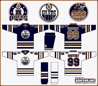
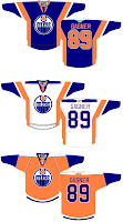
This first one keeps with the copper theme but makes a few adjustments. For one thing, there are two different secondary logos — one for each shoulder. It also continues the stripe all the way around the sleeve.
Not too bad overall, though. The letters on the nameplate might be a bit hard to read but the secondary logos are well done. I like the one on the left, personally.
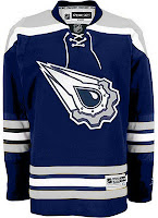
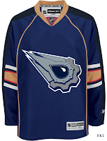
These two jerseys are a couple of designs featuring the logo you guys voted as the NHL's best third jersey logo. One with silver, one with copper. I like the silver.
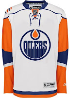
And these two were just fun. I think that jersey on the left looks bad with an Islanders logo on it. The Oilers logo doesn't improve it. On the right are a few concepts with some interesting striping. The orange jersey was ill-conceived, I think, but the other two have my attention.
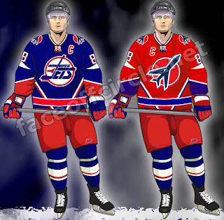
Finally, as a bonus for those of you longing for the days of the Winnipeg Jets, enjoy this.
Those are pretty sharp. Too bad we'll never get to see jerseys like that anytime soon.
I hope you all enjoyed your Christmas (if you celebrate it) and the day off (if you were lucky enough to get it). The third round of the Secondary Logo tournament kicks off tomorrow.




Reader Comments (4)
The slanting stripes on the Jets jersey need to go, then it'll be much better. And the first oilers concept is much better than there current uniforms.
the first oilers concept is basically just an uglified version of last years...with terrible logos. i give it two thumbs way down.
I was going to say that the first Oilers set would be great if the numbers and lettering colours were changed and the stripes taken off of the pants, but then it'd just be last year's stuff. And then I started crying because I miss that stuff. But anyway, there's not much point in making a "concept" of something that was just ditched, so good effort. A few tweaks and it'd be great! Like last year! I'm off to cry again.
that first concept with the dark blue and copper and the new Oil rig and rigger secondary logos is absolutely AWESOME. I love keeping the old logo and adding those two new ones, I'd buy that sweater in a heartbeat.