Winter Classic, Part I
 Monday · Dec 31 · 2007 | 2:04 PM PST
  8 Comments
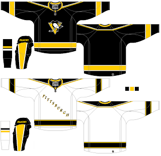
 In honor of the Winter Classic which takes place tomorrow, I've got concept art for the two clubs taking part. (Penguins today, Sabres tomorrow.)
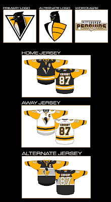
First is a rather dramatic logo redesign. You can't help but like the throwback jerseys though.
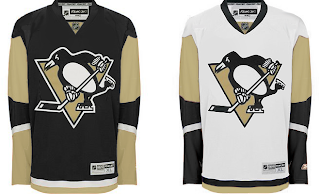
On the right is a set that also makes use of a new logo while throwing back even further to the days of blue sweaters.
Here we have a recolored set of New York Islanders jerseys. Still not a fan of that design but the lack of piping is allowing me to warm to it only slightly.
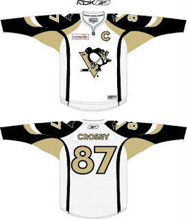
The numbering here scares me but it shows what you can do to improve the visual look of the Pens' sweaters.
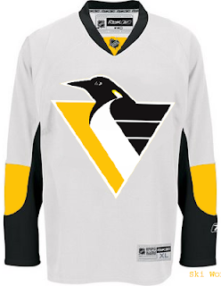
And this one's for the few of you that preferred the '90s penguin.
This last concept is a little far out but it's not bad thinking. Needs work but it feels like it's on the right track.
That's all I got. Should have some Sabres artwork tomorrow. Hope you enjoy the game if you were lucky enough to score tickets. Happy new year!



Reader Comments (8)
I don't know about any of those logos. It has to be hard to make a good logo while using a penguin. I'm fine with the current one, but it is a bit too cute and cartoony.
Apparently the Penguins are really happy with how their uniforms for tomorrow look and are trying to get permission to use them as an alternate starting next year.
Its not bad work but i love the one they have right now.
it would be pretty cool if they start using the blue one next year.
oh and happy new year to everyone who still come to this site and to Chris for doing this.
..cheers to all of you.
The first redesigned logo is really well done, but the evil penguin looks more goofy than intimidating. Just the nature of the animal, a penguin can look majestic but not angry.
is that first penguins design matt's(ghettofarmboy) work
i know i've seen a design that looked like that before, it was a sens design
"Apparently the Penguins are really happy with how their uniforms for tomorrow look and are trying to get permission to use them as an alternate starting next year."
I hope that's true Jason. Those are some nice unis. And seeing the Sabres on the ice in their throwbacks... my heart just broke all over again. HEY LARRY QUINN, BRING THEM BACK.
Anyway, back on topic...
I don't care for many of these redesigns, aside from the modified Islanders uni. The striping is easier to see on that mockup than on the actual Pens jersey. And like I've said before, I just can't get into that Vegas gold. It's not easy on the eyes, especially when placed next to anything white. Bring back the yellow.
Two words for the first set's alternate logo: Ninja Penguin.
I had to double-take it before I realized it was a penguin squacking.
I do like the second concept's penguin logo. It's reminiscint of Alfred Hitchcock's silhouette.
It's true, Mr. Drew. Down at the bottom of this page: http://www.pittsburghlive.com/x/pittsburghtrib/sports/penguins/s_545107.html
Both teams looked great yesterday. I'm with you on the Sabres. No idea why they didn't just go back to that once they decided to return to the blue and gold.
I'm sure I agree with many Pittsburghers when I say the logo here now stays. That 90's logo sucked and it's gone for good.
I do like the idea of bringing the blue back for the third jersey next year. It'd be cool to cycle through the historic jerseys of the Pens including the baby blue diagonal Pittsburgh and the Navy blue shirts as well. I like the Gold, but the yellowish Gold they wore in the '89 season wouldn't be a bad alternative either.
I'm a fan of the old school Sabres as well.