Concepts On The Isle
 Saturday · Dec 29 · 2007 | 6:10 PM PST
  3 Comments
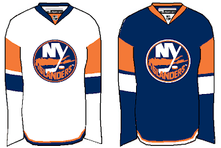
 I got a couple of nice New York Islanders concepts delivered to me. I felt like sharing them tonight. The first is a really simple improvement over the new design introduced this year.
It's not much, but it makes the sleeves seem like they're actually a part of the jersey. And it does away with the pointless piping around the shoulders.
Now if you just can't live without the piping, here's how you do it the right way. Tip: Use a different color for the shoulders.
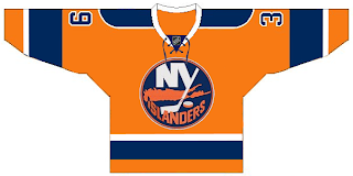
Plus, I've always liked the Islanders in an orange jersey. Just like I preferred the Stars in green — even the Wild in green as well. It's almost like there was actually a mandate requiring teams to wear black, blue or red (the Sharks with the teal the only exception). Anyway, here's to orange jerseys and Mike Comrie.
Though he appears to be disintegrating as if in one of those sci-fi films.
I'll have more stuff to post tomorrow. I hope to make a large-scale update to the Concepts Gallery as well.


Reader Comments (3)
The 1st of the 3 offerings is quite acceptable. Very simple, and more what I thought they should have done for this year than what Isles fans got. I will never like our present jerseys and time will not help them to grow on me. They are awful. No piping and no laces please.
The 2nd and 3rd concepts I can't even rate because the orange is wrong in both. Just doesn't look right.
do the avalanche count as not red?? i would put them into a maroon-ey cattegory myself...which is kind of a red i guess.
I like the orange. Anything that adds color is a good thing. Too much blue and red in the league right now.