Just To Freak You Out XVIII
 Saturday · Dec 8 · 2007 | 3:51 AM PST
  12 Comments
 It's time for another belated edition of the Freak Out series. Hopefully I'll get over this cold soon. It's making me very unreliable here at NHLToL. And it's supposed to be Freak Out Friday, right? Anyway, let's dive in.
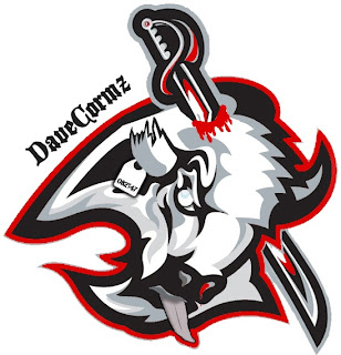
Wow, that was awfully violent. Who's hungry for buffalo tongue?!
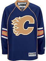
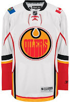
I got a ton of submissions this week for the "If They Mated" category. And these are all about rivalries.
I don't even know what to say about this. Except that once again, don't send me hate mail as I am excessively illiterate and wouldn't understand it anyway. Also I didn't make these.
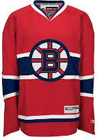
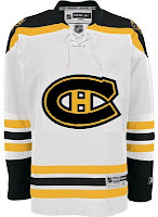
Perhaps slightly less inflammatory are these.
Everything's gone haywire. But wait it gets better. Sure anyone can mix two teams in a blender, but it takes a special kind of talent to do three.
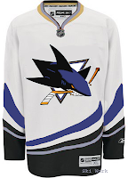
Presenting the Anaheim King Sharks. Let me break it down for you. You've got the Sharks logo in Kings colors on a Ducks jersey. Can't get much more to the point than that.
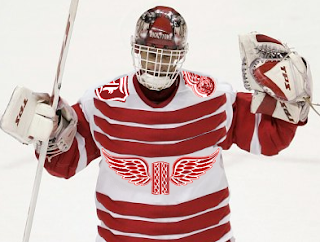
While we're still on the topic of ridiculous jerseys, do you remember the crazy Red Wings design I posted a while back. (It's the second one down in that post.) Were you wondering what it might look like on Dominik Hasek? Wonder no more.
Don't know what he's so happy about. Hideous if I do say so.
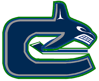
Here's a scary merging of the current and original Canucks logos.
Whales that play hockey. I love it.
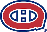
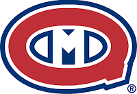
To finish up this morning's post, I've got a couple more whacked out logos. I'm pretty sure these come from a Quebecois looking to break away from Canada. It's like if Texas decided it wanted to be its own country. I laugh. But then I am a lousy Floridian who knows nothing of the politics of Canada. Look!
But wait, there's more!
So what do you guys think?
Oh and I'm just warning you now that any comments with discussion of politics will be promptly removed. Go elsewhere for that.
In the meantime, I hope I managed to freak you out a little. Until next time.



Reader Comments (12)
Wow, the "if they mated" concepts didn't work for any team this time, I guess these teams have their colours for a reason.
The Sharks one is pretty much their original colors on a Ducks jersey....looks decent.
Texas being its own country? Yeah, like that'll ever happen. Oh, wait...
(and if you were being sarcastic, my apologies)
That sabres one is disgusting! who in there right mind do that?
"That sabres one is disgusting! who in there right mind do that?"
Either someone who realizes what our ownership and management is doing to our team, or someone who's watched our last 2 games out west.
Whoa. Hasek looks like he has giant strips of bacon slapped on him.
*shudder*
hasek looks so happy because of his six vezinas. nuff said
Well, I am a Quebecer and if Quebec was ever to separate from Canada, I wouldn't spit on the second logo option (Q+M). The (Q+H) is ugly though.
Honestly, Quebecers has been Canadiens way before moderm Canada vas born (1867) so why changing the shirt. It will stay like it is separation or not !
The rest of Canada will have to refer back to their origin of north american britannia, which could be shortened to N.A.B. so the resident of N.A.B. unlike the U.S.A are not called British but Nabers like Neighbours.
So the american can called their fellow neighbours from the north, Hello Nabers !
P.S. It's a pun got it !
Wow, What a Freak-Out Post.
My Guess for the Sabres Concept Somebody Doesn't Like the Black White Silver and Red Colours.
If they Mated 1. Wow, Sure Screwed that Up. The Colour Of the "Oilers" Looks like Blood. And Calgary...Plain Awful.
If they Mated 2. Montreal Wouldn't Look Half Bad in Bruins Colours, The Same Can't Be Said for Boston though.
Sharks on Ducks. Looks Nice.
Red Wings Concept. A Big Mess. Could Look So Much Better.
Canucks Combonation. Freaky. If they want to blend the Orca In take the Stick Logo and put the orca on a corner. Probably Wouldn't Work. I Challenge Somebody to Make it Work! Then Again. It's Nice to See Green on the Outline of the Orca Instead of Silver. Why Didn't they Put Green as the outline on the Logo. Why!!!
And Finally Separation From Canada. The Canadians Name Would Absolutly Go Out to many fan's Disapointment But the Successor Wouldn't be the Quebecers it would be the Montreal Quebecois. With the Q+M Logo.
And That's My View.
Is that a toe-tag on the buffalo head? That one is just sick and wrong...and also hilarious.
The Edmonton-Calgary pair is some kind of disturbing.
Calgary Oilers? Edmonton Flames? Iyiyiyiyi, that's just WRONG!