Rebranding The Devils
 Saturday · Dec 8 · 2007 | 12:17 PM PST
  24 Comments
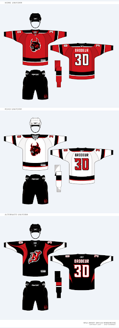
 Continuing his rebranding of the NHL, our friend Matt has taken a shot at the look of the New Jersey Devils. He emailed me these images to share with the rest of you.
If you want my opinion, the logos look fantastic, but I think the current primary works too well to throw out altogether. So my suggestion (which I feel like I've made before) would be to swap the primary and secondary marks. I think the secondary here is a great update of the classic Devils logo. I'm also a fan of the wordmark.
These jerseys are another great update, but I couldn't be more impressed by the alternate uniform. That one really grabbed me first. While overall not as impressive as some of his previous work, these are some very sharp designs.
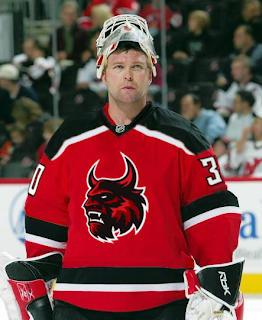
By the way, Matt went ahead and painted his home jersey onto Martin Brodeur. And while I normally wouldn't post a photo of Brodeur on my blog without a puck in the goal net behind him, I'll make an exception here.
Like I said, great logo, but it seems like it belongs more to a minor league team on the front of the jersey. Those black jerseys are my favorite.
By the way, Matt wanted me to let everyone know that if you'd like to contact him directly about his work, feel free to email him at gfb_designs@yahoo.com. Otherwise, leave your comments below for all of us to read.
UPDATE (6:34 PM): Hey guys, due to popular demand, I'm introducing a small new feature. You can now access all of the rebranding concepts by Matt (aka GhettoFarmBoy) by clicking on the link under NHLToL Series in the sidebar. Or by clicking here. I'm considering creating an album solely for his work in the Concepts Gallery.


Reader Comments (24)
YES!!
I LOVE THIS
doesnt look like a monkey anymore huh? This is fantastic! oh how i envy GFB.
The new primary is one fierce lookin mofo! That thing will give little kids nightmares! It definitely looks great.
That said, if it ain't broke... The current Devils logo is perfect. No need to change or tweak. But everything else about the new sweaters is great! I'd love to see them with the current logo, especially that alternate jersey.
The home and away sweater designs look like something Lou might actually go for. They're sharp and modern while not being complete overhauls and still keeping with their traditional look (again, this is if the current logo is on them). The alternate is amazing! But probably too radical for anything like that to ever actually be worn by the Devils.
All in all, absolutely fantastic work! Keep it up, man!
Interesting. Not bad, but not as good as what the Devils already have.
Great work, but I think some religious people would be offended by it.
The secondary and teritary (sorry if I spelled it wrong) were great.
The jerseys look awesome with that devil on it, but the second jersey isn't as good as people are saying it is.
I like the update to the current primary, but the black alt looks too much like a recoloring of the current RBK practice jersey.
I hate to critique this guy, especially because his graphic design skills are through the roof.
There are a couple of things I like about this redesign - the update of the wordmark and the lettering/numbering on the jersey.
Apart from that, all I can think is http://www.iwn.fi/~dana/gameworn/thb_lydman_buf_black_playoffs.JPG" REL="nofollow">Buffalo from a couple of years ago, both in terms of the logo and the jerseys.
I agree with the last post. Looks like the old Buffalo-head logo morphed into a more human-like creature. More Demon, than Devil if that makes any sense.
I would really like the striping pattern of the red jersey with the updated Black NJ logo. Similar to how Calgary changed to a black "C."
THAT'S IT! I knew that logo reminded me of something!
I still think it looks cool, but not as a primary logo. Maybe as a replacement for the current Devils Den dude ... the same dude they put into the Lowell Devils logo.
http://i113.photobucket.com/albums/n204/BatWings14/American%20Hockey%20League/update_devils.jpg
The Devils don't have a third jersey because third jerseys are nothing more than a marketing ploy (though I think it's a great ploy) to get people to spend more money.
Lou is all about tradition and the brand, and no third jersey would ever fly so long as he's around, and I can respect that.
I also think, in addition to the old Sabres logo, this logo looks like the Beast from the Disney animated movie.
Very nice work, like the uniforms, very nice touch on the numbers. I'm just not sure if I could see a devil of any sort on the front of their jerseys though, somehow they always need some sort of variation on their deviled-letters to work for me. And while it looks cool, the striping on the alt just looks too much like one of RBK's practice jerseys.
Is it me or does the Tertiary logo look more New York Rangers than New Jersey Devils? As a Ranger fan I must say the original Devil logo is one of the best in the league.
Alright, to give a litte foreground to this concept.... this was taken from my CCLSC thread....
****************************************
So before anyone skips right ahead to the logos, PLEASE HEAR ME OUT. When I first decided on the Devils, I tried everything I could to upgrade the NJ logo. But after 5 or 6 failed attempts, I finally realized that no matter how much I changed the NJ logo, it would be a lateral move at best. I would get a ton of posts saying, "Yours is nice, but I like what they have now." And that didn't sit well with me....
...so I decided to go for broke. As most hockey fans know (or at least I hope they know) the Devils were named after the mythological Jersey Devil. (Google it if you want to know the whole story on it...) After thinking it through, I decided that the best way to move their identity forward was to follow this lead. So I rendered my best vision of what a Jersey Devil looked like.....
...so with a new primary, I made a few changes to the classic NJ logo and added variations of it as the new secondary and tertiary logos. The wordmark is completely custom. Also, you will see more of a black, red, and maroon color scheme now, but on a dark backround you would see more of a black, red, and white scheme....
Alright, I am officially giving you the OK to start tearing this rebrand to shreds....
*********************
Feel free to e-mail me suggestion, concept ideas, questions, or anything else....
gfb_designs@yahoo.com
I think this logo looks too much like the beast from "beauty and the beast" plus why mess with perfection the updated "nj" is nice but i dont like that little split between the horns
Looks great. Not sure I could handle anything but the NJ mark on the front of a Devils jersey, but I do like the updated version. That black jersey would be great as an alternate. The devil looks too much like Disney's Beast for me to take it seriously, but it is a sharp logo. It would probably work as a shoulder patch. And I love the wordmark.
I'm not a fan of the logo. It looks like the dude from Beauty and the Beast.
The NJ logos, however, are top notch.
I really like the shoulders on the Brodeur picture. The logo is a great too but nobody really knows what a devil looks like though. So overall I think its a upgrade!
I actually like the secondary logo more than the current logo, it is an update that keeps the original mostly intact.
The black jersey with secondary log looks awesome.
Keep up the great work, I can't wait to see your next designs!
Maybe when all is said and done you could make some desktop wallpaper for each team with your updated logos.
wow. the more and more i look at that brodeur pic, the nicer that striping pattern looks. And the numbering is pretty unique too.
The devil head is a nice design and would be different for them. I really like the black jersey, it looks great.
It's definitely a solid redesign (it's hard to nitpick your work anyway :p) but I think in re-shaping the NJ with devil horns and tail logo, you lost the J. It looks more like an N with horns and tail now. But that's really my only complaint.
Call me crazy, but I don't like the new primary. The new secondary is awesome - it's like a badass version of a already awesome logo. Slap that on his redesigns and you've got a kickass jersey. But the beast thing just isn't working for me and shouldn't work for any self respecting Devils fan.
The more I look at these the more I like them! At first I would have said stick with the current logos, but now I would love to see the Devil Head used on an alternate jersey.
I like that Devil Monster thing. Be cool as a patch on the uniform or a hat option. NOt sure about it on the jersey, but I really like it and it should find a place at the rock.