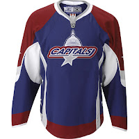
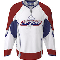
FanFic Caps Unis Making Rounds
 Saturday · May 12 · 2007 | 10:41 AM PDT
  Post a Comment
 a Cathode Rays & Power Plays cross-post from May 3, 2007
 First off, of course they're fake. Everybody keeps posing the ridiculous question: Are these real? Are you for real?
As is evidenced by the web address where the images are located, the handiwork comes by way of a graphic artist — from Baltimore, Maryland. (Clearly either a Caps fan, or friends with one.) If he's just hosting it on his site, I'll be very surprised.
 Anyway, the design mixes the old with the new in that it keeps the dull (instead of bright) colors and elements of both the old logo and the current one. Note the "Capitals" script with the dome element above it. The grey star beneath it is interesting but it doesn't work on the white jersey. As I've said, I've never been a fan of NHL logos wherein the team name is blatantly spelled out. That's not what a primary logo should be.
That's all for now. Remember, the Washington Capitals unveil their actual new logo and uniforms on June 22.


Reader Comments