HF&P, Part 2: Washington Capitals
 Tuesday · May 15 · 2007 | 11:03 PM PDT
  Post a Comment
 In case you missed yesterday's post, HF&P stands for "Hockey Fans & Photoshop." It has a lot to do with the fact that this series of posts features potential uniform designs consistent with the new Rbk EDGE unis to be used next season. No NHL team has yet officially unveiled their uniforms, but hey, fans can dream right?
By the way, I didn't do any of these designs so don't let me take any credit. I'm just re-posting someone else's handiwork that I found kind of cool.
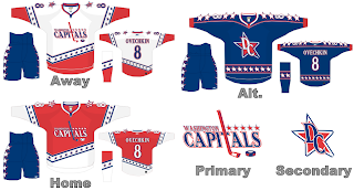
Today's graphic is for the Washington Capitals. The Caps previously announced plans to return to a red, white and blue color scheme so this fan took it a step further and came up with a new logo — a modernized version of the old '70s logo. The graphic features an "alternate" design and as one reader pointed out yesterday, the league has said it will be shelving "third jerseys" for a while as the teams adjust to the sweeping uniform changes.
If it makes any difference, I really like the "DC" star logo. Put a graphic design firm on that to touch it up and we may have something there.
Coming tomorrow: the St. Louis Blues.


Reader Comments