HF&P, Part 12: Columbus Blue Jackets
 Sunday · May 27 · 2007 | 7:06 PM PDT
  Post a Comment
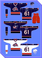
 All right so today brings a good example of what happens when a hockey fan gets a hold of Photoshop and doesn't know how to use it. By the way, I use the term Photoshop generically here.
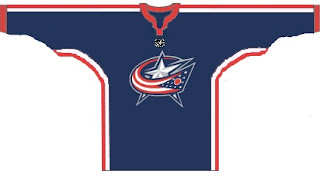
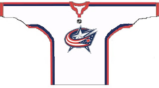
Really I think someone just got a hold of Microsoft Paint. Basically the designer was just trying to see what a jersey might look like with the secondary logo as the crest, which was announced by Doug MacLean before he got fired. Thing is, we've already seen that. It was called the Blue Jackets' third jersey.
 The jersey in the middle there is what Columbus wore as alternate this season. I'm a big fan of it. I've also heard rumblings of a slight change in the color scheme. I don't know what, though. We'll just have to wait it out and see.
Now, lastly I should just apologize for mocking the obvious lack of talent in the designer of today's uniforms but come on as I am no better. At least this person took the time to open Paint for three seconds. I'm just sitting here at my keyboard looking on and making snide comments.
But that's fun too.
Next up: the Carolina Hurricanes.


Reader Comments