HF&P, Part 13: Carolina Hurricanes
 Tuesday · May 29 · 2007 | 12:05 PM PDT
  Post a Comment
 Well, the "Hockey Fans & Photoshop" series is winding down now as we're just a mere two weeks out from the opening of the NHL Tournament of Logos. It's pretty exciting. But unfortunately, that also means the NHL season is ending. It's down to Ottawa and Anaheim in a true battle of the best. If you're wondering, I'm pulling for the Ducks to take home Lord Stanley.
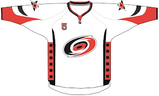
Correct me if I'm wrong friends, but I believe we've seen this designer's work before. This is a very simple design not a far cry from what the Hurricanes currently wear. All that's been done really is the hurricane flags worn horizontally around the waist have moved vertically to the sides under the arms.
This design also uses the front right shoulder numbers being worn by the Buffalo Sabres this season. I doubt that will become a league-wide mandate.
At this point I'd typically take the opportunity to point out flaws or suggest improvements, but I really can't. I like the Hurricanes' logos — both primary and secondary — and can't see a reason to change the color scheme or jersey design. It's a keeper. Now we just wait and see what the 'Canes actually have planned for next season.
Up next: the Pittsburgh Penguins.


Reader Comments