Friday
Jun222007
The Caps Unveiling Party
 Friday · Jun 22 · 2007 | 6:01 PM PDT
  14 Comments
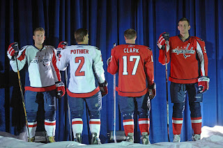
This evening the Washington Capitals had their big draft day party in D.C. where they unveiled the uniforms to fans. Check out all the cool smoke and stuff.
 Ex-Bolt Ben Clymer is seen here modeling the brand spankin' new Caps duds. They're sharp uniforms. I still hate the logo though. I don't mind the shoulder logo with the eagle in the form of a "W." Anything but a logo made out of the team name.
I do get nostalgia and throwbacks and stuff, but come on. Put that on the shoulder or something. Anyway, it's not up to me and I'm not even a fan of the team. I'm just hoping the Lightning come up with something cool this summer.
We're all waiting on the "EDGE" of our seats. Come on! You don't like puns?


Reader Comments (14)
i think they've done a very good job!
i don't know if they'll still look as classic in ten year's time as the wings and bruins designs though...
I generally don't like the "futuristic" jersey attempts, but this one is pretty good. The white seems to have just enough balance of blue and red to contrast, and the horizontal stripe at the waist is very good, although maybe a bit better if it was moved up instead of extending to the bottom of the jersey.
Why didn't they do the same with the red jersey? Why not a contrasting white horizontal stripe at the waist? That thin blue pinstripe isn't cutting it. There's not enough white on the red jersey, a big mistake.
I'm intrigued by the socks! I think the half/half look just might work.
Lastly, I've never thought much of their logo, and this attempt to make it look more futuristic just makes it look even weaker than what it was. At least the logo they had the past few years and on alternate jerseys was more thematic and traditional-looking.
Ya I'm not a fan of trying to make all the jerseys look flashy like RBK style in the future, and i'm gald the caps made they're jersey a little old fashion except updated. It looks like an older jersey with the stripes on the arm and everything, but it's even nicer.
i think that the logo should be more red,white and blue
considering it is like the Capital of USA
its too red for my taste (funny because im a Sens fan)
the white one is cool tho
Another thought about the logo...
The simple blue lettering on the white jersey is easy to read.
But the blue lettering with a white outline on the red jersey is more difficult to read, not enough contrast. If they had to use two colors for the lettering, it should have been reversed - white lettering with blue outline for better visibility against the red.
One more reason why the red jersey is awful, and the white one is pretty decent.
I kind of like these. One thing that bothered me about the old Washington uniforms that these were based on was that, for some reason, they couldn't keep the "Washington" flush with the "Capitals" like their official logo was supposed to be. They seem to have solved that problem this time around.
I Love the New Washington Capitals Logos and Uniforms..
I love the shoulder crest. Best logo I have seen in a long time. Not only is it nice because it's the Eagle in the shape of a w, but the red trim along the wings helps it alot. And if you look closely, you will notice that the inside of the bottom part of the W is shaped like the top of the white house.
That eagle is the best thing ever developed in Washington sports, and like idiots, the team relegated it to a shoulder patch. DC has a bad habit of choosing awful logos. The Wizards logo looks like a swastika with an Islamic crescent, the Redskins logo speaks for itself, and the Nationals logo is boredom incarnate. The Capitals went from ugly toothpicks to something out of the 19th century, and now back to toothpicks again. Ted Leonsis should have slapped that new eagle huge on the front of the jersey. i was all set to buy some gear with that eagle on it, but I'm not buying toothpicks.
The new Washington home jersey is the best jersey released so far, the vancouver canucks should get in touch with the designer.
Guys, this is by no means a "new" or "futuristic" logo... this is the old '80s logo for the team.
Because of this is a definate throwback to a classic uniform for me.
I like it... better than the 'nucks.
As on Oiler fan..... by far the best redesigned jersey so far. I like Boston's the best because of the retro patterns and logos but for a new patterns and new shoulder logo washington takes the cake here.
I think next to Columbus the best redesign thus far. Great job looks really sharp. I'm curious to see how Ovechkin will accessorize this uniform...maybe some red laces and blue tint visor with white gloves and chrome skates. He can't hold a candle to Crosby...GO KID GO the records were set for you to break them!
good call going back to the old logo, i like the red and white and the blue is alright on the home jersey. The away jersey is alright, but the blue pants and socks just ruin the whole jersey and look. it makes it was to american.