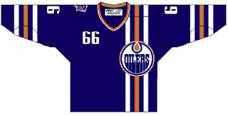
HF&P, Part 26: Edmonton Oilers
 Saturday · Jun 9 · 2007 | 10:42 AM PDT
  Post a Comment
 If this was a deck of cards, we'd be halfway through it. But this is the "Hockey Fans & Photoshop" series here at the NHL Tournament of Logos. Just three more days until the tourney begins! How exciting is that?
As you can see we're taking a gander at the Edmonton Oilers today. While this may not be a specimen of quality per se, I do like that is unique. It takes a page out of the Buffalo Sabres' book by placing the jersey number on the front shoulder but it also completely reworks the front. We have vertical stripes going down the left side instead of the usual horizontal stripes across the bottom. The design also gets rid of the centered crest and places it on the left over the stripes.
Very interesting. We'll never see it on the ice, but it's sure something to look at here.
Speaking of which, if you or anyone you know is a graphically-inclined hockey fan and has designed the jerseys posted here or anywhere else, feel free to shoot me an email or leave a comment. We'd love to hear from you.
Up next: the New Jersey Devils.


Reader Comments