Flyers Jersey Concept Designs
 Saturday · Jul 21 · 2007 | 10:54 AM PDT
  5 Comments
 Hope you're enjoying the tournament. In the last few days, the traffic here on this blog has skyrocketed, due in part, I believe, to links being posted on various message boards. I thank you all for dropping in and I hope the information regarding new jersey and logo designs for this fall that I've been providing is helpful.
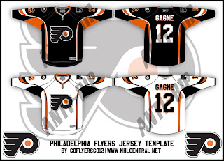
Today we get a look at a fan-made concept for the new Philadelphia Flyers uniforms. These designs have the Rbk EDGE cut but use the same layout scheme as the all-star uniforms, which is why I know its fan art and nothing official from the team. I'm under the impression the Flyers will be going with black for their home jerseys this season. Take a gander.
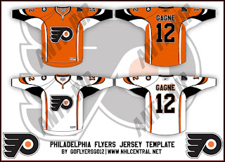
If you were wondering what the home uniforms might look like in orange, check out the design below.
Once again, these were of course designed by a fan and despite the fact that the Flyers are taking pre-orders for the 2007-08 jerseys, we have yet to see what one will actually look like. As usual, keep it here for info on that as it becomes available.


Reader Comments (5)
The Flyers jersey concept designs are pretty cool i think. I wish the Flyers would go back to the orange jersey. Being a Flyers fan, another nickname for the Flyers is the orange and black. I think i saw it on one of your designs for the Flyers jerseys..as the liberty bell as a side patch...ive been saying to myself for the last five years that it would be a great idea. I kinda like that Canucks concept jersey!!!
Thanks for the posts Chris!!
Tom - Philadelphia
Those mock-ups for the Flyers are nice but I'm guessing they'll go with something completely different. And I too thought the Liberty Bell shoulder patch was a great idea. I wish I knew who half these designers were so we could give them the credit they deserve.
I thought the Canucks concept was very cool from the standpoint of the colors. They are certainly unique. The crest, however, needs some work. Still, I keep hearing the Canucks will be sticking with the orca logo — just some color alterations.
Once again, thanks for the comments, Tom! And I'm glad you're enjoying the blog. Let me know if there's anything I can do to make it better.
I love this site Chris, i appreciate what you've been doing. It's great. If i think of anything i'll let you know, but so far everything is good. I do like the countdown meter for the jerseys...i dont know of you saw, but there was a rumor that the leafs were going to switch back to the logo from 67'..but Toronto Star columnist Damien Cox shot that down. I also saw that the Flames are ditching the horse side symbol..well thats all i got for now!!!
Tom
I read about both of those items actually, but I appreciate you passing that information on. I have heard that the Leafs are planning a modernization of some kind for the logo but obviously we don't know anything beyond that yet.
http://nhllogos.blogspot.com/2007/07/wild-vs-flames.html" REL="nofollow">I actually liked the horse logo, by the way. The flaming "C" obviously makes for a better primary logo, but I'll be sad to see it go.
Thanks again, Tom!
personally i like these jerseys a lot but as we found out yesterday these are almost def not the jerseys i no they were fan made but still there really good