New Blackhawks Jersey Design Concept
 Sunday · Jul 29 · 2007 | 5:27 PM PDT
  6 Comments
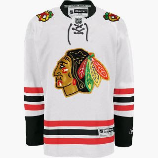
 We haven't been hearing much about the Chicago Blackhawks lately, but I came across this design on the 'Hawks official message board. Have a look.
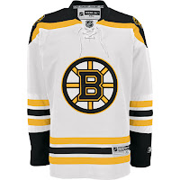
Now, have a real good look. I mean get out your fine-tooth comb and really go over that puppy because I have my doubts as to the veracity of this image. It sure does look like a Blackhawks Rbk EDGE jersey, but the first thing that caught my eye was that familiar horizontal striping pattern on the sleeves and bottom of the sweater. Remember this?
 Now compare it to the Bruins jersey to the left. Dead on. So I'm sorry if I got anybody's hopes up. It is just a very good Photshop job based on the B's road Reebok sweaters. Wondering what tipped me off? The stripes on the Blackhawks' white jerseys go black-red-black whereas the ones in this image go red-black-red.
Anyway, I'm continually impressed by the work people put into these jersey designs. You gotta think I'm pretty interested in the subject on account of writing this blog but I'm not sure I'd really go to the extent of coming up with my own design concept. Kudos to the folks that do, though. They give me something to write about.
The Blackhawks have yet to give word of plans for any sort of formal or official announcement, so until we hear something, it's a cool idea to muse on. Any Chicago fans reading? What do you think?


Reader Comments (6)
Hey, just a heads up.
Someone's gone and put that fan concept jersey (the one you posted a couple of days back with the full uniforms, but with the old fin shoulder logo), onto players in an NHL game, though I don't know which one.
http://onveutlacoupe.blogspot.com/2007/06/presenting-your-2007-2008-nhl-uniforms.html
It's posted here, about half-way down the list of new logos/jerseys.
Pretty crazy, I tell you.
Yeah I saw that and several others on another site. It looks like somebody designed a bunch of jerseys for NHL07 and did some screen grabs. It's interesting but I've been leaning away from posting images from video games. Not sure why.
Should I go ahead and post them anyway? I've got a handful but they just don't seem to offer a good picture of what the jerseys really look like. Thanks, Glenny!
I'm not to tell you what you should do. hehe.
If there was a way to send you a more private message, I would have. Just giving you heads up.
It's no problem. I appreciate the tip!
This concept jersey is a lot better than the concepts I saw posted on another site (Hockey Digest or some silliness). At least there aren't numbers on the front in this version. The Blackhawks jersey is one of the best in the league and I've been worried about what we might see. This would be something I could live with.
Found new canucks jersey!http://thecanucksreport.blogspot.com/2007/07/possible-new-uniforms.html