Mull Over These, Sens Fans
 Wednesday · Aug 1 · 2007 | 2:05 PM PDT
  10 Comments
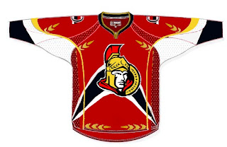
 We've already seen the purported new Ottawa Senators logo yet we haven't heard word one from the team with regard to this matter. No worry, because where there's image manipulation software, there's hockey fans to use it. Enter this.
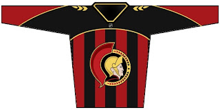
I'm sorry, but what a mish-mash. I applaud the effort but, um... yeah. There's sure a lot going on. And hey, they make use of that new logo we've been seeing. On the shoulder, though, this fan opted for the striped old-time Ottawa logo. Speaking of stripes, how about this puppy?
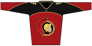
The vertical stripes make it look like a European soccer jersey to me. However, I do like what this designer chose to do with the logo. He dropped the black pointy things from behind the galea and gave the logo an overall 3D effect. For a look at a cleaner version, sans the stripes, see the image below.
Impressions, Sens fans? Do you guys like the potential new logo? Or do you prefer the proposed design in the bottom two concept sketches? Or would you rather not see it change at all?


Reader Comments (10)
I'm sick of the all-star game template concepts!!!! ahh!!
that "new" logo is quite cartoony and has too much going on. same with those jerseys. but the idea of taking off the three black wings is interesting. the ottawa logo needs less of a change, more of a tweaking
personally, as a life long follower and a citizen of ottawa, i would love to see them completely rid themselves of their hideous cartoon looking red jerseys and that 3d logo and keep the current whites the way they are. love the 2d logo, to me, THAT is the OTTAWA SENATORS and quite frankly the trojan condom metaphor is bogus, besides, we had our logo way before they did! Long story short, keep the road whites the way they are, albeit in the new rbk edge cut, keep the 's' shoulder icons and SLIGHTLY modify the main logo (ala reduce the number of roman leaves around the outer shell from 26 to 16, like the maple leafs have done over the years to their logo) All in all, GO SENS GO and long live the current logo!
Whoever did those logos is blind and or an idiot. Those are terrible. Regular whites with original logo for road games and a red one with black trim and the new logo for home games please.
The current home jersey is terrible.....the black, white an red swirl is an eye sore. It's like watching a clown troop on ice. Any new uniform design should not be based on it.
The Sens should go back to the barber pole style. for their home sweaters. Classic centurion logo may work on it.
the third sample jersey looks suspiciously like a star trek uniform
I don't like any of those, they are all terrible IMO
I love the 2D logo and I will be very disappointed to see that go. I've gotten used to the 3D logo, but I still prefer the older logo. I'd love to see them work in some arrangement like we currently do where we use the new logo for one jersey and the old logo for the other jersey. I'd be very happy with that.
Even though I moved to Vancouver 5 years ago. I stay true to my hometown team which I saw grow up as I did.
That top one is just disgusting. Way too busy. The other 2 with the mutilated older logo are also bad.