Covered In Coyotes Concepts
 Wednesday · Aug 1 · 2007 | 12:58 PM PDT
  8 Comments
 I feel like I've been ignoring the Phoenix Coyotes fans out there. This is certainly not intentional. There just hasn't been a lot of news to post for them. Until today, that is. I've scoured the far corners of cyberspace for a few images you might find beautiful or repulsive — or something in between.
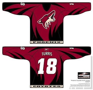
This design was created by someone who designs the outsides of racecars, I believe. Anyway, it's really quite — something. I couldn't see them wearing anything like this because the whole reason they changed their logo was that they wanted to go the classic route and simplify everything.
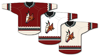
Well, to me, that was a sad thing. One fan designed this jersey set in memory of the old days when the Winnipeg Jets first arrived in the desert.
It's got that desert Indian look that was very cool. This design uses only the head of the original Coyote logo. It was first seen by itself on the green third jerseys they had for a short time. This is closer to what they actually wore in those days.
 The big difference being that the Coyotes wore black dark jerseys, not maroon like they wear now.
I haven't seen any Rbk EDGE jersey concepts based on their current logo and uniform design, but haven't you heard, horizontal stripes are so out. Seriously though, don't be surprised if it comes out looking like the Capitals or Blue Jackets new jerseys.
It'd be nice if the league would unveil more of the new uniforms. Chances are we've still got another month ahead of us before we start to see the rest of the teams trickle out. Anyway, Coyotes fans and others alike, what do you all think of these designs?


Reader Comments (8)
1st one looks pretty good.
What is the NHL doing?
Absolutely no hype around that reebook's new jerseys. What a shame. All their teams are going with a face lift and no news on that. The most complete site on that matter is this blog, witch I constantly refresh.
It's like this new era is beginning with fear. If I was in charge of the marketing in the NHL, I would make a giant wave with this new look. Instead of that we are left with scouting the forums in various team messages boards. Shame on the NHL so far.
As for the coyotes, only the head of the coyote is not that bad.
I like the concepts in the middle, the three with the coyote head, although I think sticking with the most recent logo would be better. Still, those are pretty tight. The colors work very, very well.
As for what Sephiroth said about lack of marketing, I both agree and disagree. He's right in that there should be more official marketing for this new look, but the NHL isn't controlling the teams and when *THEY* market and unveil their uniforms. That seems to be an entirely individual thing. So should the NHL have made it one huge unveiling? Or is this whole "mystery" thing just another way to market? It sure has people talking. It has us on the edge of our seats (some of us) for sure.
So I think that some more work with *general* marketing is badly, badly needed, but on an individual level, it works that things are being kept secretive and are being held back.
Anticipation is a successful marketing scheme.
I agree with "artymous." The number of people visiting my blog alone these days is a good indicator at how stalling works as a marketing tool. They know everybody wants to know what the new jerseys will look like anyway. There's no need to create a buzz. We're all already buzzing.
For reference, we're averaging over 6,000 hits a day here. That's literally a hundred times more than it was getting just two weeks ago. I started compiling everything I could find about these new uniforms and suddenly the hits skyrocketed.
Having said that, official promotional tools would be nice. I think more teams should keep a countdown on their web site like the San Jose Sharks did before unveiling their new logo. Either that or at least give us a date so we can keep a countdown.
Thanks for the comments, as always.
I think the coyotes should go back to their original logo, or at least change their colour scheme.
That brick colour is getting old.
I know this doesn't have anything to do with the coyotes, but I was wondering if you had heard anythign about the wild getting new jerseys? Everyone on the wild fan boards said they are but I have heard nothing officially. Just wondering if you knew anything about that
The first one, the red markings kinda looks like a phoenix (the bird)
This is in regard to the new Minnesota Wild uniforms: As far as them getting "new" uniforms, technically every team is with the switch to Rbk EDGE. Having said that, whether there will be major or minor changes in the adaptation to the new cut, we don't know a whole lot yet.
What we do know is that the new home jersey will be red and closer in style to what they've been wearing as a third jersey. The green sweaters will be gone. I'll keep you posted if I hear anything more. Thanks!