Saturday
Aug112007
Additional Ducks Designs
 Saturday · Aug 11 · 2007 | 10:22 AM PDT
  7 Comments
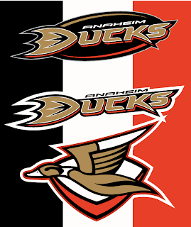
 The Anaheim Ducks logo and uniform designs I posted on Wednesday were mostly well-received though a handful of you were wary. So I came across a couple more I thought might be worth considering.
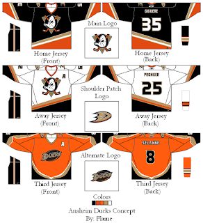
These concepts are in keeping with the current color scheme with some minor alterations. What about using the duck logo from that original design in the new colors and making it a secondary or converting the current logo to secondary.
That's one possibility. Another is more nostalgic, keeping the old Disney logo. It mixes the new colors with the old logo.
Would you buy any of those jerseys or should we just leave well enough alone and stop messing with it?


Reader Comments (7)
Those look really good. I love that alternate flying duck logo. I really think that would be the way to go.
i think: the main logo, the old mighty ducks logo, with the alternate flying duck logo would look sweet!
thats great
I liked the forest green and the orange colour scheme. With that beautiful duck logo. Beats their current one all to crap.
use the duck that they show in d3 at the very end after they win the varsity jv game. that movie sucked but that logo was hxc
If the Ducks ever use their original crest logo again, bring back the original numbering font, but keep the new lettering font. I think the old logo on a jersey with the new colors could work.
Yeah, the alternate flying duck logo rocks! Wow!