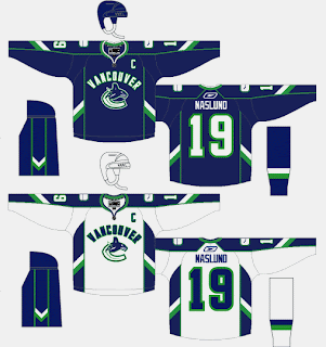
Canucks, Pens Fan Concepts
 Wednesday · Aug 15 · 2007 | 1:21 PM PDT
  11 Comments
 When I don't have real news, I invent news. That should be my slogan. No, this isn't news. This is just fun. The fan concepts keep on rolling in. Let's start with the Vancouver Canucks.
I think the only problem with these is the giant "VANCOUVER" sprawled across the chest. Kind of unncessary and not aesthetically pleasing. I'm liking the side stripes on the sleeves and pants. They form Vs if you didn't pick up on that.
Anyway, I've also got some Pittsburgh Penguins artwork to share with you all. Check this out.
While you're trying to process that, let me fill you in with some background. The folks over at The Pensblog submitted this idea for a new series of Pens uniforms. For those unfamiliar with the history of the club, their original uniforms were pale blue a la the current home jersey of the Atlanta Thrashers. This, despite the fact that the triangle in the penguin logo was always yellow. But that yellow and the blue worked well together. I'm not too sure about the two-tone blues on the Vegas gold.
Anyway, I mean no offense to the designers as I share my opinion. I think the re-introduction of the blue wouldn't be all bad if done right. What do you guys think on that subject?
While you ponder on that, I'll share with you a design tweak someone emailed me for the much-loved Penguins logo.
Look close at the eyes. He's more pissed off than ever. Somebody woke up on the wrong side of the Antarctic ice shelf. Oh, and he's got a nice new shiny belly. Improvement or not?


Reader Comments (11)
All I have to say is that I wish whoever it was hadn't used Slabyk's template.. gives the guy a bad name.
Those aren't anywhere *NEAR* good.
That gold Pens jersey may be the worst thing I've ever seen.
Holy shit, that's ugly.
The update to the Pens logo is kinda cool, but I still prefer the Vegas Gold.
They should never return to the blue, IMO.
1: It's Thrashers now
2: Don't fit well with anything exept more blue
3: The pens are Yellow, or Vegas.
JUST SO EVERYONE KNOWS THE CANUCKS NEW SHORTS ARE GREEN WITH A WHITE STRIPE ALONG THE BOTTOM AND A BLUE KINDA CURVED STRIPE HALFWAY DOWN SIDE!!!!!
the pens need to go back to the old yellow gold, instead of this ugly gold in their current logo. i love the minor tweak...
Is the 'tweaked' logo the new logo they'll be using? Or just a drawing by a fan?
Fan art. Believe me, if anything is official or believed to be official, I'll be clear about it. Thanks for the comments, everyone!
Thanks Chris
i like the white pens jersey with the pittsburgh wording across the chest. the gold jerseys are hideous. and i think the minor tweak to the current logo is a pretty nice improvement and i could see them using something like that if they were to change from the vegas gold
well that concept was dead on when it came to the front of the new cancouver jerseys. I think the concept may actually be better than what was used.