Revisiting The Senators
 Wednesday · Aug 15 · 2007 | 1:49 PM PDT
  8 Comments
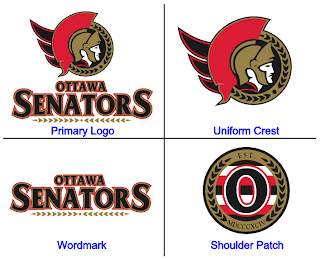
 On Monday, we got a preview of the Ottawa Senators' new logo set courtesy of Canada's government trademark web site. They were black and white on the web site, so we had to imagine how the coloring might work (at least for the secondary mark).
The image I posted had the outer circle in gold. Here's how they might look in red or white.
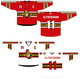
As for the primary logo, one fan ran with that on a jersey concept. See below.
Not sure how I feel about the striping across the chest. Certainly an interesting choice, though. Thoughts on that?
For the part of you that persistently resists change, one fan designer altered the new logo to mix in some of the old.
Truthfully, I'm not a fan. Until we get to the shoulder patch. I think that is pretty cool. I like the old-time stripes and the contrast in that logo, which you'd think would be hard to achieve, is excellent.
Sens fans, what do you make of all this here? Good? Bad? Ugly?


Reader Comments (8)
Hey Chris, if i may call you that. I'm a Sens fan so naturally i have to comment. But also wanted to say your doing an awesome job. I have enjoyed your site immensely, it's helped me get through the loooooong hockey free summer.
Anyway, I really like those jerseys. I was always a fan of the gold stripes on the third jersey, but i prefer red to black for the actually jersey colours. The O and stripes in the circle were brilliant, I really like those as a shoulder patch as well. But i also love the maple leaf and peace tower as shoulder patches,any chance we could have them both? On one each shoulder?
As for the logo's the "2D" one is a nice update, but I really like the "3D" one, I hope it's used on both jerseys. I doubt it though.
I'm not a senators fan, but I think those jerseys look really good. exzept for that different stripe down the arm
The patch is nice, but it looks like something a soccer team might use.
Im a Senators fan, and just have a few comments. For the "new" secondary logo, i think red on the outside of the circle works best - it has a nice contrast. and as for the jerseys that were created with the primary logo, i think all that has to be done is to remove the horizontal stripes in the middle, and then you've got a truly awesome jersey.
I really dig the shoulder patch, I had always hoped the Senators would incorporate the old Silver Sevens in their logo or uniform somehow and I think the shoulder patch looks break.
I don't really dig the striped vine in the uniform concept though, it sort makes it look too busy.
Hey Chris,
Love your blog !
Sens fan here, and i have to say those jerseys are pretty much my favorite up to date. Even though theyre not even close to anything we ever had in the past, I think they would be nice.
I love the horizontal gold striped vine and i also think the Peace tower should remain as a shoulder patch.
I should be there when they unveil their new jerseys, let's hope i won't be disapointed.
A BLACK VERSION OF THIS CONCEPT JERSEY WOULD PROBABLY BE INTERESTING ...
Childish. I don't like them at all. The new primary logo looks much better on paper. The shoulder patch is nice, but it's the only one positive I found on this ugly jersey.