Mailbag: Very Sharp Sabres, Oilers Concepts
 Thursday · Aug 16 · 2007 | 2:16 PM PDT
  21 Comments
 Since I've started soliciting jersey concepts from readers, I've gotten a lot. Really. A lot. But sometimes I get designs that really stand out from the rest. Today, I'm sharing a couple of those.
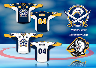
Let's start with the Buffalo Sabres. Some fans were ecstatic over the idea of returning to the traditional blue and gold. They were then left horrified by the "Buffaslug" (I just love writing that). With all that in mind, one talented fan artist came up with an idea that works the past back into the present. Have a look for yourself.
I think it's really cool. The crest logo seems a little busy to me. I think the crossed sabres overlapping the blue circle would be fine. I'm not necessarily sure it needs the buffalo in it — especially with the buffalo logo on the shoulder. What do you think? Is it just because I'm not from Buffalo?
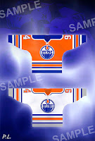
Then we also have a very interesting idea for the Edmonton Oilers. Check out Ryan Smyth in some orange.
 Wow. That is orange. Very orange.
But after staring at it for a while, it's started to grow on me. What I really like are the silver accents, especially the silver circle around the Oilers logo crest. It's a very sharp color combination and it would certainly stand out on the ice.
Though just for the heck of it, I'd be curious to see what a blue jersey would look like in that same design.
What do you guys think? I'm sure our very talented artists would love your feedback, good or bad.


Reader Comments (21)
Further proof for all you Sabres "fans" who think the slug would be ok with swords added - it won't. It sucks. It cannot be salvaged. It's a piece of corporately designed garbage and should be forgotten.
That logo is horrid. The slug just doesn't work. In any capacity. Except for mockery. It's excellent in that regard.
I Like it HELL NO As a Sabres fan this is a joke. The Buffaslug is a joke
The Buddaslug should be taken out into a field and shot. If I lived in Buffalo I would be embarrased to be wearing it.
I like the Buffalo ones... even with Buffaslug. It'd be good without it too though.
The Oilers jersey..not so much. I like orange, and on paper I think orange jerseys would be awesome. But it doesn't mesh well with the blue. Plus it looks too much like the Islanders.
Ryan Smyth is coming back to the Oilers? Sweet! /sarcasm
That blog is so cool
Oilers is absolutely beautiful
i dont like the retro look of the oilers and i could not live with that much orange as an oiler fan
buffalo is my second favourite team and those jerseys actually look pretty sharp
Once my eyes stopped bleeding from that pumpkin orange, I took another look at the Oilers jersey and yep, they're still hideous. As for the Sabres jerseys - anything with the slug sucks.
PointMeAtTheSky said...
"I like orange, and on paper I think orange jerseys would be awesome. But it doesn't mesh well with the blue."
Dude, look at a color wheel. Blue and Orange are complimentary colors. Why else would so many teams use that combo of colors? Oilers, Islanders, Thrashers, San Jose (now), Chicago Bears, Denver Broncos, Miami Dolphins... the list goes on.
I hate the Oilers, regardless though.
I think a return to the orange and blue, color scheme would be a vast improvement. They were worn by the Oilers from '72-'96, and have been missed by this Oilers fan for many years. The current copper, dark blue, and red scheme has really become bland and tiresome over the years, and carry little sense of tradition.
Also, I don't understand the argument, the Islanders uniforms are already orange and blue and therefore Edmonton's shouldn't be. There are currently 4 teams in the NHL using the colors red, white and blue. I highly doubt 2 orange and blue teams would create any confusion. Plus, the Oilers were using those colors (in the WHA) just as long as the Isles were.
Bring on the "pumpkin" and blue!
Those Oilers jerseys are unspeakably hideous. HIDEOUS I SAY! There's really only one NHL team that can wear orange as a primary jersey color, and that's Philadelphia. And for the record, I hate the Flyers with a passion.
Now if you'll excuse me, I have to go mop up the blood that spewed from my eyes when I saw those orange Oilers jerseys.
Now don't get me wrong, orange and blue, especially when it's a darker blue, work very well together. But orange really needs to be a secondary color in the design -- it takes a great deal of skill to design a predominantly orange jersey that doesn't look godawful. Before the Islanders puked out that new design, their home and road unis were among the best in hockey, in no small part because orange was an accent color. Their third jerseys looked like they let a kindergartener throw paint on a blank piece of fabric.
http://www.legendsofhockey.net/graphspot/one_plante06.jpg
Bad ass!
Those Sabres jerseys don't do it for me - and I never want to see that goat's head logo ever again, even as a secondary one.
They need to quit fooling around and just bring back their old uniforms.
Those Oilers uniforms are fantastic. I just hope they keep that oil-man as the shoulder logo.
Those Oilers uniform ideas look sharp!
Granted that there is quite a bit of orange and would take some getting used to, but it goes to show that a lot of colors will look good if they are part of a classy jersey style..unlike the new uniforms we have been seeing Reebok pull out. So far none of them are an improvement, except for possibly Nashville, which already had one of the worst in the league, so no further harm.
If you traded the orange for the blue on the Oilers jerseys they would look great. Wait, they already wore those jerseys before. They already had that colour sceame before as well, back in the WHA.
http://whauniforms.com/
Oilers concept looks better than the actual design the Isles came up with...
I like the fonts of the Sabres concept but anything with any sort of resemblence to the Buffaslug is unacceptable and offensive.
-Charlie
SabresNotSlugs.com
I love the Oilers concept. Remember, when they played the first few years of the WHA, they wore orange on the road. And any shade of blue is better than what they have now that looks black at a distance!
I'm an Oilers fan and I like the jersey's. The Oil silks that is but on the away jersey I'd make the shoulder patches blue with a orange strip. The Home Jersey remind me of the 3rd jersey's from the 70's. It also kinda ties in with the Oil Kings jersey but they have red instead of Orange.