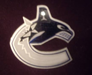
Canucks Logo Leaked Via Stickers?
 Saturday · Aug 18 · 2007 | 2:59 PM PDT
  7 Comments
 Apolgies for the late posts today. Went to the movies this afternoon. Superbad was hilarious.
I got emailed a photo claiming to be that of sticker produced by the Vancouver Canucks bearing the alleged new logo. I should clarify. The sticker wasn't claiming anything so much as the sender of the email. Anyway, for your viewing pleasure:
 For a better look at it, I was also sent this rendering of the logo. I really like it better with the green, but who am I to say, really? The question is what do you guys think? Is the blue/black/silver combo too Lightning? (It is for me.) Do you like it better than the blue/maroon/silver combo of the last decade?
I also want to be clear on the fact that I can't vouch for the veracity of this photo. Just know that it was something emailed to me and that the Canucks will supposedly make their official announcement regarding new uniforms and logos on August 29. We'll all be watching and waiting.


Reader Comments (7)
looks batter without the marron, but would prefer the green and blue
I've seen the ticketmaster canucks stock and the tix are white with a green and blue stripe at the perforation. The logo above is on there, outlined in blue and green.
There's green on the logo, I've seen it. This ain't it. Close though.
I hope the green is there too. The blue and green combo represent the province of BC a lot more than any other combination of colours the Canucks have had. The blue and green have a character that Canucks fans are most attached to.
im pretty sure itll have the vinatage colours in it since thats what they told store owners to order for thier canucks gear. but all in all i dont really like the orca, i wanted to see something new and sharp
http://canucks.nhl.com/team/app/?service=page&page=NHLPage&id=17540
They have the whole "Where We Began...What We've Become" deal going on. They jersey seems to be almost all white, save for a blue neck.
that logo is pretty much bang on. invert the silver and white so that the ice is white. there's no green at all in the logo, though i don't know if there'll be any in the jersey. i've seen them with my own eyes. not the jerseys, just the logos.