Sharks Jersey Concepts
 Tuesday · Aug 21 · 2007 | 3:16 PM PDT
  18 Comments
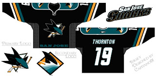
 Quick note before I call it a night. I recently got a few emails with concept designs for the new San Jose Sharks uniforms. Have a peek.
That's a pretty cool design but I have a feeling the Sharks will go with teal home jerseys since the logo sort of fades away on a black background. Not sure about "SAN JOSE" written across the bottom. The very Kings-like and unoriginal.
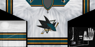
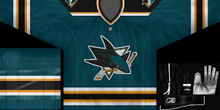
Last week we saw a video game magazine with what appeared to be a blurry screen grab from NHL 08. It seems we may have gotten a sneak peek at the new Sharks jerseys. With that concept in mind, one fan came up with these.
I don't hate them. They're very nice yet without a hint of their previous jerseys — which I felt were among the best in the league. Regardless, doesn't the new logo seem to stand out better on the teal sweater?
We'll have to wait until we hear official word from the team on when we'll get to see the new Rbk EDGE jerseys. Until then, speculation is all we have.


Reader Comments (18)
I don't "hate" them either (the bottom ones), and I have a strong feeling that a design very close to that is what we'll see.
Still.. Orange.
Yes, I'm still having trouble with that whole idea.
My brain can't seem to allow me to accept it in any way.
like artymous, i still cannot comprehend or accept the disneyfied or anaheim ducks-ified logo that is the san jose sharks. too much dark teal and where did they get orange from? jealous b/c of the success of the ducks perhaps? i think it is a slap in the face to all those die-hard shark fans that the team dramatically changed color schemes albeit the "modernization" of a classy logo. i'm sure a bunch of people in design and management were or weren't on enough drugs when they decided to have this monstrosity as their logo. just pitiful indeed.
yeah, i finally figured out how to add a pic!!!
the design of the bottom ones looks a lot like what the blues ought to do with their jerseys.
Really, I kinda like the tad of oj but...could live without
about those numbering on the jersey - aren't those the same used by the nashville predators? that's not very original...
Looks like a copy of the AHL's Manitoba Moose jerseys if you ask me.
I have to be in favor of the waranddefense comment.
That new logo of the san Jose sharks, with some time passed, is clearly ugly.
Of all the new jerseys, only the Bruins have a good one.
okay check this out: The actual jersey was captured on camera and has been out for at least a month. Why is it that I haven't found it ever since? It has a side panel that is the same shade of blue, but has camo like markings on it. Please somebody tell me where to find it!!!
I think they are actually quite sharp. Not my fav. but pretty nice. Although I do agree that they look very similar to the Manitoba Moose jerseys.
http://www.manitobamoosestore.com/virtuemart/70.html
I think the design of the new new Sharks logo is one of the better ones,however,I really don't like the the added ORANGE to the team colors and I really hope that its kept to a minimum on the jerseys. Orange+teal just does not seem like a good combo...
the new look is ok, but they were better off to keep what they had
THE MOOSE IS LOOSE IN THE HOOSE!!!!!!!!!
I like the Black one but Sans word mark along the bottom trim.
-Kindred-
I agree with the whole Manitoba Moose look. Also, if you watch the logo unveiling video, there's a jersey hanging up beside their old one that has orange from the neck down to the arms. I thought that might've been a sneek peak, but I sure hope not.
I have to say I am very against the team names along the bottom of the front of the jerseys...
in reference to the unveiling video, are you talking about the shots when terry smith is talking? because that looks more like a "this is sharks territory" towel or blanket.
looks just like the design of the Manitoba Moose of the AHL without the best part being the lace-up collar and logo
I like this "concept" a lot.
Only problem I have believing this could be the way they're going is that from a "template"'s perspective the Shark's "current" jersey is probably the closest thing to the new EDGE template and this concept is one of the most "classic" I've seen in a long time. I can't see why the Sharks would give up their "unique" look for this Vintage look, especially since their history doesn't go that far back...
As for the background shots in the video, we have to trust that an organization that puts out such an elaborate video, would not overlook the shirts (fabric) in the background. It's either some promotional item or a decoy...
p.s.: where can I find that Layered template used for the concept?