Hey, Canada! Part 4
 Thursday · Aug 23 · 2007 | 12:58 PM PDT
  31 Comments
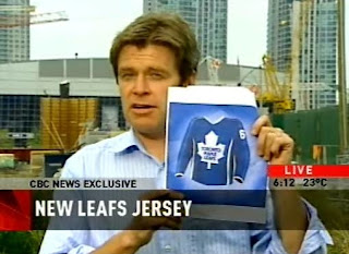
 You know, one of the things I hate about living in Florida is that an occurrence like the one that arose yesterday in Canada would never happen here. Right there in the first block of the 6:00 news, CBC reported on what fans might expect for the new Toronto Maple Leafs uniforms.
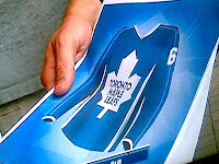
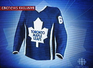
First, let me be clear in saying that this is neither a leak nor an official unveiling by the team. This is a concept produced by good people of the Canadian Broadcasting Corporation, acting on information they'd received about what the Leafs' new Rbk EDGE jerseys might look like.
Look at that! A news reporter holding a picture of a speculative hockey jersey. I have a special dislike for Florida. Those vertical stripes you see going up the sides are silver, by the way.
 In case you wanted one more look at the uniform design they came up with, I offer this. It better shows the thin vertical stripes going up and down the sleeves.
It's really something. I need to make a trip up to Canada one of these days. Just to bask in the hockey fever. It's not very contagious around these parts.
So now you should be able to understand my plight and why I spent the whole day today taking a pretend trip across the Great White North. You guys up there, you don't know how lucky you are. (Or maybe you do.)
Before I forget: Leafs fans, what do you think of these developments? Do you like these designs or does the team need to go in the horizontal stripe direction of the Bruins and Red Wings?


Reader Comments (31)
The leafs did have vertical striped arms for the 70's and part of the 80's.
Nice work on the Canadian content buddy. where's the Vancouver stuff?! Don't worry, we have roughly 7,928 "concept" jerseys on our official jersey thread over at the canucks.com message board. LOVE the jets and nord's jerseys!
I know, I did leave out Vancouver. It wasn't entirely intentional but take a look back at this blog. I think I've posted more Canucks stuff than any other team in the entire league. You guys are certainly prolific with your fan concepts, that's for sure. Thanks for the comments!
honestly ..those are awful..i'll never buy a leafs jeresy again if they look like that
I'd far rather see something that looked like the '06 3rd jersey if they go with the horizontal stripes like Boston.
Personally, if they took the CBC draft, shrank the leaf logo about 50%, and added a horizontal line of white or silver across the bottom, I'd be OK with it. I'd also like to see a shoulder logo, but I can live without it.
I am a Leafs fan, and if they went to that atrocity... not only would I not support the team anymore... I would proably vomit the entire way to a new team. Let's be serious, one bad looking jersey is enough for Ontario. Actually all of Canada. Let's let the Sens keep that honour.
Did anybody notice that the timestamp on the screen was roughly 3 minutes before the Sens unveiled their new logo and jerseys. That had to be an attempt by the god forsaken CBC in Toronto to steal the SENS thunder as they began their "New Era". Toronto is just jealous that Ottawa has a hockey team and they don't. There can be no other explanation for it.
To live in the North is the only way to live on that earth planet. Here, my trees are turning orange yellow, gold...incredible. I think that during autumn, Canada is the best place to be on earth.
Odors of legumes, winter arriving, colds hands when you enter home, where you can watch a hockey game with everybody going crazy for anything.
On the morning, a snow storm, hockey night in Canada starting a triple header at 13:00Pm...oh my god this great time is approching, I'm so happy, it's indescriptible.
Returning home after a game outside with kids on the street just in time to catch the meal, returning at the arena after that...
CANADA IS HOCKEY CANADA RULE
Sephiroth... I hate you. ;-)
No, actually that sounds awesome but way to rub it in my face. The leaves don't change colors in Florida during the winter or any other time. It's awful. First chance I get, I'm moving to Canada.
Anyway, thanks for all the comments, everyone!
Sorry Chris, but sometimes things must be said clearly. Growing as a kid here in the snow playing hockey is awesome.
I never intended to throw that to you, you rule too. But just when I got in my car one hour ago, all the radio were talking hockey, because nothing is really more important.
And the wood burning in the chemney during a Calgary-Oilers game...OH MY GOD.
Sorry sorry sorry sorry get carried
welcome to UGLY TOWN.
if thats what Toronto releases, its the worst jersey yet. the logo being WAAAAAY too big is stupid. the tiny trim lines on the arms are stupid. the little white trim on the cuff is stupid. the silver vertical waves up the side are stupid. the lack of white arm bands is stupid.
Im really starting to hate the NHL.
All these new jerseys look the same, its horrible.
to Sephiroth - You just brought back some nice childhood memories. Well, minus the snow (live in Vancouver). Then again, I hate snow anyways - god bless the west coast.
oh, and CANADA RULES.
I find it hard to believe that Maple Leafs Sports and Entertainment would be foolish enough to return to a 1970s-style jersey that fans were relieved to see go in 1992. However, I believe one thing to be true: that MLSE will keep that disgusting excuse of a leaf logo. Despite the Toronto Marlies wearing the vintage leaf crest full time, the parent team seem to be intent on wearing something that resembles a cookie cutter. I refuse to wear jerseys with that logo, and have opted to stick with the vintage stuff. Furthermore, if the MLSE does go with the "leaked" design featured on CBC, then there is no reason to be a Leafs fan, anymore: the team has not won a Cup or gone to the finals in my lifetime; ownership continues to badly manage player personnel; and the tradition design of the jersey and socks (except for the crest) will be gone. And don't talk to me about tradition: so what if they won various cups in the 20th Century? I want to see the team win a Cup this century.
Every leaf fan out raged at that jersey needs to go to mapleleafs.com and send them feedback that they wont be buying it.
I'm on my way there now. I try really hard to support them...but..it just gets harder and harder...what with JFJ running wild...and the lack of anything to be proud of in 40 years.
looks like a shirt not a jersey at all thats all i hate about the rbk edge jerseys and the fact they don't have horizontal lines on them
I don't get teams that do this kinda garbage, the Leafs, the Sabres...the fans make it clear what they like in the teams jersey's...so force somthing else down their throats.
I think they are horrible. I almost barffed when I saw them. I will say that I do like the idea of updating it by adding some silver. The problem is you can’t see it well. I think for sure they need horizontal strips on the arms and at the bottom. They could have 2 white ones with a silver on in the middle…same for the arms…or, have the white ones with a silver border. And, yes, the logo is WAY to big, seems to be the new running theme in the NHL. I also think they need some type of shoulder patch, and not the TML one…and to change the main logo….use the one on their 3rd uniform (the 35 point leaf) or keep the same one but change it a bit. Keeping with the silver idea, add a silver border to it and make the writing more of a metallic blue to update it a bit or make it look a bit more 3D like Flyers did on their 3rd uniform…something like that…what does everyone else think? Lets hope this is not the real one or it will be hard to watch them on TV or at the game…if you can actually get tickets that is…LOL
It's ridiculous, the guy who designed that should be hung.
I went to their website and sent them some links to message boards so they could read it for themselves that the jersey is the worst in the NHL if it is real.
It's like the logo is supersized so folks don't need their reading glasses. Terrible and a slap in the face of Maple Leafers out there.
-Charlie
SabresNotSlugs.com
The Leafs striped arms style from 70's and early 80's is not the same as having a thin vertical line, like many of these reebok uniforms are displaying. I wouldn't even call that older style a line really. That style looked perfectly fine, but the vertical accents and lines we now are seeing are just hideous!
Concerning the Senators (as of late last night) an Ottawa paper had a ongoing poll which had 83% of fans hating the new Sens Jersey.
That is awesome!!! I would still love to see all of these NEW uniforms shut down before the season starts. It would take the players and fans to speak up though...
The leafs might as well have a huge logo on the front of the jersey... after all, no need to leave space for anything like a Stanley Cup patch considering they will never get to it!
As far as all the other jersey's... bah... I'm keeping my cash in my pocket!
I wouldnt mind if they took the 80's jersey and brought it back...I think it would fit with teh EDGE jersey style.
Solid white lines down the sleve with the silhoette of the leaf on the shoulder.
But please for the love of all that is holy please dont add silver to the colors.
I know that there was a hint of silver the past few years but I bleed blue and white...not blue, white and silver.
i commend you for loving hockey and being from florida....however those leaf jerseys are putrid
I actually heard back from the leafs on that jersey, and they neither confirmed nor denied that the CBC jersey is accurate. The reason behind not using last year's third jersey was laughable.
It would cause them to loose a "competitive edge" and loose points in the regular season...
So I guess they figure the jerseys and not Raycroft's soft goaltending cost them that one point needed to make the playoffs.