Hey, Canada! Part 3
 Thursday · Aug 23 · 2007 | 12:45 PM PDT
  8 Comments
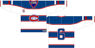
 I'm heading to Quebec for the next stop on my trek across Canada today. The only team there today is the Montreal Canadiens. So let's start with them. I was emailed a concept design that is rather unique.
Interesting choice with the striping. What do you Habs fans think? Do you like the bars across the chest?
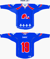
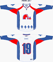
I got a really cool piece sent to me recently, as well, for a team that now exists under a new moniker in a new city. This designer contemplates what the Quebec Nordiques might look like in the "new NHL."
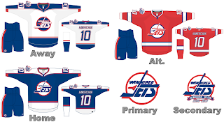
Gets you all nostalgic, doesn't it? Speaking of nostalgic, let's "jet" on over to Manitoba and muse on what the Winnipeg Jets might hve looked like in Rbk EDGE jerseys, had they not moved to Phoenix.
Talk about a trip down memory lane. Feel free to leave a comment about any of these designs. I'm sure their creators are interested in your responses.
Still to come today: A preview of the new uniforms of the Toronto Maple Leafs.


Reader Comments (8)
The Habs shirt looks like the All-Star shirt they used the season before the lock-out!
I prefer the one you showed us a couple weeks ago... it looked like France soccer shirt!
Speaking of countries...
the newest Habs design appears to have a Russian flag on the sleeve..I know it's not intentional but it's a little ironic considering that a team named the Canadiens has the flag of our fiercest international rival on their jersey.
As a Habs fan, the only way is traditional. Stick with what they have now. Any change will be disaster.
Nordiques - if they were still around, they would have that husky logo that was proposed for the 96 season (if they didnt move to Denver of course).
Jets - i like the "reinaugural season" patch. Clever touch.
I thin the Habs could easily pull off wearing the same style of jerseys their affiliate Hamilton wore last year. http://www.soshop.ca/view.php?view=category&catid=6&subgroup=42&subcat=106
obviously with the Habs logo and not the Bulldog.
you cant forget the "goals for kids" shoulder patch on the jets jersey!!!
love the site!
Love the Jets.
The Nordiques are nice.
The Color of the number on the back of the uniform being blue looks terrible. Red or white would be better.
yo man try to do one for LAS VEGAS seen as they might get a team!
BTW PEOPLE check out my NHL rumor site:
www.thenhlrumorspot.blogspot.com
If the Canadiens organization use anything but their traditional red jersey and one of the two white jerseys (remember, the throwback was the original home jersey), then their true fans will turn away. I know a lot of Montrealers who will turn away from going to games when the team can't even win three in a row, so image if the team ditches their uniform.
As for the "globe" shoulder patch -that was a crest design they wore in 1925 to snub the rest of the league as "world" champions of the Stanley Cup from the previous season. I don't mind the look of the globe logo - very retro looking - but I think they should return the small 'C' as the shoulder patch, worn on one sleeve only.