Lightning Unveil New Logos, Uniforms!
 Saturday · Aug 25 · 2007 | 9:48 AM PDT
  65 Comments
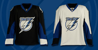
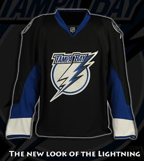
 The Tampa Bay Lightning officially unveiled their new logos and uniforms today outside the St. Pete Times Forum at IceFest. Take your first look now!
My first impressions: I love them! Well done, my Bolts! I'm buying one the very second they're available. I'm so thrilled with the logos and jerseys. The black one is amazing. Looking at it, I'm so glad they didn't go with blue.
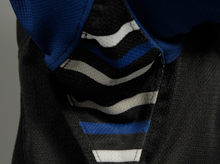
The greatest thing, in my opinion, is the continuation of the stripes found under the arms. See what I mean below.
Those stripes have been one of the major elements of the Lightning's jerseys since their inception in 1992. The way I understand it, Phil Esposito — who designed the original uniforms and logos — said the stripes would serve as a nod to fans for years to come and that every time a player raised his arms to celebrate a goal, we'd be reminded. It culminated with a Stanley Cup championship in 2004 and in every photo of a player raising the Cup, you see those unique stripes.
What do you guys think of that? As a lifelong Bolts fan, I'm thrilled over that feature being kept on these new jerseys.
As far as the logo, I'm all right with it. I'd rather the "TAMPA BAY" be gone entirely, but it's a big upgrade from what we used to have. Overall, I'm happy with what I've seen here.
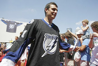
UPDATE (1:59 PM): The St. Peterburg Times Bolts blog Lightning Strikes had this picture of Filip Kuba in the new jersey — our first photo of a player actually wearing it.
UPDATE (2:55 PM): Forgive me if I'm going overboard with Lightning stuff today, but we've all got our favorite teams right? Today is our day. I've come across a few more pictures worth posting here.
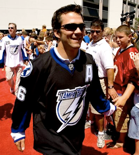
Above, you see Marty St. Louis walking down a red carpet amongst a sea of excited Lightning fans. Below is a group of people including Lightning players Chris Gratton, Filip Kuba, Johan Holmqvist, and St. Louis (in black). I haven't figured out who the rest of them are — except for the guy on the right in the white jersey. That's local news anchor Brendan McLaughlin I believe. He's wearing 28 because that's the channel number of his TV station — the one where I used to work, as a matter of fact.
As a side note, the Lightning's official site mentioned that the road jerseys would feature the number on the front shoulder. These photos indicate that as well. For more photos, check out my official Rbk EDGE photo gallery.




Reader Comments (65)
when they come out in tuxedos or ballerina clothes, then we have a problem
XD
the smallest things make me laugh
but on topic these jerseys are really nice big improvment over what the formerly had
i'm tired of people hating the new RBK jerseys they really aren't that bad and i'm not ashamed to admit, I LUV the Islanders jerseys
this hating RBK jerseys is as old as the reruns of clone high they play (they need to make new ones)
Chris, this is what you've been waiting for! It's great that you're happy with the logo and jersey design for your team. That's all that matters really.
I dig the white white ones especially! They're sharp and intimidating. A very balanced design.
However I am not sold on the black ones. The white cuffs make them look unbalance. I don't totally hate them or the idea of the white sleeves, but they seem a bit unfinished. Like a work in progress. Something as simple as a white collar might make the difference.
The stripes under the arms are a very nice touch! It's great for a relatively young team like Tampa to have a great tradition like that!
Thanks for the pics Chris. Enjoy your new jersey.
I highly dislike the font on the lettering and numbers. I was really upset when they changed it from their old look. I was not expecting them to keep that at all
They are definantly an upgrade. I was never a big fan of the old lightning jerseys. The striping was big at the time of their unveiling but it quickly faded after.
This is only the second RBK jersey I've liked so far. The Bruins looks very good too.
Now...if only the Leafs would pay attention that would be great.
IMHO the jerseys look great, especially the black ones. It's something different from what other teams unveiled with especially the blue jackets, panthers and preds jerseys looking quite similar. And they look quite modern, which I think is good. Nothing against tradition in hockey, bot I didn't like the old Lightning jerseys at all, so that's a big plus. The logo is an improvement too, but still... c'mon, they could've done much more.
why do they only have the numbers on the front of the white jerseys??
hey there are numbers in the front of the white away jerseys
probably close too, if not the new ugliest jerseys in the entire league. that logo is simply grotesque.
these nhl teams have such an opportunity to create and sell a marketable new look and tampa thus far has failed. shocking.
I'm underwhelmed.
Not a fan at all of no striping on the bottom of the torsos of some of these jerseys. It really, really, doesn't work for me.
Someone mentioned Roller Hockey International up above.. I have to agree. That's what a lot of these new looks remind me of as well.
I think they are very sharp looking. That blue on black home jersey gives off a great ambiance. The re-touched logo looks much sharper then the original one.
Saying that I still think the secondary logo is much much nicer then the primary, and I really wished that would be on the front, while the "Tampa Bay lightning bolt" logo was on the shoulders as the secondary.
Also hate the numbers on the front of the whites. I hate all numbers on the front of the jerseys. This is a trend, that I'm NOT a fan of. (Way to go Buffalo!) It makes the front of the jersey look too cluttered.
Actually, I like the black one personally. It's the white one that I'm not really sold on.
The white shoulders on the onld black jerseys I liked as it kind of reminded me of the old Capitals jerseys of the 70's and 80's, before they went to the eagle.
I'm also glad that they kept the underarm striping, that was one of my favorite features of the Lightning jersey as it was very original. Overall though, nice new look.
I like the black - it's very, very slick.
I have to admit, I may think about getting one even though I'm not a Lightning fan. (Besides, ya'll finally got Doug MacLean out of Columbus, so I owe you a favor or two. :D)
Not sure I'm sold on the away jerseys with the numbers on the breast, but we'll see how it looks in action.
Chris,
In an earlier post about the Canadian teams (I am a proud citizen and resident of Canada), you mention wanting to live in Canada because of the tradition of hockey in this country. Another poster had a great description of autumn and how awesome it is to come home after a cold day and sit in front of the fire and be warm and cozy while watching Hockey Night in Canada. There is tradition in Hockey.
I, and I think a lot of other big time Canadian hockey fans, think RBK is "ruining" hockey because of the blatant disrespect and ignorance of two things: tradition and retro appeal.
The only thing that RBK has considered is the tie up necks. Boston is the only team so far with a good jersey design. Actually, it's spectacular. Even the Red Wings and Rangers could have done something more. I was hoping the rangers would go back to a white collar with white neck laces and change the "rangers" font to the way it was in the 30's.
I am hoping the Canadiens add back the white collar to their reds and add the red knee caps to their white socks, but a Canadian can only dream, right?
All the jerseys released so far have sucked. Including this new Tampa one. These are ridiculous. The design on the forearms will be hidden by the gloves.
Hockey is about to look radically different with skinner jerseys, which is kind of cool, it means we'll be able to see the players move better...that's about it.
As for the Tampa logo - it's terrible. Just get rid of the word "TAMPA" and it's much better already.
Ugh... no trim on bottom and needless colors under the arm pits. This is the NHL not the NFL! So far Boston's jersey is the only one that gets a thumbs up from me... and that's not easy to say as a Habs fan.
I totally agree with oilfaninvan. I get that the new jerseys are lighter. And that's great. I held one up in the store and I really could feel the difference over the traditional jersey. But why do we need new designs?? The strips on the sleeves don't cause drag. They don't weigh more. It's senseless tinkering I say. The Bruins right now have the best uniform in hockey. Hands down. And it will remain so until my mind is set to rest by the Habs unveiling a jersey with no changes.
Man... I should be the commissioner.
I'm kind of indifferent on these. I dislike the lack of white shoulders on the black jersey. That's what set the lightning's jersey apart, those huge white shoulders, it made them look pretty intimidating. The old logo was better too.
I also think that there's too much blue. It should be like the ducks, how there's only a puny stripe of orange.
I loved how the lightning were just black and white. With a few blue lines.
Now... I don't know what to think.
Jersey's seem alright. I'm definitely NOT a fan of the number on the front of the jerseys.
Their new logo is an improvement, but it's still one of the weakest logo's in the league. Get the 'Tampqa Bay' lettering the heck off the logo! They think people won't know where they're from without it?
don't like the numbers on the front (away jersey) and agree with others that the logo would be better without the words Tampa Bay
everybody hates these jerseys but there is nothing we could do about it so just relax unless we all petition
My opinion on these jerseys? They're not terrible. The logo is bad, but the design of the jersey is ok.
My opinion on the RBK jerseys?
PULEEZE!! What need is there for a "form fitting jersey" why do the players have to wear sweaters that are THAT tight. It worked for years and years, and years. If you think it's going to make these guys THAT much faster, you're nuts!! This is a slap in the face of hockey tradition!!
With respect to the "Reebok is ruining hockey" vs. "the RBK jerseys are awesome!" debate:
As a relative newcomer to hockey (but a huge fan of sports in general throughout my life), I like the new RBK jerseys. I understand tradition, and I love the new Boston jersey; but it's not as if Reebok has FORCED each team to follow a certain template. Those teams that have chosen to go a bit old-school (Boston and Detroit come immediately to mind, and I'm sure there will be others) have been able to do so without a problem. The colors/design/style are part of the brand, but in the end, the game is about...well, the game being played on ice. If the players like this new style of jersey (which, apparently, they do), then I'm all for them. I'd rather know that the team I follow is playing in a jersey they like, rather than playing in a jersey that looks good, but is inferior in peformance.
Now, with respect to the Tampa Bay jerseys:
I like them! The road whites do create an optical illusion of a smaller logo...but that is because of the white border around the logo (very visible on the home blacks, invisible in the pictures of the whites.) The logo is okay; I think they could have done better, but they could have done MUCH worse! I don't mine the sleeve patterns; they didn't immediately appeal to me, but the more I look at them, the more I like them.
Overall, I'd like to see the full uniform on ice. Something tells me that the jersey alone isn't quite enough to get the full impact.
The underarm stripes: I had not heard that anywhere before...a VERY cool addition to a uniform! There's some interesting local flavor in local Colorado uniforms, but something specifically designated for fans and propagated throughout the uniform history...I like it!
Tolerable. Could've been a lot worse, but they're not horrible like the Panthers or the Islanders, which puts the Bolts pretty high up the list of teams that have redesigned their jerseys for next year. Boston's done the best, and I'm digging the Caps' return to red, white, and blue. I'll take the boring Bolts jerseys any day over the more cringe-worthy offerings that have shown up.
to be honest I'm not really that impressed with the logo. It looks like it came out of a comic book or cheesy movie, especially with the lettering. True, there's not much you can do with a bolt of lighting, but at least the old logo didn't look so hollywoody...
I actually didn't know about the under-arm stripes. (I was probably too bummed about the first Canadian team in the finals in 11 years not winning that I didn't notice.) That definitely earns this jersey bonus points. The way these jerseys are going, I'm pleasantly surprised that they kept that feature.
The first thing that pops into my head whenever I see a Tampa Bay Lightning jersey:
SHAZAM!
Um is it just me or do the Bolts and the Sens have the same jersey design?... look at the sleaves on both the jerseys, i think its the same. So i dont understand why the lighning jersey is more liked than the sens jersey... okay maybe the colours lol