Lightning Unveil New Logos, Uniforms!
 Saturday · Aug 25 · 2007 | 9:48 AM PDT
  65 Comments
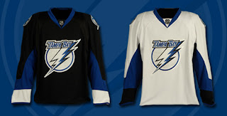
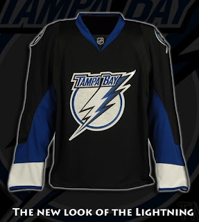
 The Tampa Bay Lightning officially unveiled their new logos and uniforms today outside the St. Pete Times Forum at IceFest. Take your first look now!
My first impressions: I love them! Well done, my Bolts! I'm buying one the very second they're available. I'm so thrilled with the logos and jerseys. The black one is amazing. Looking at it, I'm so glad they didn't go with blue.
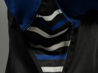
The greatest thing, in my opinion, is the continuation of the stripes found under the arms. See what I mean below.
Those stripes have been one of the major elements of the Lightning's jerseys since their inception in 1992. The way I understand it, Phil Esposito — who designed the original uniforms and logos — said the stripes would serve as a nod to fans for years to come and that every time a player raised his arms to celebrate a goal, we'd be reminded. It culminated with a Stanley Cup championship in 2004 and in every photo of a player raising the Cup, you see those unique stripes.
What do you guys think of that? As a lifelong Bolts fan, I'm thrilled over that feature being kept on these new jerseys.
As far as the logo, I'm all right with it. I'd rather the "TAMPA BAY" be gone entirely, but it's a big upgrade from what we used to have. Overall, I'm happy with what I've seen here.
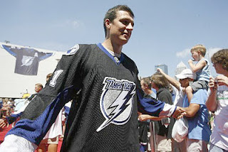
UPDATE (1:59 PM): The St. Peterburg Times Bolts blog Lightning Strikes had this picture of Filip Kuba in the new jersey — our first photo of a player actually wearing it.
UPDATE (2:55 PM): Forgive me if I'm going overboard with Lightning stuff today, but we've all got our favorite teams right? Today is our day. I've come across a few more pictures worth posting here.
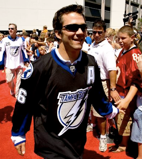
Above, you see Marty St. Louis walking down a red carpet amongst a sea of excited Lightning fans. Below is a group of people including Lightning players Chris Gratton, Filip Kuba, Johan Holmqvist, and St. Louis (in black). I haven't figured out who the rest of them are — except for the guy on the right in the white jersey. That's local news anchor Brendan McLaughlin I believe. He's wearing 28 because that's the channel number of his TV station — the one where I used to work, as a matter of fact.
As a side note, the Lightning's official site mentioned that the road jerseys would feature the number on the front shoulder. These photos indicate that as well. For more photos, check out my official Rbk EDGE photo gallery.




Reader Comments (65)
is it just me, or do they look really short?
I dont think these are all that flattering..but then again they can't do much with the lightning logo anyways...
Hmmmm First impression is good. The black seems more classic than the white. The new logo seems ti more fit on the black than the white.
The modernized logo is sharp, but a complete overhaul have would be nice.
The shoulder patch seem not necessary. Maybe an optical illusion, but the logo on the white one seem smaller.
I wonder what the numbers and lettering will look.
I thinks that's an upgrade for your team Chris.
Definitely an upgrade. Personally I always hated those white shoulders on the old jerseys. The only thing is that without "Lightning" on the bottom the logo seems a little empty on the lower end, but I'm sure that will just take some getting used to and won't even be an issue.
They really should have gotten rid of the circle behind the bolt. That would be sweet. Thank god they got rid of the UGLY shoulders they had before.
Nice. Looks like the Senators and Penguins style.
I read on the T-Bay website that thier putting number on the front like Buffalo and the Islanders.
Hi, habscaps9, my name is Chris and I run this blog. I just wanted to let you know why I've been deleting some of your comments.
I mean no offense but often they're frivolous and off-topic for the most part. Not to mention, many of them serve as only advertising for your blog. If you want to exchange links, please email me directly so we can discuss.
Once again, thanks for reading my blog and please cease the frivolous commenting. It's a little annoying. If what you have to say is related to the topic of the post, I'd be more than happy to leave it along. Thank you for your time!
To everyone else: These uniforms are so great! I'm excited. Sorry some of you disagree, but I can't hear you through all my happiness. Thanks for all the comments!
I wasn't expecting much in the form of classy uniforms from the Lightning, so no disappointment here. Too bad the roller hockey international league isn't around anymore. These would fit right in.
there ok not more then that.
but compared to the sens everything looks better
but by the way great job on the site chris im hooked
i don't like the white cuffs at all on the black jersey. it makes it look like one of those nerdy dress shirts that is one color but still has a white collar and cuffs like the shirts bloomberg wears in "office space." I like the white one alright though.
You mean "Lundberg" from Office Space?
How do you comment on a jersey and logo that went from incredibly bad to incredibly worse. Very weak and ugly. Doesn't look like they took the time to really dig in and come up with something more modernized and less cartoony. By far the worst jersey I've seen; even worse than Minnesota, Nashville, and Florida.
These are on the level with the Isles jerseys in the hideious collection. At least the away jersey saves it some what.
As far as comparisons with other new reebok uni's are concerned , these are not too bad, it could of been a lot worse! but compared to the Lightning's prior jersey it is no improvment! The Logo is ok.I don't like the accents. I like the other commet about the roller hockey. These would fit right in. While I know some of you are excited about all these new jersey's. Some of us are in complete agony! watching all of these futuristic jersey's roll out, I guess it is just an indication that the NHL as I and others have known is GONE!
Thanks Bettman, you SOB!
Thanks to Chris! for the work on the site.You seem to be one step ahead of other sites.
They're an improvement, but I'm not thrilled with them.
The lack of horizontal striping in the RBK Edge designs is really starting to get to me.
can everyone shut the ever-loving hell up about how rbk is ruining hockey? when they come out in tuxedos or ballerina clothes, then we have a problem.
and that old tampa uniform was the most pathetic attempt at a jersey.
this is much, much better. the only really hideous one i've seen is the isles. just too much. the others have been sharp
why so much agony over a design that will look fine on TV and cause players to not carry around so much excess weight? and it gives teams like the panthers and tampa, who had terrible logos, to jazz them up a bit. RBK didn't ruin anything.
i don't get it. and no, i'm not an employee.
Have fun today Chris, it's a great day for you. Your team just get fresh new look, and it's not all the day's like that.
These jersey's look great and classic feel. Gone are the white shoulders! Just that should have been enough.
Enjoy that great day!
Not bad overall, nothing to write home about though. An improvement but I can't help but feel some of these jerseys are pretty plain without a stripe along the bottom. The logo is a bit better but still average. I kinda don't like the away jersey, seems like the colors just don't fit together right with white as the main one. Oh well, a slight improvement.
I wish they would have ditched the "Tampa Bay" over the Bolt. It would look awesome with out it, almost super hero like. But the word mark just looks tacked on, not as bad as the different font "Lightning" they used to have, but still not needed.
They're soooo much better than what they used to be! The logo is a big improvement too! Good on the Bolts!
Hate the WORDS in the logo. The Tampa Bay font is ugly and the words aren't needed...
Aside from that, I like them -- clean & simple. I'm glad to be rid of teh contrasting shoulders (which also made it tough to see what was going on in a scrum because both teams would have white shoulders)
Looking fwd to seeing the #s (including the front #s on the road jersey)
To everyone complaining about Reebok, Bettman, and the lack of horizontal stripes: It's the TEAM that designs the jerseys. Somehow, NYR, BOS, DET & others have 'found a way' to use horizontal stripes. If you miss them, blame the team for designing them that way, not the Commish or the new RBK Edge uniforms.
Anything is an improvement over the old Lightning jerseys. If any jersey looked like it belonged in a roller hockey league, it'd be that old design.
Between the cheesy, cursive font spelling out Tampa Bay and the unnecessary band of color on the shoulders those old sweaters were pretty atrocious.
The home jersey may leave something to be desired but the away duds looks pretty sharp. Maybe using the new secondary logo we saw on the site a few days ago would've been the best option, but I'd say these get a passing grade.
I got video of the reveal, right next to the stage, check it out at http://youtube.com/watch?v=5GlIfGupA2Y
Wow, the lamest look in sports is still pretty, well, pretty lame. The logo is lousy and only a slight upgrade from the previous kindergartener drawn dreck. The jersey itself is okay - not too flashy which also means not too stupid. I actually like the jerseys well enough. It's a shame they're ruined by that awful logo.
Someone mention it's better than teams playing in tuxedos.... wasn't that exactly what Cooperalls looked like? Not everything from the past is good.