Lightning Unveil New Logos, Uniforms!
 Saturday · Aug 25 · 2007 | 9:48 AM PDT
  65 Comments
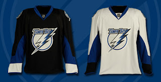
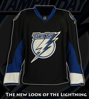
 The Tampa Bay Lightning officially unveiled their new logos and uniforms today outside the St. Pete Times Forum at IceFest. Take your first look now!
My first impressions: I love them! Well done, my Bolts! I'm buying one the very second they're available. I'm so thrilled with the logos and jerseys. The black one is amazing. Looking at it, I'm so glad they didn't go with blue.
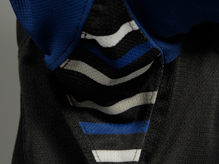
The greatest thing, in my opinion, is the continuation of the stripes found under the arms. See what I mean below.
Those stripes have been one of the major elements of the Lightning's jerseys since their inception in 1992. The way I understand it, Phil Esposito — who designed the original uniforms and logos — said the stripes would serve as a nod to fans for years to come and that every time a player raised his arms to celebrate a goal, we'd be reminded. It culminated with a Stanley Cup championship in 2004 and in every photo of a player raising the Cup, you see those unique stripes.
What do you guys think of that? As a lifelong Bolts fan, I'm thrilled over that feature being kept on these new jerseys.
As far as the logo, I'm all right with it. I'd rather the "TAMPA BAY" be gone entirely, but it's a big upgrade from what we used to have. Overall, I'm happy with what I've seen here.
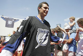
UPDATE (1:59 PM): The St. Peterburg Times Bolts blog Lightning Strikes had this picture of Filip Kuba in the new jersey — our first photo of a player actually wearing it.
UPDATE (2:55 PM): Forgive me if I'm going overboard with Lightning stuff today, but we've all got our favorite teams right? Today is our day. I've come across a few more pictures worth posting here.
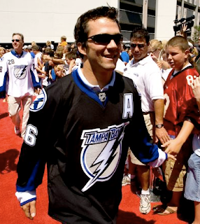
Above, you see Marty St. Louis walking down a red carpet amongst a sea of excited Lightning fans. Below is a group of people including Lightning players Chris Gratton, Filip Kuba, Johan Holmqvist, and St. Louis (in black). I haven't figured out who the rest of them are — except for the guy on the right in the white jersey. That's local news anchor Brendan McLaughlin I believe. He's wearing 28 because that's the channel number of his TV station — the one where I used to work, as a matter of fact.
As a side note, the Lightning's official site mentioned that the road jerseys would feature the number on the front shoulder. These photos indicate that as well. For more photos, check out my official Rbk EDGE photo gallery.




Reader Comments (65)
Look closer. The sleeves are quite different.
yeah your right Chris.. sorry about that i didnt notice the difference at first.. my bad
i sorta think these jerseys are a little to plain
as im pretty sure my house leauge jerseys from when i was younger were more classy and well done
and as for the stripes under the arms thats sorta neat, and for the guy who was to bummed to notice these because the only canadian team lost in the finals butttt wheere have you been the last 4 seasons, ottawa was in the final, edmonton, cowgary so you should pay slightly more attention to the game
I think it's a slight upgrade, however I was really hoping to see a blue home jersey. The black jersey is very plain and dosen't really stand out. Hopefully once third jerseys are re-introduced, they will bring one in. I would totally buy this jersey if it was blue, and I'm a Thrashers fan!
Chris, I have to say you,re well ahead of the other sites. Besides, as a Montreal Canadiens fan, I like the classic look. The logo might not be as classic as it should, the jerseys still are, in my own opinion, the best to this day (if you don't consider Detroit and Boston as new, since the designs are still the same.)
I have to agree with many of the previous comments.
Looks more like a Roller Hockey jersey.
Not impressed with the logo, looks "compressed".
The contrasting stripe at the wrist is a waste since it will be hidden by the gloves.
And the lack of a contrasting horizontal stripe across the bottom of the jersey makes it look plain, like a practice jersey.
I can't emphasize this last point enough. A LOT of teams have eliminated this feature and it really makes the jerseys look weak.
To be honest, I kinda liked the old jerseys. (Not the alternate from '97, though, that just sucked altogehter.) The old jerseys were of a relatively simple, traditional styling. And, call me crazy, but I liked the old logo a bit, too.
I do think it's nice to see that they carried over the stripes on the gussets. The styling, though, seems a little on the plain side. And the "Tampa Bay" in the revised logo - that's an eyesore, they should just get rid of it altogether.
as a fellow DIEHARD Tampa Bay Lightning fan, I must say I'm not completely disappointed with this new uniform. I actually like it, and had the privilage of attending the unveiling party at the St. Pete Times Forum, even snagged Dave Andreychuck's autograph. :)
But I have to say, the one thing I dont like about this whole design is the main logo on the front... it just reminds me of the power rangers... and its sad to me really, I was just beside myself in anticipation of this new design. *sigh*
chris,
i figured u would be at the unveiling party? u didnt miss much but rediculous heat. and how i boo'd gratton. i cant believe we took him back... but back on topic:
i dont like the jerseys. they look like t-shirts. or those t-shirt jerseys they sell. and the tails with no striping at the bottom doesnt help sell it.
i like the new look of the logo. its updated. but the jersey is really lacking in the effort or imagination department.
just looking at it as how its worn in the pictures is ok. but imagine that black jersey... with no color at the bottom, moving into the black pants. then into the socks that will probably have black in them. its goin to look like their skating for practice or in warm ups at home games.
as for others who say its not "classic" or "roller hockey like" well tampa didnt show up until the 90s. how can u be classic when u have only been around 15 years? oh and btw, thats the same few years when the RHI came out. so yes.. they were current in styling. as were the lightning. so thats a no brainer.
Best armpits in the league.
You must be very proud, Chris!
I am proud of our armpits, thank you!
Hey Chris,
I would like your opinion as a lifelong 'Bolts fan on the alternate that they used several years ago. The blue one with the storm theme that had the waves along the bottom.
Thanks,
TJSharky (waiting nervously for the Sharks jersey)
I would like your opinion as a lifelong 'Bolts fan on the alternate that they used several years ago. The blue one with the storm theme that had the waves along the bottom.
Thanks,
TJSharky (waiting nervously for the Sharks jersey)
Believe it or not, I am one of the few fans that really liked that jersey. I wish I had one. I know it was cheesy but it had all the elements of a storm — very Florida-like — and the lightning bolts down the sleeves were really cool. At least I thought so.
I also liked the numbering a lot — the jagged edges making it look like it was being electrocuted. I don't know, you can say I have bad taste but we all just like what we like, right? I may be biased, though, because of my unconditional love for my team.
In the same vein, I was hoping for a revised secondary logo that featured more elements of a storm. I know we're the Lightning. But with lightning, you get a thunderstorm.
Thanks for asking!
I probably should have said that I loved them! As a self decribed weather geek I loved the concept.
The number on the front shoulder/upper chest on the road whites seems pretty redundant to me...