Blues Uniform Concepts
 Tuesday · Aug 28 · 2007 | 2:17 PM PDT
  3 Comments
 There's so many teams to choose from. I'm thinking I'll go with the St. Louis Blues next. I've been emailed some great concept art for their new Rbk EDGE uniforms. You should see them.
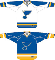
For those who fear change, this might be a good option. It's got the same colors and overal jersey design, save for the small stripes on the sides. Not much to complain about. But then by the same token, it's rather unremarkable.
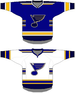
 If it's the retro look that suits you, perhaps this is the way to go. Simple blue and gold with the horizontal stripes we all know and love.
Again, plain and unremarkable but not necessarily bad. The Bruins went with plain and easily have one of the best Rbk EDGE jerseys at this point — and that's unlikely to change if you ask me.
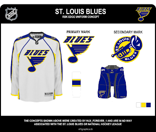
Now, if something new-fangled is what you seek, peer below at final concept I have to offer you.
I wouldn't necessarily like to see the Blues undergo a logo change, but if they had to, I'd be all for the trumpet logo. I think it's great! But then I'm a Lightning fan, not a Blues fan. However, I don't feel like the musical note logo is improved by the text above it. I'm also a big fan of the two-toned blue of the uniforms. I hope they don't lose that in the new designs.
Any thoughts? Don't forget, any concepts I post here on the blog will also go straight into the Concepts Gallery along with many other concepts I haven't posted. I add several new designs every day so keep an eye on that.
One more post planned for today then I'm calling it a night.


Reader Comments (3)
Wow, firSt one to post huh? No one posted Anything yet? Well the jersey on top isn't VEry unique with a subtle referenCe to the oLd Red, YellOw aNd OrangE jerseys of the Canucks and the Penguins 92-2000 jerseys. But I wouldn't want tHe Blues wearInG anytHing like that. The one below is a little better but the blue is way to pale. And that brings me to the last one. I love that jersey. It has a nice simple design nothing but blue sleeves with a little bit of white. And the "Blues" above the logo looks great. Two thumbs up to whoever made that.
i'm the guy that designed that first one, and i was wondering where you saw the likenesses to those canucks and penguins jerseys because i don't see it. i actually just pulled from the blues late 70's/early 80's look as well as our most recent jerseys, then added the stripes on the sides. thanks for the input!
it's because of the way those horizontal stripes in the middle almost make it to the logo where the Canucks and Penguins it goes through the logo. I couldn't find a Canucks one but I found this link.
http://i111.photobucket.com/albums/n152/JetFlyinKyle/PIT_emaz7ibs36tg6f7ay2se.gif