Something To Circle In
 Tuesday · Aug 28 · 2007 | 1:24 PM PDT
  10 Comments
 My headlines seem to be getting more and more obscure. I guess there's only so many times you can say "New Concept Art For [insert team name here]" before going out of your mind. Whatever. I'll roll with it.
Anyway, the team to insert now is the San Jose Sharks. They unveiled their new logo just over a month ago but left us wondering what the jerseys would look like. Just one more thing to ponder this off-season. As expected, I have concept art to share.
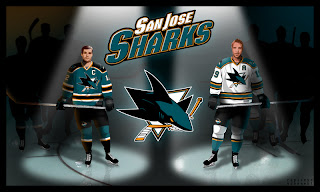
First up is my personal favorite. If the Sharks wore something like this, they'd be among the sharpest-looking teams in the new Rbk EDGE jerseys. Boston's got some game so don't get too worked up. But these I like. The horizontal striping and traditional look totally clashes with the new-fangled, curvy-line logo but I don't know. I still like it.
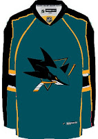
This uniform set is based in large part off of the Panthers' new sweaters. I like them, but not as much as the ones above. And I really think those elbow stripes need to go all the way around the sleeve to work right. Still, not too shabby.
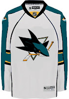
Nor is this. But I think this design takes most of its cues from what the Sharks have been wearing the last few years. I really did like the silver, but the orange works too. This design needs a black accent though, I think. It's very, very teal. Very teal. With some teal on it.
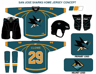
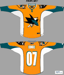
But before you go thinking that's all I have to offer, Sharks fans, wait until you see this. The addition of orange to the primary team colors has met a somewhat mixed response. Though to be honest, I have heard anyone love it so much that they'd want to see a jersey like this.
My eyes, my eyes! What a work of art. I'll tell you what makes me like it a little bit — the big shield logo on the shoulders. First of all, I like big shoulder logos. Second of all, I like that shield logo the Sharks came up with. So it's got a lot going for it in my opinion. Unfortunately, too much orange, not enough teal might well spell disaster.
Now I'm done. Take me to task with your comments.
For those who still haven't worked it out: Sharks circle their prey in the water. Get it? Something to circle in? No? Okay. It was a long shot anyway.



Reader Comments (10)
Sheesh. I must be out of the loop. I had NO idea that Ken was the captain of the Sharks.
Barbie must be so proud!
;-)
The jerseys in the illustration card are one of the best Sharks concepts I've seen to date. If the Sharks end up with those, I agree that they'll be among the best in the NHL that have new logos and jerseys.
I don't care for the next two concepts in comparison to the first one you posted, Chris. The one with the orange? Creative, yes. But I don't feel it belongs with the Sharks. Orange belongs with the Flyers and I hope the Ducks DON'T have a orange alternate jersey either.
yes orange belongs to the flyers and only the flyers
the top one looks kinda like the Manitoba Moose jerseys...
As a Sharks season ticket holder, I wouldn't mind those traditional-looking unis. Better than some of the rather "interesting" ones that some of the other teams have elected to choose.
But you guys are right . . . the orange belongs with the Flyers.
maybe, the uniforms would be better if the white was replaced by teal? then have the orange still in the middle?
My favorite part of the Marleau/Thornton picture is Marleau is right handed in it, where in real life, he shoots left.
Oh my gosh, the orange. I didn't like it in the first place and if they ever had a full orange jersey, I'd get a headache from watching little oompa loompas streak across the ice.
The shield is slightly growing on me, but I still say gray was way better the orange.
I really dislike the orange, and it's been getting more annoying as I've gotten used to the new logo. It's just so out of place. I can only hope it remains just an accent on the logos and patches.
What I really don't understand is how many of the new jersey and logo designs continue to make the same mistakes as the last round of redesigns. They're busy, look cartoony, and have poor design proportions. Given how fans are increasingly sporting old-school jerseys, which are simple and understated, why aren't teams doing more to emulate them?
Here's hoping the Canucks go back to the rink and stick C logo.
they do look exactly like the older moose jerseys.