Concepts For Blueshirts
 Tuesday · Aug 28 · 2007 | 12:41 PM PDT
  6 Comments
 One team I haven't posted a lot of jersey concept designs for is the New York Rangers. I guess there just aren't a lot out there. Regardless, I have some today.
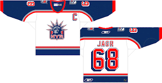
Rangers fans probably aren't loving the Flyers template in this design. I love the use of the Lady Liberty logo as a primary for the Rangers, but I think a lot of teams are so afraid of losing traditionalists with the introduction of the new Rbk EDGE jerseys, that they won't even attempt something with a little "edge" — with all the pun I could possibly intend. I think the response to that fear is to make something that looks traditional on a "non-traditional" sweater.
Well what I have to say to that is this: If your support for your team hangs in the balance opposite the uniform or colors they choose to wear, how can you possibly consider yourself to be a real hockey fan or a sports fan of any variety? It's about the game, remember? The puck gliding across the ice. The teeth-breaking body checks. The one-timers. The hat tricks. The amazing saves that precipitate no possible response other than sheer awe.
I know those thoughts have slipped through the cracks on this site because we're all so delirious from the lack of hockey this off-season — fretting the changes being imposed by a controversial commissioner — but don't forget that this site is all for fun. When I read comments here about how self-proclaimed "fans" suggest cheering on another team if their team's new jerseys suck, it just saddens me.
Anyway, look at that. I just went off on a whole thing there. Moving on. More Rangers stuff to look at!
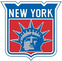
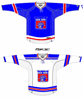
 That design is actually in the Rbk EDGE cut. And the logo used can be seen at a larger size here to the left.
It's pretty cool but I'm partial to the NYR version. It's got a better color scheme and overall feel. This one feels like it's trying to be too retro while attempting something new.
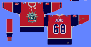
Check out this next design.
While it may be considered blasphemy to put the Rangers in anything but blue, it's certainly an interesting concept. The first thing you might notice is its striking similarity to the Minnesota Wild's third jersey from last year.
So what do you guys think? Rangers fans, are your boys due for a change or should some things always stay the same?


Reader Comments (6)
I like that red one. It took me a while to notice it was close to the Wild's Alt. I think the blue gives it a different ring to it.
As someone that has followed my hometown team for the past 24 years, I can say that I would welcome a change in the Rangers' uniform design in having the "Lady Liberty" logo as the primary crest logo. The long-time logo doesn't seem to look as good on the front of a Rangers jersey as the current alternate "Lady Liberty" logo.
I had a vision last night of the exact alternate Rangers jerseys we've all seen using the new RBK Edge template. No design changes at all. One as a road white and the other as the home navy blue. The current classic royal blue home jersey I'd like to keep as an alternate. If there was to be a second alternate Rangers jersey, I'd like to see a red version with "Lady Liberty" logo with the lower portion of the sleeves in blue instead of red as it is on the navy blue one. The numbers and letters would be navy blue with white and silver outlining so it's easy enough to read on TV.
I'm not a fan of the combined classic logo with the Lady Liberty face inside it. Doesn't work for me. That first jersey concept is nice, but I'm not diggin' the Flyers' shoulder design. The red jersey is good, but I agree, too much like the Minnesota Wild alternate jersey design template.
I love that red jerSey but it cAn neVEr be used by a team that has the niCkname of "bLushirts". It'd be like the Blues wearing yellOw, or the Red WiNgs wEaring blue. It just isn't rigHt. I lIke that jersey at the top too, I like the font "JaGr" is in it's a nice sHade of blue and I like it when the arms are a totally different colour from the rest of the jersey.
As a life long rangers fan I have to say these suck period. I love the lady liberty crest (Another great thing by Mike Richter), if that was our main logo we would have one of the nicest in the league. I personally would like to see our regular blue home jersey modified with a navy blue jersey with our regular striping only instead of white have silver. Then have the red rangers outlined in silver.
The Rangers will not change their primary design, I don't think that's ever going away. I don't want to see it go away either, I'm all into the history fo the game and don't want to see the history go away. I'm actually not a fan of the alternates they had last year, I like the first design you have there. The red jersey not so much, and those sheild with the liberty in it, don't like those either. The Rangers should stay with their current design, and use the liberty as an alternate, I have no problem with that.
The only change I'd like to see on the Rangers' jerseys is going back to NEW YORK down the front of the road sweaters like the 80s, and the home opener after 9/11. Anything else, I don't think you'll find a lot of interest from Rangers fans. We like the whole original 6 traditional thing.