Thrashers Fan Artwork
 Friday · Aug 3 · 2007 | 2:31 PM PDT
  14 Comments
 Get excited, Thrashers fans! You asked for it yesterday and some among you responded. I reader linked me to the following designs for a new Atlanta Thrashers jersey. Keep in mind they are only concepts and as far as I know, no change in logo is being contemplated at this time by the team.
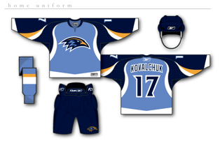
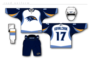
How about them apples? It's certainly a unique take on branding for the Thrash. The designer certainly took "Blueland" and ran with it. He dropped the maroon altogether. They're sharp designs but I don't think there's really anything wrong with the current uniforms.
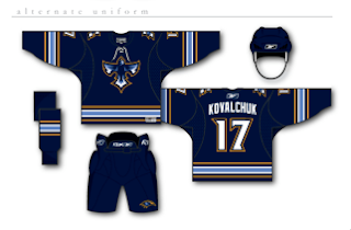
But if that wasn't enough for you, he also came up with an alternate jersey design, as seen below.
I really just think the color combination and jersey design of the current home uniforms work so much better. These are cool, but more like something I'd expect to see on the backs of a minor league club — that's certainly no offense at all. Still, Thrashers fans, we finally have something new for you to look at. What do you think? Go? No go?
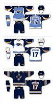 UPDATE (8/6 5:30 PM): Good news for those of you who liked these Thrasher designs. I found better quality images. You can click on the images to enlarge them. These are the same jerseys posted above.
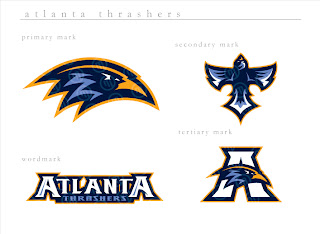
I also found graphics with a better look at the logo designs. If anyone else is seeing the Baltimore Ravens resemblance, I'm with you. It's a great set of logos, though. And any team would be lucky to wear them.
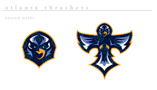
The second graphic features logos the designer created but ultimately did not use for this concept. They're all very sharp though with a very nice and clean color scheme. Thrashers fans, do you like these? Or do you prefer what your team wears right now?



Reader Comments (14)
pretty cool, i like the third jersey. Of course these will never happen but i like the ones the have now better anyways
I don't know.. minor leagues, maybe, but they're STYLIN'
I love them.
i love those jerseys and the logos and color choice.
Whoever made those has good taste. Those are sex!
I like these a lot, really nice lookin'!
Great Update, even better now
I'm really happy with our current set. If I wasn't, I'd be all for those first two -- add some of the copper and maroon, though. I like the thrasher head ("Ravens") logo, but our current shield logo is pretty awesome. Something like this could be our new third eventually? Though a third background color (not the navy -- looks look much like the Canucks' uni) like yellow or copper would be cool, too.
Thanks for this post. :)
These are definately the best looking jerseys ive ever seen in my life! Props to the designer..lets hope these are what the thrashers will unveil!
The second unused logo is a great logo. the thrashers would be privileged to be allowed to use that logo.
cool, ghettofarmboy's first concept
I'm sorry, but has the artist ever seen a freaking thrasher?! (The bird, i mean)
the current logo is a good representation...
those are BAD ASS! thanks for posting them!
I like them better than the current jerseys. I think are current jerseys are atrocious, ESPECIALLY the blueland jersey. In fact, I don't like the whole Blueland marketing campaign. I mean, come on, you have to admit it is kinda lame.
Personally, I always wanted the Thrashers to make a brown color their primary color. Something darkish, but not Hershey Bears dark. Myabe have the yellow and a darker blue as the secondaries.
Brown was one of the original colors in the bird logo (I believe it was called Thrasher Brown), and thrashers are brown birds. How many blue and red teams are out there? Brown would look great, especially if they went with a bit of a retro design. Maybe just have Atlanta diagonal across the chest. Not to mention that one of their corporate sponsors is UPS. They would go nuts for that. Come playoff time, we could have "brown outs". Anyway, that's my two cents.
They look almost exactly like the Phoenix Roadrunners jerseys of the ECHL. The third jersey is sick tho