A Bunch Of Concept Logos
 Thursday · Aug 30 · 2007 | 12:31 PM PDT
  30 Comments
 I get a lot of emails with concept jerseys but most of them make use of the team's actual logo. But sometimes people send in new ideas for logos. That's what this post is about.
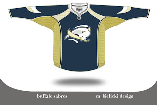
We're going to kick things off with the Buffalo Sabres. Lots of complaints have been lodged over the Sabres' new logo. There is even an entire site dedicated to the subject. Just as interesting is the now-famous design of John Slabyk. His work is nothing short of brilliant. But then someone emailed me this. And it rivals Slabyk's work on a different level.
The logo is very abstract but very unique because of it. The colors are a bit muted and I think that is actually a plus. But I feel like this is a very sharp logo. I'm curious to know what you all think of it. Please comment.
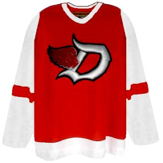
But that's not all. You probably know by now I'm not a huge fan of the Detroit Red Wings logo. I get the whole tradition/Original Six thing, but all right already. The Bruins are an original and their logos kick ass. They do. I'm not necessarily saying this is the answer for the Wings, but here's an idea.
I think the addition of black to the color scheme adds a lot to the uniform. The monochromatic red/white combo rubs me the wrong way — though I completely associate it with a scary good team. A little change never hurt anyone (except for the Islanders in the mid-'90s).
While still on the topic of the NHL's mainstays, you also probably know I'm not terribly keen on the Toronto Maple Leafs' logo. People like to say stuff like, "you don't mess with tradition" and the Leafs logo has been around forever. But the fact is, while the Leafs have been around forever, the current incarnation of logo has only existed since the 1970s. Anyway, what do you make of this?
I like the incorporation of the CN Tower, but I think this is more worthy of a secondary logo. I could see it as a shoulder patch, but not a primary for the Leafs. Thoughts?
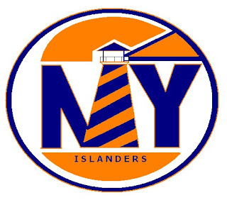
Next we have the New York Islanders. I'm always talking about how a lighthouse would serve as a good logo element for the Islanders. Here's a rather simplistic version of that idea.
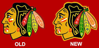
One of the most controversial notions I hold is the idea that the Chicago Blackhawks do not, in fact, have the best logo in all of professional sports. (Stop throwing rocks at me.) Here's what someone came up with to alter the Hawks' logo.
I see the differences and they make sense, but for my money, it's a lateral move. No better, no worse. Anybody else have an opinion on the logo?
One day I'd like to hear a real explanation as for why people think this logo is one of the best out there. There are too many colors in it and it's just so jumbled. A lot of you guys say simplicity rules all. That doesn't apply here. If you can educate me, leave a comment. I read them all.





Reader Comments (30)
I think all the presented concepts are only joke we to smile. Especially concept of new Vancjuver jersey with Nucks form Vancouver :)
the sabers jersey sucks, but i lik the wings and blackhawks.
That Sabres concept logo now looks like a slug eating a banana. In other words: awesome.
Don't complain about the long posts--some bloggers have long posts with no pictures!
I don't like the Wings concept, but I like the fact that no one has come up with a better one yet. I don't neccessarily object to adding some black, since I love the way black sets off red and white in general, but very very tiny amounts. Maybe just an outline of the red portions of the logo would be enough to set it off without looking too much like the Devils or Hurricanes, but it looks pretty sharp as is.
And I live in Michigan, and can confirm that there was a great deal of apprehension over the redesign of the jerseys.
It makes me sad that the Blackhawks logo looks unhappy, because a depressed logo is unfortunately very apropos for that poor fan base. I like their jersey fine, but I don't know I'd consider them the absolute best. Maybe hockey fans figure they need something to cheer about since ownership certainly doesn't give them much.
The Blackhawks' logo is just beautiful in general. It is busy, but it's classic. When you compare it to Nashville's jersey, that dumb tiger looks pathetic. The thing about the Blackhawks is that with all those different colors, they still manage to look classy. It's all set on a beautiful sweater too.
Detroit doesn't need any black. They have the most intimidating sweaters in the league.