Just To Freak You Out, Part 4 of 5
 Thursday · Aug 30 · 2007 | 3:06 PM PDT
  22 Comments
 My week-long series meant to freak you out a little continues today. If you thought the last three days were something, just wait until you see what I have for you today.
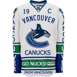
Canucks fans, a lot of you were unhappy with the new uniforms unveiled yesterday. But just remember. It could've been so much worse.
Told you. And what if they hadn't gone so far back to find vintage colors? What if they stopped in the '80s?
That's what.
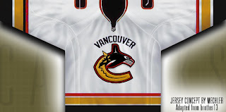
 Oh and I had to share this one. The Canucks seem to be all about mixing and matching. So here's what might've happened if they'd gone with this idea back in 1997 instead of the orca. A little scary but not horrible.
If you want to see horrible, imagine the Minnesota Wild in North Stars colors.
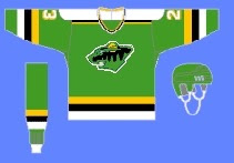 Try not to gouge your eyes out. It doesn't get any bigger for a reason. Quite frankly, I think the Wild have excellent colors. If you're among those who only see Christmas colors, I challenge you to find beige and yellow among the more common decorations. But that's neither here nor there.
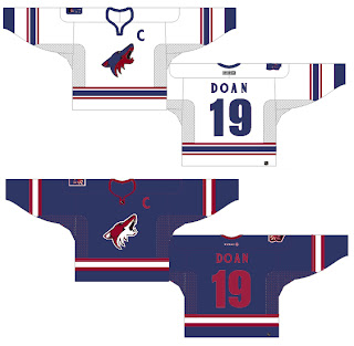
Moving right along. While we're on the topic of throwback colors, what if the Phoenix Coyotes had gone with Jets colors?
It's a rather frightening thought. You don't know what bad is until you see and red and blue howling coyote.
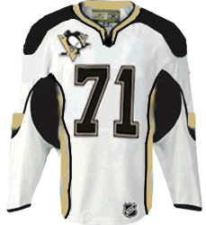
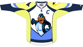
But I've saved the best for last, dear friends. My pals over at ThePensBlog.com came up with a good bit of satire that pokes some friendly jabs at the Reebok folks.
You may not realize at first glance, but that's the front of the jersey, not the back. I love the giant NHL logo at the bottom. If you want to see the number, there's the damn number. Crest be damned! But don't riot yet. You haven't seen the worst part.
Now you can riot.
Have a nice night. I'll be back tomorrow.



Reader Comments (22)
i actually like that Coyotes jersey...
the last penguins jersey loks like disneys daffy duck
I liked the second Canucks jersey but that last Penguins jersey was just way to much. That could actually be worse than the Blues alternate jersey.
Regarding the first Vancouver "concept" in this entry.
Oh. My. Gawd.
Vancouver fans sure do have a great sense of humour.
Wow, that second canucks jersey/logo was awesome.
I actually liked that black/orange away jersey for the Canucks that you posted. It's actually pretty decent.
I think the red, black, yellow version of the new jersey is awesome!
Ya, I thought that penguins jersey was an attempt at a ducks jersey...
Where do the Canucks play again?
I liked the first one
that second canucks jerseys is pretty good... i like the yellow better then the blue and green
i like the coyotes/jets jersey
I like the second (Canucks 80s) concept... I'd go for it!
The Canucks should definetly put GO NUCKS! on the bottom of their jersey. AS should every team put GO [name here].
haha wow.
The black/red/yellow 'nucks jersey is a little too East German (or just plain regular Germany) looking. It's actually not horrible - especially because it does away with the silly whale. Johnny Canuck in some form or another should be the main logo for the Canucks.
The Mechler jersey is amazing. Much better then the new ones unveiled Wednesday. 100 times better!
i like the Yotes jerseys, but i think that the coyote on the white jerseys should be the regular coyote (like the one on the blue). it shouldn't be half blue and red.
i also really like the second Nucks one there. the yellow is used very well. not too much, but not too little.
the Pens jersey w the #s on the front is actually pretty good. very footballish, a sport i'm not too fond of, but you can still tell its a hockey jersey
hey charlie, just look at the top, unfortunately lol
But yes, even with the wordmark at the top, the 80s canucks jersey really kicks ass. Also, the white coyotes jersey, I really did not mind.
Is it wrong that I actually like the second Canucks jersey Sans "Vancouver"? It's amazing how fans can come up with better concepts than the people who are paid the big money.
The Mechler design(2nd jersey)just solved a problem with what is wrong with the new Canucks design.By making the wording smaller to actually fit the logo it suddenly looks very legit and cool! I couldn't figure out why the wording before was bothering me so. I think the Canucks should go down this route (smaller wording) immediately and kick something down to the designer for this idea.
I think the Canucks play somewhere in Canada, but I don't know which city. I'll just google it to figure out. ;)
That first Canucks jersey is great, though. It looks like a fan jersey--one some kid got hold of and scribbled cheers all over, and then painted his face blue and green to match.
I actually like the second (white) concept, though. I agree that is makes all the difference if the "Vancouver" is in proper proportion to the logo. It doesn't look as crowded or busy, and looks as though the logo and city were both supposed to be there instead of both being shoehorned in at the last minute because the design team couldn't settle on one or the other.
That Penguins concept is simply an abomination.
I'm not going to lie - that black gold and red orca looks really awesome.