A Bunch Of Concept Logos
 Thursday · Aug 30 · 2007 | 12:31 PM PDT
  30 Comments
 I get a lot of emails with concept jerseys but most of them make use of the team's actual logo. But sometimes people send in new ideas for logos. That's what this post is about.
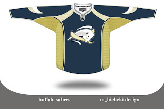
We're going to kick things off with the Buffalo Sabres. Lots of complaints have been lodged over the Sabres' new logo. There is even an entire site dedicated to the subject. Just as interesting is the now-famous design of John Slabyk. His work is nothing short of brilliant. But then someone emailed me this. And it rivals Slabyk's work on a different level.
The logo is very abstract but very unique because of it. The colors are a bit muted and I think that is actually a plus. But I feel like this is a very sharp logo. I'm curious to know what you all think of it. Please comment.
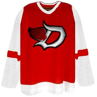
But that's not all. You probably know by now I'm not a huge fan of the Detroit Red Wings logo. I get the whole tradition/Original Six thing, but all right already. The Bruins are an original and their logos kick ass. They do. I'm not necessarily saying this is the answer for the Wings, but here's an idea.
I think the addition of black to the color scheme adds a lot to the uniform. The monochromatic red/white combo rubs me the wrong way — though I completely associate it with a scary good team. A little change never hurt anyone (except for the Islanders in the mid-'90s).
While still on the topic of the NHL's mainstays, you also probably know I'm not terribly keen on the Toronto Maple Leafs' logo. People like to say stuff like, "you don't mess with tradition" and the Leafs logo has been around forever. But the fact is, while the Leafs have been around forever, the current incarnation of logo has only existed since the 1970s. Anyway, what do you make of this?
I like the incorporation of the CN Tower, but I think this is more worthy of a secondary logo. I could see it as a shoulder patch, but not a primary for the Leafs. Thoughts?
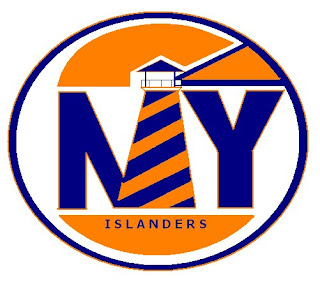
Next we have the New York Islanders. I'm always talking about how a lighthouse would serve as a good logo element for the Islanders. Here's a rather simplistic version of that idea.
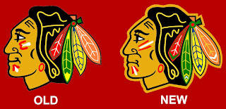
One of the most controversial notions I hold is the idea that the Chicago Blackhawks do not, in fact, have the best logo in all of professional sports. (Stop throwing rocks at me.) Here's what someone came up with to alter the Hawks' logo.
I see the differences and they make sense, but for my money, it's a lateral move. No better, no worse. Anybody else have an opinion on the logo?
One day I'd like to hear a real explanation as for why people think this logo is one of the best out there. There are too many colors in it and it's just so jumbled. A lot of you guys say simplicity rules all. That doesn't apply here. If you can educate me, leave a comment. I read them all.




Reader Comments (30)
The Red Wings "logo" is from Zephyr hats. SO it wasn't an original design or concept.
I like the Sabres concept you've posted, but I still think they should just go to the original design. I know redesigns are meant to make money, but there are a lot of fans here in Buffalo that love the old crest.
The Bruins showed that an classic look can work on the RBK Edge template. I wish more teams would stick with what has worked for them.
Look, the Hawks logo and unis are classic and ONE of the best period. Traditional, classy, no nonsense. Your slight change to the logo is fine. It's sad when these teams make drastic changes for the sake of change (and let's not forget $$$$).
People forget that many times simple is better. And like RJ noted, just look at the Bruins new jersey. It can be done.
The Red Wings "logo" does not work for me
The thing about logos and original six teams is that they don't need makeovers for marketing purposes. The Canadiens' branding, for example, is based on tradition. Did the Yankees changed their uniforms lately? They don't need new logos to make some more money. Small cosmetic adjustments, ok, but they don't have to follow sport trends like expansion teams.
Chris,
Taste-wise, we really are polar opposites.
First off, what we do agree on. the Blue and Gold project is wicked awesome, and I really think those would make the best Sabres jersey. I mean, I'm sick of seeing Buffalos as the Sabres logo. If they're going to keep it, they should rename their team the Buffalo Buffalo's.
But Detroits logo is excellent, and it has everything you could want in a logo, it represents the team name, AND the city. And while it was never my favourite logo, it is one of those classics I wouldn't want to see change.
Chicago's logo is one of my favourites. I love colour and vibrancy, and so it's natural for me to like it. I'm not a fan of simplicity, in my mind, it's just for the lazy, mundane and unoriginal.
That Red Wings concept is absolutely hideous. Chris, what you don't seem to understand is the immense pride that the people of Detroit and the state of Michigan have in the Red Wings crest. In addition to "tradition", etc., the Wings haven't changed their logo since the 40s because they'd have a full-scale riot on their hands. The fans have no desire to "modernize" the logo or the red-and-white uniform, because it's what we know and what we love.
Correct me if I'm wrong, but I believe the Red Wings are the only Original Six team NOT to introduce any kind of alternate jersey (one-time throwbacks don't count). The team once held a poll on the official website, asking "if the Red Wings ever introduced an alternate jersey, what color would you like it to be?" The overwhelming response was the final one: "No alternate jersey".
There were a lot of nerves amongst Red Wings fans with the release of the new RBK Edges... and we all breathed a collective sigh of relief when the jersey remained unchanged. It is a beautiful, timeless jersey and logo, and we hope it never changes. We don't want it "modernized" (look what that did for Buffalo and Ottawa), we don't want black added for the sake of adding it, and we don't want the jerseys to ever change without good reason. Change can be good (see Boston), but there must be a purpose to it. Why change for change's sake? That seems to be what Tampa, Ottawa, and San Jose did... why would 15-year old logos already need "updating" or "modernizing"? Boston went back to its roots somewhat with their latest jersey... the Red Wings have never left theirs.
i don't know that many necessarily say the BHawks logo is the best, just the overall jersey. the whole look of the red, black and white jersey with the highlights of yellow, orange and green on the crest just looks good overall. the logo is now classic and it would be a shame to change it just for the sake of change.
Oh, and I love the idea of a lighthouse as the Islanders logo, but not with letters. I'm not a fan of wordmarks at all.
I actually loved the fisherman logo, but I see it suiting a team from the Maritimes more(not that there will be one any time soon)
The Toronto one is nice, It kind of copies Ottawa's old secondary logo(the one with the Peace Tower) and it probably would be better as a secondary logo. I like the idea of returning to the leaf design fro the 60's, but without the text.
I think the proposed Leafs leaf is fine, but it doesn't need the phallic symbol.
I don't like the BH logo or jerseys. I just find them generic. Not good, not bad. Just fine.
i find the wings logo fine... but adding black to it might help...
agreeing with most of the rest, why the hell do they have to use a BUFFALO?!?
kay, you can say im nuts/have bad taste (i wouldnt care :P), but i like the islanders the way they are, and hate the hawks stuff... (both logos and jerseys)
The Red Wings logo (the real one, not the concept) is the best in all of sport. Classic. Untouchable. Period.
The concept is hideous. I could, however, see the Wings introducing a new 3rd jersey down the road that incorporates an Olde English D. A throw back to the 1926 Detroit Cougars, and also a tie-in to the Mike Illitch owned MLB team, the Detroit Tigers.
The Blackhawks is another classic. But I wouldn't mind wiping the smile off that Indians face. What, did he just get his profits earnings from the casino?
The Buffalo concept is horrible. I like the current Buffaslug, but this takes it to another level and would prove the naysayers right.
Toronto's shaggy leaf is ace. The straight line Leaf is lame.
The concept CN needle-thing is all wrong.
Damn! That person beat me to the punch with a straight CN Tower in the Leaf!
-Kindred-
I find it hilarious that the hawk's logo is no longer smiling...
the fact that you don't like the Wings logo, perhaps one of the only MEANINGFUL logos in the league, adding with the constant pictures of absolutely ridiculous 'concept' jerseys you keep posting on this site shows your ignorance, half of these look like they were made by a 3 year old with MS Pain. Enough already.
You're bang on about the Canucks' new unis. Those things are heinous. I can't believe all the Nucks fans on the news saying how much they loved them.
But those mock-ups for the Leafs and Wings? You gotta be kidding me. Those two teams are Exhibits A and B for why the "don't mess with tradition" argument is 100% valid. That's why the Isles went back to their originals and why the Sabres should do the same.
I'm glad the Wings haven't touched the logo in 50 years. That looks hideous.
I think the Hawks logo is so popular because it was ahead of it's time when it was unveiled and the times still haven't passed it by.
simplicity, simplicity, simplicity...the blackhawks logo has so much going on with it...so many lines, so many colors, it doesn't work for me
detroit's logo is perfect, like a lot of people said, it highlights the city and the team...it has meaning, unlike a lot of uniforms
and for the record, IMO the best logos in sports are the old ones that were highly imaginative: the yankees...the canadiens...etc...
Chris
The Hawks logo with proposed changes looks the way the logo did in the 90s. There actually have been minor tweaks to the logo over the years, and it use to have more of a grin and background behind the outline of the indian head.
There is no such thing as a simplicity = good rule. You like the Wild's logo, which is probably the busiest in all of sports. Uniqueness and easyness on the eyes wins above all else.
The Hawks logo is the best in all of sports because it is the most unique and colorful yet manages to be simplistic and timeless all at once. 99 times out of 100 a logo with that many colors looks awful, but the Hawks prove logic wrong in more ways than one ;)
Simplicity is find for simple minds. There's nothing wrong with a fancy logo as long as it works. These don't work so well, but I applaud the efforts - I especially like seeing people suggest something new for a logo. There's nothing wrong with tradition, but there's also nothing wrong with taking a fresh perspective.
The Red Wings "concept" though, should definitely be a part of the "Freak Out" section! It's just awful.
I like the changes to the Hawks - a tougher chief works for me.
i would like the detroit one alot better if it was just the D, and the blobby redwing sticking out from it was gone
I have yet to see a Red Wings concept with an ounce of sense to it. Leave it alone, people, my eyes are burning!
Long story short: I can't read all these posts, they're too fucking long.
Key Points:
1) Buffalo needs a logo without a fucking Buffalo in it.
2) Adding black to the Wings colors makes them too much like the Hurricanes and Devils. Differentiation is important.
3) Do they have lighthouses on Long Island?
4) The new Blackhawks logo is not an improvement. Both logos suck. A lot.