Saturday
Aug042007
Deplorable Detroit Design
 Saturday · Aug 4 · 2007 | 9:42 AM PDT
  7 Comments
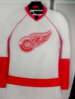
 Not sure exactly where I first saw this design for the Detroit Red Wings new Rbk EDGE uniform, but not to worry, I'd bet money on it being a fake.
Now you can see why. It is rather ugly. I mean, like, really, really ugly! Scary ugly!
But what do you think? Is it really as bad as I'm making it out to be or would something like this work for the Red Wings?


Reader Comments (7)
its looks like a piece...Shall i vomit
its worse then your making it out to be...
It's as plain and generic as you're gonna get with the Edge jerseys. It could be worse...*cough* Nashville *cough*.
With all due respect to Heats, it couldn't be worse. Even Nashville's isn't this bad and here's why...Detroit has a classic logo and uniform that has changed very little in it's long, proud history. Nashville, although I agree has a pretty hideous new uniform, doesn't have such proud history or classic look.
Well unlike most this picture actually has EXIF data claiming to be taken by a cell phone 3 weeks ago. I guess we'll see.
Maybe its just me, but is that not the old NHL logo on the collar? If it is then this is proven to be a scam.
Hmm, I think its purposely blurry so we can't really tell. Thanks for all the comments, everyone!