Mailbag: Lightning Fan Concepts
 Saturday · Aug 4 · 2007 | 9:00 AM PDT
  2 Comments
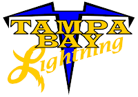
 A few people have responded to yesterday's post about the St. Pete Times requesting fan designs for the new Tampa Bay Lightning logo. I've received a couple of designs I thought I'd share.
The first one comes from Doug and its simply the current primary logo sans the text.
It's very plain and it feels unbalanced. It's better than having the text, though, if you ask me. Then Michael emailed in with a completely new concept. And he likes yellow.
It sort of reminds me of a '50s high school jacket. What do you guys think? These two were also part of that set. Feel free to continue sending in your concept designs and I'll continue posting them.
By the way, if you've desgined a logo or uniform for another team and would like to have it posted, send it along and I'll put it up here. You can email me at nhllogos@gmail.com.


Reader Comments (2)
I've seen versions of the old crest without wording and the new crest without wording as well as that "coming out of the circle look" several times now.
But having that elaborate L logo just gives me the shakes. Someone on another forum compared it to Lavern and Shirley...
All along, I've always hoped the Tampa Bay Lightning would get rid of the wording and just have the lightning bolt through the circle by itself. I like it so much better that way. The leaked new logo doesn't look as good as that.