Cool Sens Concept, Bruins Too!
 Monday · Aug 6 · 2007 | 2:48 PM PDT
  13 Comments
 A lot of people responded well to the Islanders concept art I posted yesterday. It came from the artist who also designed the Thrashers concept art from Friday. (NOTE: I updated that post with higher-resolution graphics if anyone's interested.)
Anyway, I have some more work from that same artist who posted his work on Chris Creamer's Sports Logos Community. As a disclaimer, I need to point out that none of this is official team artwork, but I thought it was fun to look at just the same.
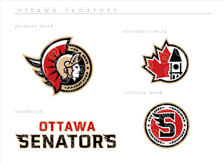
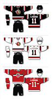 This logo set appears to be merely a revision of the current look of the Ottawa Senators. Personally, I prefer leaning more toward the yellow-gold over the beige color seen here. That's not to say that this color scheme doesn't work well, though.
Do you guys like this designs, the current one, or the one rumored to be taking over in the fall?
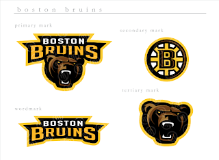
Next, we have a look at some logos that are irrelevant when you consider the Boston Bruins just changed their logos back in June. But have a gander anyway, if you're inclined.
 If you ask me, that's a pretty sweet Bruins logo, setting aside the fact that a drastic change like this would likely send the Boston faithful into a frenzy. I'm not sure how I feel about the re-imagining of the spoked "B" though. It isn't sitting well with me.
I'm loving the bear, though no one's asking me, and wondering whether I like it more than the new one that was unveiled a couple months ago.
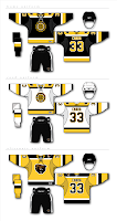
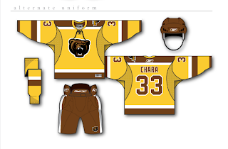
And then for those of you longing for the days of the yellow and brown, our talented designer leaves us with this other alternate uniform design.



Reader Comments (13)
Wow this guy is awesome!
im not a big fan of the Senator's logo. But those third jerseys are smoking!
Like the boston ones. the brown pants (bottom concept) is different and cool. It will never happen but thanks for posting fun to look at
I find myself refreshing the sportslogo boards on a daily basis now, waiting for this guy's newest designs, although he seems to have gone into a bit of a lull.
New Jersey was to be next up, and I have yet to see a fan-based design for the Devils that hasn't been absolutely horrendous.
I'd really like to see what this guy can come up with on that point.
who is sending you those logos? they are doing a pretty good job!
Hi, Seth. These designs I actually found on the http://boards.sportslogos.net/index.php?showtopic=50270&st=0" REL="nofollow">SportsLogos.net message board. It really is awesome work!
As for the stuff that gets sent to me, half the time I have no idea. It just shows up in my inbox one day. I'm grateful for it and I think a lot of readers are too. I'm glad you're enjoying the stuff I'm posting. Thanks for reading!
wow, the Senators stuff is pretty cool. the tweaks done to the main logo are pretty sharp.
the bruins are good too, but i think what the team is going with now is better.
That yellow/brown Bruins alternate is sexy. Brown is an awesome color and I don't think it's even used be a single NHL team. :(
Those are really cool, all of them!
Love that bear! Man, that's an awesome logo.
The guy does some nice work. I've always liked the profile Ottawa logo over the 3/4 view that has been on their home/alts the past few years.
As for the Bruins logos? The bear looks good, a bit minor-leagueish, but better than the lazy-eyed pooh bear the B's used to have on their jerseys. As for his take on the spoked B? I think it may be his weakest effort. Everything is the same weight and the shading clutters up what is a clean and simple logo.
Some very nice displays of art work here. I really liked the Senators red jersey. But I did not really like the redisgned Bruins logo, to me it looks like the bear is yawning.
*throwing up* IM IN LOVE WITH YOUR WORK GHETTOFARMBOY BUT I'M FROM OTTAWA AND THAT SENS LOGO SUCKS! No offense, I REALLY love all of your work except the sens. sorry :(
Oh, forgot to say, the striping patterns and the colours and EVERYTHING about all the the jerseys is great except for the primary logo.
Dislike. I'm tired of cartoon logos.