Revisiting Some New Uniforms
 Thursday · Aug 9 · 2007 | 2:14 PM PDT
  5 Comments
 The designs in this post are for teams that have already unveiled new uniforms so, like the rest of the concepts I post, it's just for fun. Hey, I can't post artwork the caliber of that Anaheim stuff everyday.
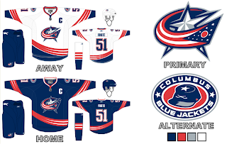
Here is what one fan thought the new Columbus Blue Jackets jerseys should look like.
I really like the curved stripes. Very interesting. I'm a big fan of the real Blue Jackets uniforms, but these aren't bad either. Maybe the team could consider something in this vein for an alternate once that program is reinstated in a year or two.
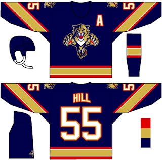
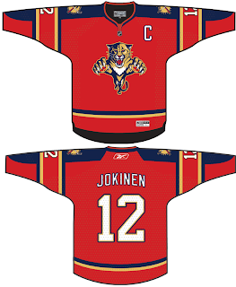
Then I also had a few ideas for the Florida Panthers emailed to me.
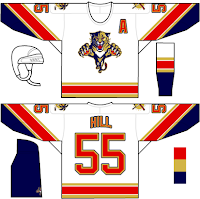
We've never seen that kind of gold on a Panther jersey. I wonder how it would look on the ice. I feel like the Panthers have always been more associated with red than blue, which is why I thought it was strange their home Rbk EDGE jerseys are blue. Then there's these two.
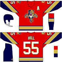
The white jersey seems really familiar and the red is almost how it should be. Speaking of red, one fan based a red jersey off of the new ones just released last month.
They also tried wrapping the elbow stripes completely around the sleeve as opposed to just halfway. I think it makes a world of difference. But I don't really mind the elbow stripes the way they are. I just know there are a number of people who are annoyed by it.
Any thoughts on these designs? Remember, if you would like to send in a design or you own or one you've seen elsewhere on the web, you can submit it at nhllogos@gmail.com.



Reader Comments (5)
ummm... wait a minute. i was under the impression adam foote was #52, not 51
Thank God the Panthers aren't predomninantly red (still use it ) anymore. In the same division you'd have (if kept red) three teams with red-based jerseys - Canes, Panthers (and now) the Caps. Why is the NHL so obsessed with that color? I agree with the site proprietor -- why not use brown in a jersey...for me, i'd love to see more green. Not a fan of that proposed Duck logo, but i loved those two green colors. The Wild rocked the green and now i guess they too will be going to...wait...oh...red...
Wings, Devils, Canes, Caps,Hawks, Wild (if they use what was the 3rd jersey), Canadiens, Ottawa (more a brick, but ok), Mtl, Coyotes (different shade, but still)
If the Panthers were still mostly red- you'd have 11 teams using it in their color scheme.
1/3 of the league with the same color or a variation? Bor-ing
anonNYRMike
are you saying blue is a rare colour?
atlanta,buffalo,columbus,edmonton, florida,nashville,both new york teams,st.louis(its even their name),toronto,and vancouver all wear blue
thats another 11 teams by my count
No, not what i'm saying. There's a ton of blue as well...(too much- forgot TB). at least there's some variation. A Ranger blue or Toronto blue is classic. Atlanta is more pale/ powder. Vancouver's blue will at least share the green (a rare color).
I wish there were more than 3 jerseys (vancouver, dallas, wild) that incorporated green. A couple have gold/ yellow. A couple have orange. 1 purple. No browns. I don't know. I'm all for diversity. IF you have an interesting/ different color like a green , i think it'd be a shame if the jersey is made to look black (Flyers/ what's rumored for the Stars). I loved that 3rd jersey orange the Flyers used. Really stood out. With that more 'chrome'-looking logo - that was tight.
Blues and reds are safe colors. Are all other colors not pleasing to the eye? Not saying the NHL should stress pinks and polka dots, but how about a moratorium on Reds/ Blues for any changes/ new teams.
I'd have to see what those Panthers designs would look like in person before I'd really pass full judgment. Overall they are nice. Not totally sure about the higher amount of gold on them.
As for the Blue Jackets, I agree that those are nice and if there was an alternate with that design, I'd be certainly open to that look.