NHL Tournament of Logos

Entries in panthers (40)

Monday
Mar172008

Logos And More Logos

I've got some things to talk about with regard to the upcoming Tournament of Goalie Masks but I'll save that for the next post. For now, I've got concept logos, beginning with one I was sent this afternoon for the New Jersey Devils.

Looks a lot like a logo for a Japanese restaurant to me but I like it. Maybe not for a professional hockey team, but in general... I like it.

Another reader came up with a bunch of varying designs for a new Edmonton Oilers logo.

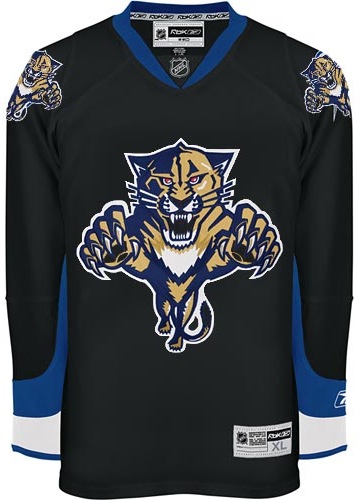
Lots of cool stuff in there. Not sure any of it is better than what the Oilers have now. Same artist simplified the look of the Florida Panthers.

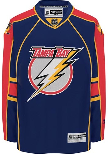
They should try that on a third jersey. Sticking to the Sunshine State, I've got a couple of Tampa Bay Lightning logos to share.

If the bolt wasn't yellow and we tried a different font for the TBL, perhaps I would consider it as a secondary mark. Like that, I'm not a fan.

I've always thought about something like that. A lightning bolt between a TB. Still, it needs some beautification work or something.

That's all for now. Keep the concept work coming in. I'll have a bunch more jersey designs to post this week. Stay tuned!

UPDATE (6:53 PM): Somebody mentioned St. Patrick's Day in the comments. Somehow I'm completely forgot that was today. I actually did have one theme concept to share. All six Canadian teams puked on by the Irish.

That's some green right there. Happy St. Patrick's Day!

Thursday
Feb282008

Odd, Unique Logo Designs

Tonight's post is dedicated to those of you who've used your imagination to create entirely new logos for your favorite teams.

We begin in Anaheim with a neat logo design I featured earlier this month. Prepare yourself. It's very purple.

Next to it is a Sharks concept that probably should never been seen by anyone — ever. But I thought it could at least serve as just one more reason why teams should definitely not do this. I thought it was all right for the Stars as a one-of-a-kind sort of deal. But the all-star jerseys this year worried me.

Moving on to Canada now, here's a Canadiens sweater with an interesting new secondary logo created by a reader some time ago.

It probably needs the fleur-de-lis in white, but otherwise it's a really cool, symbolic logo.

Now to Hartford, where someone has created a new brand for a team called the Whales. (Not to be confused with the Whalers despite the logos seen here.)

Those are some pretty snazzy jerseys. (Yes I said snazzy. What?) I like the "H" logo but the "W" logo is more effective with that hidden "H."

Next is a simply Panthers design.

I'm not really a fan of letter logos in cases like this. Put the "FP" on the shoulders and the panther head on the crest, that's what I say. But what does my opinion really matter?

And finally — you know I've gotta do it — in preparation for my trip to Vancouver, here's a new logo design for the Canucks.

I hate to be mean, but I'll come right out and say I don't like it. Ever since I saw the new Johnny Canuck logo, I haven't been able to imagine another symbol that would work better for that club. Still, no idea's too dumb to put out there, right?

Don't forget to go cast a vote at ToHL for which CHL league goes first when the new tournament begins on March 14. And if you're wondering, I haven't yet decided what tournament will follow the Quest For The Worst here at NHLToL. I'll keep you posted.

Friday
Jan042008

Just To Freak You Out XXII

I can't believe how long this series has lasted. At 22 and still going strong, what follows is another edition of Freak Out Friday. Where do I begin?

I think I'll start with a play on the Winter Classic which took place this week. It's an "If They Mated" featuring the two teams involved in the big outdoor game.

Curiously though, while the designer went with the original Sabres logo, they opted against the original Penguins colors.

Now is where I really get into the scary stuff, so be warned.

Though well executed, that can't be a good idea. Speaking of which...

Let the eye-gouging begin. It makes great use of the Panthers' colors but what is with all the suns? We get it they're the Florida Panthers!

Here's what we need.

Because nothing says we're getting rolled over like a jersey with tire tracks. A sentiment less suited for the Red Wings (first place) and more so for the Lightning (last place) who can't seem to remember how to win games. But I'm not bitter.

Speaking of the lackluster Lightning, the one color I hope is never incorporated into the Bolts' identity is yellow.

Did I mention how I hate the yellow?

And finally, it appears that not a lot of effort was put into this, but I thought the logo was funny enough to revisit.

Keep the crazy artwork coming so I can continue to frighten and freak out the readers here at NHLToL. Enjoy your weekend!

Friday
Dec072007

Poll: Blue Jackets vs Panthers


vs
Columbus
BLUE JACKETS
Florida
PANTHERS


Place your vote and then feel free to leave a comment as to how you came to your decision. Tell all your friends to drop in and vote! The more voices heard, the more accurate the results!

Poll opening date
Fri Dec 7
Poll closing date
Tue Dec 11

07SCTRN | #0B | CBJvFLA

Sunday
Dec022007

Just To Freak You Out XVII

Welcome to the belated 17th installment of the Freak Out series. Time's been getting away from me the last few days so I apologize for the delay. Anyway, this week's art has a very specific theme. I asked for you guys to send me stuff of the "If They Mated" variety and some of you actually responded.

We'll start with a couple of logos I thought were "special."

If you're staring at that and just can't place it, look no further than the Ottawa Senators. You'll recognize his cap from the Columbus Blue Jackets' shoulder patch. That one just cracks me up every time I look at it. It's like the guy took the day off to go to a baseball game but he still can't seem to wipe that constipated look off his face.

The next one goes out to all my Connecticut readers.

It's a combination of the Hartford Whalers and Hartford Wolf Pack. And the more astute among you might notice the nod to the New England Whalers. That's three leagues covered in one logo. Impressive.

So going back to Ontario now, try to imagine what would happen if the Leafs and Sens (perish the very thought) were to swap uniforms and colors?

Don't send me hate mail. I'm illiterate anyway.

And now for a rivalry absolutely no one could care less about.

Personally, I'm disgusted by this but it does make me laugh a little. What's with the black tongue on the panther? Someone should tell him to stop chewing on his pen.

This here is more of a fusion of past Coyotes jerseys. We've got the old colors on the new uniform. How many of you like me would prefer to gouge out your own eyes before watching a team wear a jersey with two different color shoulder yokes? That's got to be breaking some sort of law.

Speaking of law-breaking, remember the scary Blackhawks logo I used to kick off last week's Freak Out post?

Somebody glued it on a jersey. D'oh!

And then I thought this was mildly amusing if nothing else.

But this is what happens when you guys stop sending in the really good stuff. Hope you enjoyed another week's worth of Freak Out art. Hopefully I'll be back with more on Friday. Enjoy what's left of your weekend!

Saturday
Nov172007

Poll: Senators vs Panthers


vs
Ottawa
SENATORS
Florida
PANTHERS


Place your vote and then feel free to leave a comment as to how you came to your decision. Tell all your friends to drop in and vote! The more voices heard, the more accurate the results!

Poll opening date
Sat Nov 17
Poll closing date
Wed Nov 21

07TJTRN | #2D | OTTvFLA

Monday
Nov122007

Poll: Kings vs Panthers


vs
Los Angeles
KINGS
Florida
PANTHERS


Place your vote and then feel free to leave a comment as to how you came to your decision. Tell all your friends to drop in and vote! The more voices heard, the more accurate the results!

Poll opening date
Mon Nov 12
Poll closing date
Fri Nov 16

07TJTRN | #1H | LAKvFLA

Friday
Nov022007

Just To Freak You Out XIII

It's lucky number 13 tonight on Freak Out Friday. Hope you guys get weirded out by what I have to share here.

I don't quite know where to begin.

Wow, I don't know what you did to deserve that, but it must've been pretty bad. Now if you're thinking that looks somewhat familiar, consult a post from last month.

And the hits just keep coming. Flames, take a clue from the Thrashers. This is how you do it up if you really want your provincial/state flag on your jersey. The scary part is that half of it is what seems to be the Confederate flag. Yeah, 'cause rednecks and hicks just dig hockey.

All right so let's head up north where they can really claim the sport. Scary thought alert. Imagine the Rangers and Flyers swapping colors.

On second thought, don't. It's too horrible. Speaking of horrible, check out this Rangers jersey concept.

That's what scary is. I know the new EDGE jerseys are supposed to have larger crests, but somewhere a line's been crossed.

Anyway, let's head west. Here's a color combination that doesn't work on a jersey.

The Nashville Predators are a hockey team, not a figure skating team.

Right?

Yikes! That logo. And while we're on the topic of bad logos, consider the following.

Oilers fans, you think you've got it bad now with your half-a-stripe elbows and practice-jersey looks. What if this happened? Don't even think about it too much. Your head will explode.

We'll wrap things up in California now, if you don't mind. And sometimes you have to reintroduce a winner — like the 1996 Mighty Ducks third jersey. Only the Ducks have new colors now.

That is something.

What we're finishing the night off with might be hard to look at. Remember the old Lightning third jerseys from the mid-90s? They had the rain pouring down, lightning bolts down the arms and — the selling point — the wild waves of the bay around the bottom. Well Sharks live in the water.

The waves have been stolen. And so has what little dignity might've been left in the new Florida Panthers uniforms when an attempt to create a San Jose concept went horribly awry. This is what happens when folks have too much time on their hands.

Well I hope you all got freaked out enough on this Freak Out Friday. If not, accept my apologies. Better luck next week. Until then, I'm waiting to see what you guys have in store for me next in terms of crazy artwork. Email it along.

Friday
Nov022007

Recolor This

Today's concept post will deal strictly with recoloring things. Yes, that's right. For instance, let's suppose the Florida Panthers had opted for the more traditional red home sweater over the blue one they actually went with.

Not bad, but despite the fact that I loath the Stinkin' Panthers, I prefer the blue. The old red sweaters were nice, but I don't care much for this one pictured here. But that's just me.

Speaking of me being a Lightning fan, someone remade the Sharks' and Habs' sweaters with Bolts colors.

I don't know. No. They'll always be a teal team. That's just who they are. Don't question it. As for the Habs, you can't have that jersey in anything but red. Even blue would be weird.

Here's something else that might make you question whether this is the Freak Out Friday post. Not quite yet. Just a misguided attempt at giving the Canucks new colors.

I'm all for the return of a green team to the NHL, but this is not how that is achieved. No, no, no. I know I'm sounding very negative right now, but just no.

Anyway, here's something I like. The Blue & Bronze Age of the Washington Capitals was my favorite. Even though it fits them perfectly, thematically speaking, the red/white/blue combo is so overused in this sport. Check out the current EDGE unis in the old colors.

It may not be the most brilliant thing you've ever seen, but come on. That's not too shabby. I like the white "capitals." Very sharp, right there, if you ask me. I'd just like to see the black jersey in blue instead. I was more a fan of the blue '90s jerseys for the Caps. I like the black one as a third jersey — not so much a primary home sweater.

And finally, we'll finish off with something a bit different. This is the Islanders uniforms recolored — but for a different team.

Wow, no. I'm sorry, but those sleeves don't look good on any team if you ask me. The more I see it, the less I like it. Granted it looks better in black and orange than blue and orange, but still, I'll pass on this one.

What do you guys think? Any winners here? Or should we go back to the paint bucket?

Wednesday
Oct032007

Some Unusually Familiar Concepts

I got a funny email yesterday. Check out these. See if you notice a pattern.


I don't feel a need to explain or comment on them really. They sort of speak for themselves. Pretty clever, if you ask me. What do you think of them?