Avalanche Unveil New Uniforms!
 Wednesday · Sep 12 · 2007 | 1:45 PM PDT
  29 Comments
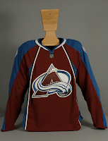
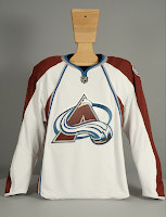
 I know we already saw images from Altitude, but this is the official post. The Colorado Avalanche have unveiled their new Rbk EDGE uniforms today. Photos follow.
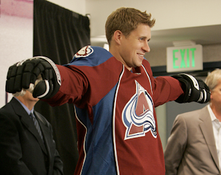
There they are. Now here's John-Michael Liles modeling the new duds at a press conference in Denver today.
I think he's been surrounded by the fashion police. I apologize, that was awful. I don't think my head's on right today. But seriously, I've been a big fan of most of these new Reebok jerseys. I'm sorry, this is not what I had in mind for the Avs. They had such a cool uniform.
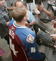
Don't get me wrong, I don't think it's end-of-the-world horrible, but it's not great either. Couple more angles.
The lettering and numbering will remain the same apparently, so that's good. What I do like that all the new jerseys have is the giant crest. Show off that logo! No need for it to be so small.
Anyway. Love 'em or leave 'em, there they are. Avs fans, it's your big day. Is a celebration in order or shall we go back to the drawing board?


Reader Comments (29)
as an avs fan, i must say that i am glad that i got my replica jerseys of the old design when i did. the whites are tolerable, the maroons are horrible. the vertical striping kills the maroon jerseys for me. i think it has the desired effect on the whites to make the team crest stand out but on the maroons, aaack. it would look so much better if they weren't on there and unfortunately i can't look forward to the team breaking out the best thirds in the league anytime this year.
I think these are a big improvement. Better clean lines.
I liked their 3rd's, I was kinda hoping that would be the new home's kinda like what Minny did with there's
The new Avs looks likes like it's caught in a time warp, it's neither classic nor modern. For instance, the old home and road uniforms used to be very modern and the third jersey was a classic. It could have done with out the colored armpits in my opinion, but I kind of like the vertical striping. Overall, the uniform is a pretty good uniform, but it's a step down from the old ones.