Maple Leafs Unveil New Uniforms!
 Wednesday · Sep 12 · 2007 | 1:29 PM PDT
  73 Comments
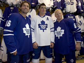
 UPDATE (6:37 PM): Normally I wouldn't put an update at the top of a post, but this one is the exception. Just got a hold of an excellent photo of the new jerseys that should leave no doubts.
Darcy Tucker, Tomas Kaberle and Jason Blake model the brand new Rbk EDGE jerseys for the Toronto Maple Leafs. You can read the original post below. Thanks to Jimmy who also linked to this image in the comments!
-----
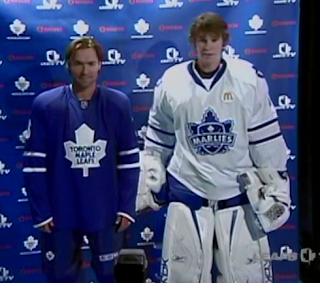
Today the Toronto Maple Leafs unveiled their new Rbk EDGE jerseys. We're getting our first look via screen grabs of the Leafs TV broadcast. Not impressive quality but it'll do until photos are out there.
Plain is the word here. I expect many of you will have that to say. And could there be more blue? You can't really see the socks in this image, but here's hoping they aren't solid blue too. More to come when I get it.
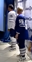
 UPDATE (5:11 PM): I mentioned that I hoped the socks wouldn't be solid blue. Thankfully, as you can see in this video still, they are not. The traditional three stripes can be found down there.
You can click on the picture to the left to enlarge it for a better look. (I think it's funny Kaberle and Blake are wearing tennis shoes with their uniforms. But the little things make me laugh.)
I'm still waiting for additional photos, but I'm adding more video stills to the Rbk EDGE photo gallery right now.


Reader Comments (73)
Wow... Phail.
Boring! It's one thing to maintain an old time hockey type look but the Leafs over did it the other way. It looks like an old practice jersey.
wow, no secondary logo either! thats brutal!
As a guy who bleeds blue and white... I've never been so hurt in my life. These are by far... the worst in the league so far.
If it wasnt for the 2 stripes on the sleeves they would look like practice jerseys! Maybe we will like them when we see them on the ice...
Too much blue. I missing very much the white stripes at the bottom of the jersey. The previous jersey was far better.
Ugh.
The piping at the cuffs is an interesting touch though -- do any other teams have this? It's not something you'd ever see in a game (except during a fight, I guess) ...maybe a touch to make these more attractive for fans to wear?
Not they look just like they play shitty !!!! Ugliest jersrey of all the rbk line.
Love em!
How hard was it to design this "jersey"?? I'd rather buy a practice jersey or the previous jerseys instead of paying $140 or $150 for these t-shirts with logos. What horse crap.
As a Non-Leaf fan, I will ay in all honesty that I like them - they are crisp and not overdone like some of the jerseys out there. I think these are classic jerseys and there wasn't much fiddling with tradition.
Boring. At least they saved me $100+ on NOT having to buy a new jersey this season. I was hoping they'd use their third jersey as their primary but I guess they wanted to make the jersey as plain as possible. Well, at least it isn't as bad as Dallas or Vancouver.
There is the video on http://mapleleafs.nhl.com/
- The socks are no fully blue.
Skip ahead to 16:45 - Tucker, Blake, Kaberle, Pogge and, a few other Marlies.
The socks have three thick stripes on them, and those have 2 very narrow stripes on either side.
No stripes around the waistline makes me a sad panda.
Is McDonald's spnsoring the team this year or something? What;s up with the Golden Arches on the Right Chest of the White Jersey???
God.... my Red, White and Silver concept for Toronto at least had a little more strength than these.....
are u guys kidding me?? ya i'll admitt i was a tad disappointed, i would have liked to see some more creativity ...but come on here, a disappointment from what?? our previous jerseys -- add two lines at the bottom, and add back the TML (which nobody was crazy about to begin with) These jerseys are NOT that ugly and overall didnt change a whole lot ...so i understand if u hated the previous jerseys as well, but you'd be contradicting yourself to say u loved the old ones and hate these ones.
oh and to those of you saying worst in the league so far!??!
have u guys seen some of the others out there?? (Islanders, panthers)??
anyways.. to sum things up, all im saying is.. THESE ARE NOT THAT DIFFERENT FROM LAST YEARS jerseys, so cry all u want about the lack of creativity (frankly, i wouldnt have wanted them to go overboard anyways), but do not cry about the fact that they are "ugly" and certainly not "the worst in the league"
that would be the MARLIES sponsor.. as they were last year too
I love them for the same reason why everyone here hates them. No shitty secondary logo. No kiddy looking vertical stripes or piping. Not overdone ...aka "plain". I'm happy they didn't make a mess of it just to appease people who need a valium. I'm glad it bores all of you. Go and purchase a Ducks jersey.
"oh and to those of you saying worst in the league so far!??!
have u guys seen some of the others out there?? (Islanders, panthers)?? "
Those are my two favorite RBK EDGE jerseys.
I like these Leafs jerseys, I'm just sad to see Jason Blake wearing them.
Changing my mind. I didn't realize the white one was Marlies uni the Leafs should steal that one....way better
@Zooch: The Leafs road whites do look like the Marlies, except they don't have a shoulder logo (or Ronald's). The Marlies blues look the same as the Leafs blues.
the white looks better than the blue because of the blue shorts....from this picture it looks like tucker is wearing PJs
I was hoping for 1970 Leafs Jerseys..the one that has the white. Those are my favorite.
i wanna see a close up of the numbers... did they completely get rid of the silver? even on the numbers?
I'm disappointed that they got rid of the horizontal stripes. Without them, the jersey looks too plain.