NHL Tournament of Logos

Entries in avalanche (42)

Saturday
Jun282008

Colorado Concept Logos

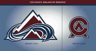
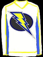
Recently I noticed in the comments of various posts, some of you pointing out that among others, the Avalanche may indeed have the perfect logo. That is, there's no way to improve upon it. Some even went so far as to challenge anyone to make one that's better. And a few people responded.

This is the best of what I received but even it doesn't come close to the Avs' current logo. A valiant effort to be sure, but certainly no replacement.

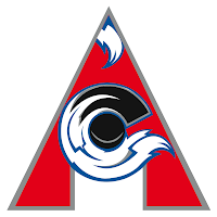
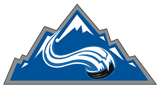
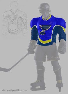
There were a couple of others, not as great, but worth a look.

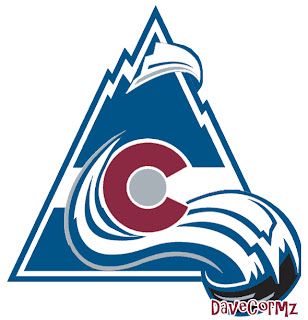
And then this one which borrows a major element of the actual Colorado logo.

That does it for tonight. I'll have a look at some Detroit Red Wings concept logos tomorrow.

Friday
Mar282008

Just To Freak You Out XXXII

Can you believe this is already the 32nd installment of the Freak Out series? Who knew it would go this long? What's interesting about this week's post is what comes at the end and the fact that it's real and not concocted in the freakish mind of one of the many readers of NHLToL. No, it's quite real and that's what freaks me out the most.

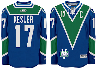
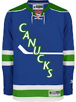
But first, let's talk third jerseys. We know they're making their big comeback next season after having taken a year off. We'll begin in Vancouver.

But wait, there's more!

And I'm sure this was just a case of colors lost in translation.

Doesn't make me feel any better. I'm all right with the purple on the Kings' uniforms because it's partnered with black and silver.

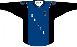
Here's a Lightning jersey even I wouldn't consider buying.

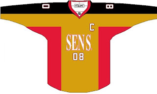
And a Sens sweater absolutely no one would.

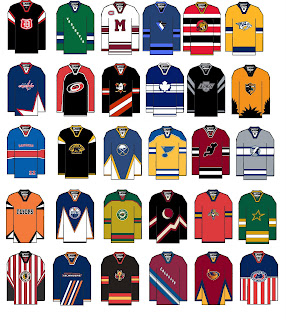
But hold on, why one team at a time? Let's go for all 30 all at once.

A good try to be sure, but I'm afraid a few too many of these missed the mark in terms of what one might consider, you know, aesthetically pleasing. (What the hell kind of sentence was that?)

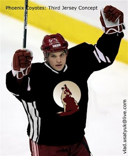
It's worse when you make it look real by painting it onto a player.

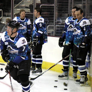
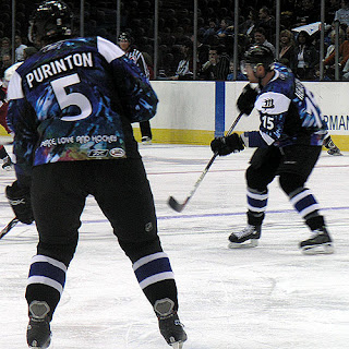
And now for the little thing I was teasing at the beginning of this post. I know it's not NHL, but I'm making an exception. The AHL's Lake Erie Monsters, this season, actually wore jerseys that... I'm sorry, there's no other way of putting this. They were tie-dyed. Behold the horror.

Because one photo wasn't enough...

Peace. Love. And hockey.

And now I'm just going to go put forks in my eyes. Until tomorrow, friends.

Saturday
Mar222008

Just To Freak You Out XXXI

I began the last Freak Out post with a similar image, so this is not a repeat. Look closely.

Yes, the duck is wearing himself on his own jersey. This is like some sort of weird fractal, right?

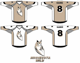
Anyway, we've also got an odd Minnesota Wild concept that scares me.

There's a reason teams choose bright colors. I can't remember what that is at the moment.

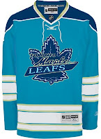
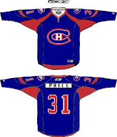
Got some stuff for Toronto and Montreal.

Does that Leafs logo look familiar to anyone? I've always thought the Habs should try blue — but on the jersey, not the logo.

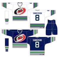
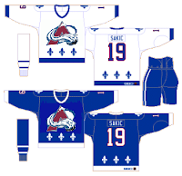
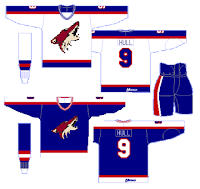
And then of course we've got a string of "If They Mated" concepts for some of the clubs that found new homes in the '90s.

The Hartford Hurricanes?

The Quebec Avalanche?

The Winnipeg Coyotes?

No, no and no. Lastly, I've got a little something to celebrate St. Patrick's Day albeit a bit after the fact.

He's got shamrocks on his shoulders! You guys absolutely slay me.

Thursday
Jan242008

Poll: Avalanche vs Oilers


vs
Colorado
AVALANCHE
Edmonton
OILERS


REMEMBER: You're choosing the WORST logo!

Place your vote and then feel free to leave a comment as to how you came to your decision. Tell all your friends to drop in and vote! The more voices heard, the more accurate the results!

Poll opening date
Thu Jan 24
Poll closing date
Mon Jan 28

Friday
Jan182008

Just To Freak You Out XXIV

Can you believe yet another Friday is already upon us? I've had a long day (which began with me waking up at 1 AM) so forgive me if I make this a quick one. Just trying to freak you out a little.

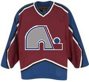
Last week's theme was crazy logos. This week's theme is crazy jerseys. For instance, what if when the Quebec Nordiques moved to Denver, they opted not to change their name or logo — just their colors?

Yep, that would've happened. Good guess.

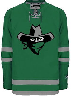
I think this next one was submitted as a Dallas Stars concept, but I don't really get it.

Are all Texans also banditos? On second thought, don't answer that.

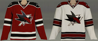
This next one is a little disturbing.

Blood in the water.

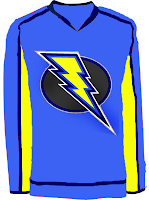
I posted a concept Lightning logo a couple weeks ago. Here are the jerseys that go with it.

I'm still not a fan.

Giant hockey player... smash!

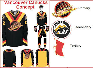
And what sort of person would I be if I didn't work in some Vancouver Canucks art? (Yes, arguably the most well-represented club on this blog much to the dismay of a handful of you.)

The weird thing is I sort of like the whales. Here's what I really don't like.

And finally, I've got this logo that serves as a great followup to last week's insane logo fusions.

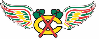
There's why the Chicago Blackhawks and Detroit Red Wings will never merge. The logo just wouldn't work as you can plainly see.

So it turns out this post was a little longer than I planned. I impress myself. By the way, at some point this weekend I hope to update the Concepts Gallery as I have over 100 images waiting to be added. I'll let you know when I get it done.

Hope you enjoyed the 24th Freak Out post. See you again right here next week!

Saturday
Jan122008

Just To Freak You Out XXIII

I've been pretty bogged down with getting this next tournament ready. I really hoped I'd have it posted by now, but obviously it hasn't happened yet. Patience. In the meantime I've got some other cool stuff for you guys to enjoy.

First thing, a reader emailed in a link to a site called MG's Helmets — specifically to a page where the designer has come up with a bunch of NHL concept football helmet designs. It's quite clever actually. My favorite thing is how any references to hockey have been removed from the logos. You'll find no hockey sticks and no pucks. Haters of the "Buffaslug" might notice at a quick glance how ridiculously appropriate that logos looks on a football helmet. The only other logo that even comes close to looking good on a helmet is the Flyers.

It's just weird.

Now you're good and prepared for the freak out stuff. I would've done this yesterday, but I didn't. This one is all wacky logos.

First, the Atlantington Thrashitals.

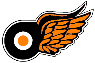
Then the Phitroit Flyer Wings. I know, creative names.

This next one here is a combination of the two Colorado clubs that have graced the NHL — the Rockies and Avalanche.

Not too horrible. I haven't quite figured out how the avalanche of snow has passed directly through the mountain, but I've found in my life it's best not to ask questions.

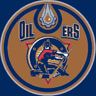
Here, I think we've got an amalgamation of just about every Edmonton Oilers logo ever used.

Learn what it means to be freaked out. Learn it well.

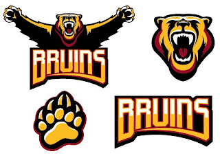
And finally, a weird generic Bruins logo design that could be used for absolutely any team called the Bruins whether they happen to be located in Boston or not.

Thanks, but I'll keep the spoked B.

Saw Charlie Wilson's War tonight. Philip Seymour Hoffman is my hero. Enjoy the other half of your weekend. The Quest For The Worst is imminent.

Friday
Dec282007

Just To Freak You Out XXI

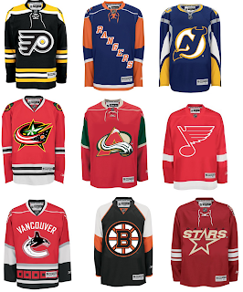
The Freak Out series hits 21 this week — old enough to get hammered. And boy, I think some of the designers this week had to have been hammered. I mean, just look at this.

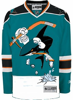
It might take a moment or two to notice that this is an "If They Mated" example. It's the new Sharks secondary logo merged with the Mighty Ducks third jersey of the mid-90s. But I love it!

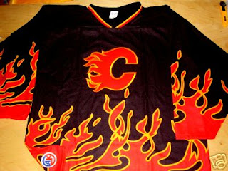
This Flames jersey is on fire! Someone on eBay is really selling it. For real.

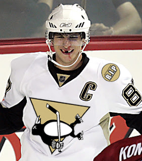
Sidney Crosby recently dropped the gloves in a rare on-ice event. This picture isn't real but it cracks me up nonetheless. There's just so much about it that's so wrong. I'm curious to see if the guys over at Pensblog have anything to say about this.

And finally, we have a plethora of "matings" here to share.

To sum things up, what you see above is the Flyers and Bruins, Rangers and Islanders, Devils and Sabres, Blue Jackets and Blackhawks, Avalanche and Wild, Blues and Red Wings, Canucks and Hurricanes (weird!), Bruins and Flyers (opposite of the first one) and Stars and Coyotes.

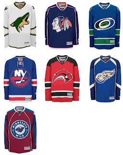
But wait, there's more.

This one is interesting because it's all opposites of the previous image. They are the Coyotes and Stars, Blackhawks and Blue Jackets, Hurricanes and Canucks, Islanders and Rangers, Sabres and Devils, Red Wings and Blues (what the—?), and Wild and Avalanche.

Hope you enjoyed being freaked out. Have a fantastic weekend!

Thursday
Dec062007

Poll: Sabres vs Avalanche


vs
Buffalo
SABRES
Colorado
AVALANCHE


Here we go. It's the start of yet another logo tournament at NHLToL. Time for you guys to decide which team has the best secondary logo. We'll kick things off with a two-part preliminary round, starting with the Sabres and Avalanche.

Place your vote and then feel free to leave a comment as to how you came to your decision. Tell all your friends to drop in and vote! The more voices heard, the more accurate the results!

Poll opening date
Thu Dec 6
Poll closing date
Mon Dec 10

07SCTRN | #0A | BUFvCOL

Friday
Nov162007

Just To Freak You Out XV

We were a little thin in terms of new Freak Out art this week, so forgive me if today's post is a little light. Still, nothing pleases me more than trying to freak you guys out with some crazy concept art.

As many of you know, the NHL unveiled the 2008 All-Star Game sweaters this week. Reader reaction here was not great. In fact, I got some very Freak Out-worthy concepts based off of those jerseys.
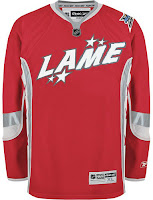
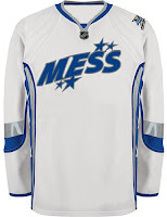
John sent those in along with a few others. You'll be able to find them in the Concepts Gallery this weekend.

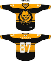
We'll keep things moving with the Pittsburgh Penguins next. Each concept here imagines a drastic change. For instance, the first example suggests renaming the team the Pirates — a club that once existed in Pittsburgh during the early years of the NHL.
And the second suggests that the team keep the name but move to Russia.
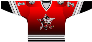
That silly penguin even looks Russian.

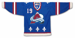
And then, this goes out to all the folks from Quebec. It just doesn't look right. At all.
We'll keep things in the Western Conference now. With all the vanity in the world these days, you had to see this coming.
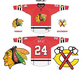
It seems even the Chicago Blackhawks' Indian head wanted a facelift. Either that or he got the Botox. And don't think I'm ignoring the Bears reference in there.

Next we'll head to Detroit where I'm quite concerned.
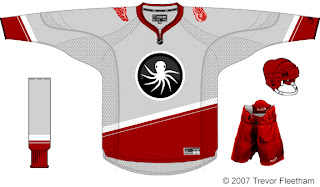
I think the grey jersey is an interesting choice, but I don't think an octopus will ever be anything but scary on a Red Wings concept. That tradition should stay off the sweater. Having said that, as a logo itself, it's not bad. But I'm still very, very concerned.

And finally, with Christmas just 39 days away, I thought I'd start my decorating now.
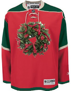
Ho ho ho!

If you've made or run across any concepts you think might be worth posting for Freak Out Friday, don't be shy. Send them along! You can email me at nhllogos@gmail.com.

Friday
Nov092007

Poll: Wild vs Avalanche

vs
Minnesota
WILD
Colorado
AVALANCHE


Place your vote and then feel free to leave a comment as to how you came to your decision. Tell all your friends to drop in and vote! The more voices heard, the more accurate the results!

Poll opening date
Fri Nov 9
Poll closing date
Tue Nov 13

07TJTRN | #1E | MINvCOL