Avalanche Unveil New Uniforms!
 Wednesday · Sep 12 · 2007 | 1:45 PM PDT
  29 Comments
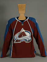
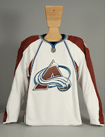
 I know we already saw images from Altitude, but this is the official post. The Colorado Avalanche have unveiled their new Rbk EDGE uniforms today. Photos follow.
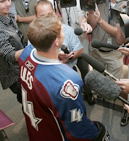
There they are. Now here's John-Michael Liles modeling the new duds at a press conference in Denver today.
I think he's been surrounded by the fashion police. I apologize, that was awful. I don't think my head's on right today. But seriously, I've been a big fan of most of these new Reebok jerseys. I'm sorry, this is not what I had in mind for the Avs. They had such a cool uniform.
Don't get me wrong, I don't think it's end-of-the-world horrible, but it's not great either. Couple more angles.
The lettering and numbering will remain the same apparently, so that's good. What I do like that all the new jerseys have is the giant crest. Show off that logo! No need for it to be so small.
Anyway. Love 'em or leave 'em, there they are. Avs fans, it's your big day. Is a celebration in order or shall we go back to the drawing board?


Reader Comments (29)
The away jerseys aren't too bad. But plain as hell. Give me the old jerseys anyday.
Was it RBK's mandate to make the NHL so bland and boring that they will some how pick up a national US TV contract? This sucks.
It's sad. Teams that had bad jerseys have been brought up some. Teams that had great jerseys have been knocked down. All that equals mediocre for everybody.
I hated them at first, and then I disliked them...
...and now I like them.
They've grown on me.
okay...
i loved the avs old jerseys, just made a lot of sense and looked really cool
these are probably one of my least favorite of the new rbk jerseys...the home jersey just looks weird and the blue underarm seems out of place...maybe if it were white? i dont know..
the away jersey is clean and i actually like it, but does anybody else think its so plain it almost looks like a practice jersey?
I hate the piping.
those vertical stripes are terrible. florida has some similar stupid design. and now rumor has it that one of the best looking (normally) jerseys are to be changed into similar, vertical striped uglies -- the Blues jersey. damnit.
Where exactly will the 'C's and 'A's go? Seems like the piping is in the way, but they can't just move them to the other side like Detroit either...
I loved the Av's jersey's when they first came out... but their non-traditional design wasn't really aging well...
I like the new look.
Alot of people don't seem to like piping no matter how it is used, I don't mind it. It looks clean, sort of sleak... I think it can easily be overdone, but I don't feel that any team so far has.
People hate change, this whole Rbk EDGE switch has sort of proven that. Maybe people will feel a little different once the teams get on the ice.
I'm not a fan of the new jerseys, and I don't agree that they're plain. A huge emblem and odd piping and stripes could hardly be classified as "plain."
If you want something less plain, check out the Lightning jerseys of the mid-90's. Lighting sleeves, anyone?
The new Avs jerseys are OK, but I was disappointed when I saw them.
Where exactly will the 'C's and 'A's go? Seems like the piping is in the way, but they can't just move them to the other side like Detroit either...
The piping isn't really "in the way", supposedly they can't stitch anything beyond the line the piping is stitched onto anyways because of the different types of fabric... the "C" and "A" will most likely get crammed close to the collar...
my blood pressure has gone through the roof today. if i don't wake up tomorrow morning send mr bettman my medical bills
This could have been a great jersey ...they ruined it with that dumb vertical piping. What an eyesore. Oh well..as long you little kids with no taste keep buying em, theyll keep making em.
It's interesting. I think these are okay and that it's crazy that everyone is complaining about the vertical piping. Maybe they are trying to appeal to a younger audience because it seems like most of the long time fans hate these but a lot of the younger crowd kind of likes them. Maybe I'm wrong though.
They aren't bad, but they're not great either.
I think they'd look like practice jerseys w/o piping, but at the same time the piping seems to kill it. Why they couldn't leave the stripe on bottom like it was is beyond me ... Carolina, NYI, NYR and numerous others have?!?
Well I honestly don't mind them. Yes, they look like the majority of other jerseys, but they're still not bad. Dare I say it, I tend to like the simple layout and vertical striping on these EDGE jerseys - mainly because the coat-tails look terrible with horizontal stripes. It is a little unfortunate that most teams will look identical this year.
I know traditionalists hate the new look, but I think they'll grow on everyone. Sort of like the Olympic jerseys. Of course I could be wrong.
these jerseys are A-W-E-S-O-M-E wayyyy better than ther old ones i wish my team (the canucks) did something like this...great job avs!!!
ugly why did the take the 'v' line from the bottom its ten times better than the bent vertical line or would i say a thousand times
outline the shoulder with the white and black piping would make these jerseys look good. they just look awkward the way they are.
I always loved Colorado's logo. It's one of the most eye-catching in the league. But, I've always hated their uniforms (except for those 3rd jerseys). After seeing these pics, I still love their logo, but hate their jerseys. In fact, I hate them even more now. Another screw-up job.
You should not only go back to the drawing board, but you should have those that were at the original drawing board shot.
i like em
I can't express enough how much I don't like the new Avalanche jerseys. They've really dropped the ball...er...puck on this one.
I wasn't as big on their originals as some, but these new ones are definitely a step down. The whites are the better of the two, but that's not saying a ton.
and i thought the earlier images were ugly.... this just burns.
now other than vancouver there hasn't been any teams jerseys that i despise with a passion... i in fact LOVE the Panthers jerseys... but this... wow. you can add it to the list with vancouver.
Smockron!