Random Concepts To Share
 Thursday · Sep 13 · 2007 | 3:29 PM PDT
  8 Comments
 Aside from the NHL 08 news, it's been a rather slow day so it would be wrong of me to leave you without a concept post to get you through the night. But before I do that, I wanted to thank you all for continuing to visit and read this blog. Yesterday, we passed the two million hit mark. For those keeping track, it was over 1,000,000 hits in just two weeks. I'm still in shock.
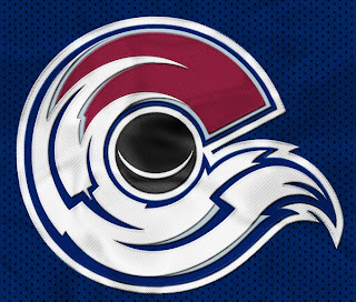
But moving along now. We'll begin with an amazingly cool concept logo which was emailed to me yesterday. It originates from the SportsLogos.net message board. It combines the tradition of the Colorado Rockies and the symbol on the flag of the state itself.
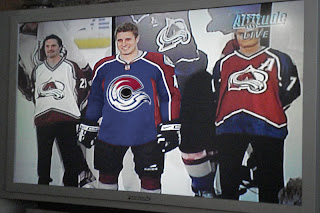
For my money, I'm sure it's just the thing hockey conservatives love. But the thing is, it's actually really good. Personally, I'm still partial to the "A" logo, but this could serve as show-stealing secondary mark for sure. I mention it because shortly after Altitude had the new Avs jerseys, somebody reworked it.
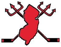
I never cease to be amused by people. Speaking of amusing — the New Jersey Devils have never had a secondary logo. Here's what one might look like.
Needs something to hold it all together, perhaps a circle or something. But I don't think it's half bad. Too boring for a primary but it's exactly what secondary marks are supposed to be.
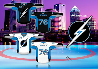
But while we're busy altering logos, I was emailed this Tampa Bay Lightning design.
While the silver and blue on black make a solid color combination, there really isn't anything to the logo. It's just... dull. I know we all like simple over busy but there's something to be said for finding a happy medium.
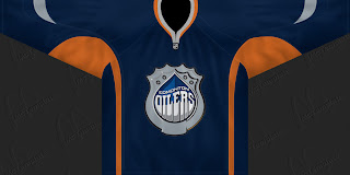
But let's not stop now. What if the Oilers were to don a redesigned logo at some point in the future? The riots in Edmonton's streets aside, it could look something like this if the right people were on the job.
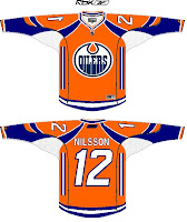
I can't speak for Edmontonians, but I like it, myself. What I don't like is an orange — and I do mean orange — jersey.
Yes it's a little busy but I can look beyond that. What I can't get past is all that orange. I'd take a copper jersey over that. What does that say?
Anyway, that'll do it for tonight. Leave your comments below as the designers who email me often peruse the feedback on their work. I'm sure they'll be interested in seeing what you all have to say.
I'll have more tomorrow if I don't get too bogged down in the four different teams unveiling jerseys.
One last thing... HOCKEY SEASON IS ALMOST HERE!!!



Reader Comments (8)
honestly, i think the blue as the primary color makes it look at ton better
im not a fan of the C looking avalanche. it seems to enigmatic. and too rough on the lower C edges.
that new avalanche 'C' is a great design, but I agree with bryan's latter point: the lower half could use some work. the large blue zig-zags make it look more like ice than tumbling snow.
I don't mind the "C" logo, it's a nice design but what I like more is the Av's having a more dominate blue jersey as opposed to the burgundy. Great design though.
New Jersey...pitchfork through poop.
Appropriate for the state flag but not for the good looking devils uniform.
I actually LOVE the devils uniforms.
Oilers fans love orange, mostly because of the dynasty playing in those colors.
The copper is way too modern for a hockey jersey. I'm hoping they do go back to orange trim.
I love the Colorado "concept" save for a different circle/puck in the middle....but those "bixton"(?) tampa uni's look like a Gay super-hero...and it looks like an 'S' not lightning
Can you believe someone is actually selling this on ebay? This is retarded! Sakic never did play for the Colorado Rockies. What were they thinking?!
http://cgi.ebay.com/JOE-SAKIC-Colorado-Rockies-SIGNED-Retro-Hockey-JERSEY_W0QQitemZ230172828994QQihZ013QQcategoryZ27284QQssPageNameZWDVWQQrdZ1QQcmdZViewItem