Early Photos Of New Blues Jersey!
 Friday · Sep 14 · 2007 | 11:37 AM PDT
  22 Comments
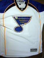
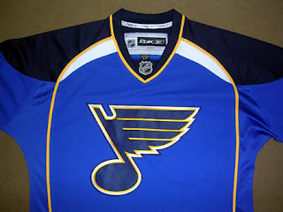
 Courtesy of my friends over at The Checking Line, we have photographs of replicas of the St. Louis Blues' new Rbk EDGE uniforms. The actual unveiling by the team will come tomorrow at FANfest.
 The new jerseys look sharp! I'm a huge fan of the shoulders. I wouldn't be surprised if the Blues make off with one of the best new Reebok designs here. Quite impressive.
Keep in mind that these images are replicas and not authentics so if the material doesn't look quite right, that's why. But as for the overall design, expect to see just that on the authentics.
We'll likely see Blues players modeling them at FANfest tomorrow. I'll have pictures posted from that event when I can.
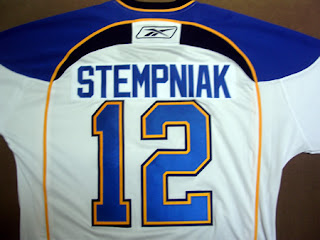
Here's the back of the road sweater. I think the nameplate and the numbers are a little too close together here but that may have to do with the fact that's it's a replica.
Overall, I like it. And if I were the kind of person who could reconcile giving money to a team other than my Lightning, I might actually buy the home sweater. What do you guys think?


Reader Comments (22)
I like the Blues jerseys. Not crazy about the piping, and I'll miss the bottom stripes, but it's a good modification.
I preordered the roadie, so I'm stoked to get that in time for the season!
terrible
where do the C/A go?
i like the piping...kinda gives off the image of the rink
i would kinda like the piping if this was Roller Hockey International, or Pro Beach Hockey. This is the NHL right?
The piping has laid waste to most of the new RBK EDGE jerseys that use it but it looks good on this Blue's jersey. I like the new design.
Love 'em...second only to the new Flyers jersey.
I'm trying to give the jerseys with piping the benefit of the doubt, but the new Avalanche and Blues jerseys aren't helping me like this template any more......
At first i was skeptical about the arch-like piping, but then i began to think. Could this possibly be a reference to the Arch of St. Louis?? Maybe I am over thinking it but that would be pretty cool if it symbolized the gateway arch.
I am not a fan of the piping, however, when I looked at it a few more times, I too thought it could represent the Arch of St. Louis, in which case, it is easer to to handle the piping,as it is a neat idea but I am still not a huge fan of it....I like their older ones from last year better. I am not a Blues fan what so ever, but thought they had a nice uniform.
Better hope you don't have a long last name if you play for the Blues. I have no idea where they'd put it on that jersey.
Overall, it's not bad. I shouldn't like it. But it's actually pretty sharp.
It's alright. Not the horror that some are, but still begs the question "why the change?"
Very good point about long names.
Still, all in all, I'm relieved, after seeing some of the others.
I hate you RBK, with or without your vowels. I really do.
automatically one of the blues worst jerseys, i'm just trying to decide where to place it in relation to the diagonal red stripe era.
Jerseys are much better than expected. I liked the old horizontal stripe at bottom, but assume will get used to not having it. Will the shorts be darker? Some of teams seem like jersey and shorts blur with no bottom stripe.
chris
next tourneys: worst logo, best new uni, worst new uni, you could keep this up for a while
blues,not bad but not the best unis. i think the best are the original 6 teams, caps, bjs, nucks, nyi.
worst: nash, fla, atl, avs. overall i like the new jerseys. from the earlier pics they look about the same and on tv you'll probably never notice
Sharp jerseys, especially the home.
I never really cared for the Blues' look. Until now. And the shoulders and piping isn't annoying at all.
Here is another jersey this Sabres fan would rather buy than a Sabres jersey.
The jersey looks OK, simply because of the classy logo and color, but why did they have to go screw up one of the best jerseys in the league?...again!
The back looks like a tombstone. Retarded.
I just saved $250.
After seeing the NHL 08 screenshots and then these photos of what is supposed to be the new St. Louis Blues jerseys, I really like them.
I'm more in favor of a simple look like last season's jerseys, but I actually have taken a liking to this design. I don't mind the thin white piping on the home jersey, but if they weren't there, I'd like it a little more.
Either way, I think that despite this being a significantly different look to last season's jersey, I feel this is a winning one. As long as the numbers aren't too close to the nameplates as Chris mentioned, I'm happy with it.
I must be in the extreme minority, because I own a Hull jersey from the "red horizontal stripe" era, and it's easily in my top 2 or 3 favorite sports jerseys that I own (1990 Elway is #1)...
Maybe it's because it reminds of the closest the Blues have been, talent-wise, to winning the Cup during my lifetime...
Here's a change for the Blues new unis that HAS TO HAPPEN!
http://www.stltoday.com/forums/viewtopic.php?t=485163&postdays=0&postorder=asc&&start=0" REL="nofollow">
http://www.stltoday.com/forums/viewtopic.php?t=485163&postdays=0&postorder=asc&&start=0
Man that tombstone back is sick.
i like it alot. its a improvement in my eyes