Stars Unveil New Uniforms!
 Friday · Sep 14 · 2007 | 4:37 PM PDT
  30 Comments
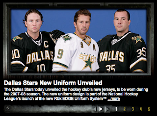
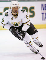
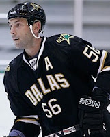
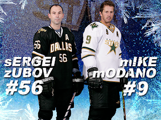
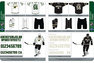
 Add the Dallas Stars to the list of teams that have unveiled their new Rbk EDGE uniforms this summer. That was done today and they're exactly what everyone feared.
The first thing I'll say is that I was never behind this whole idea that manifested itself in the form of these new home sweaters. But after seeing these photos, consider me a convert.
In a "new" NHL where cookie cutters are being doled out for even the smallest of things (i.e.: web sites and the like), I find it comforting if not overwhelmingly reassuring that one team managed to step outside the prescribed boundaries and come up with something — wait for it — different.
Now many of you will respond to that superfluous thought with the suggestion that in choosing to be different, they've ruined something good. Obviously I disagree but am always open to a good argument.
Oh and to the next person who suggests that the reasoning behind "DALLAS" being written across the chest is anything other than to remind fans where they are — a giant gold star. From me to you. I really don't understand the number of people seriously under the impression that any NHL doesn't know where the teams are from. Dallas and Vancouver do not have text on their jerseys because their residents lack cognitive function and at various points during a three-hour period forget where they are. Now I'm done with that...
Even if I were the kind of person who could spend money on anything hockey-related that didn't have a Lightning logo, I still probably wouldn't buy a Stars sweater. But that doesn't mean I don't like them. I think the designers knew what they were doing and hit the nail on the head.
Which reminds me, the Stars did a cool thing and posted on their web site the entire graphics package for the uniform set. It's pretty cool.
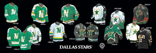
Finally, the Stars also gave us a look at the history of their uniforms. I'll leave you with that.






Reader Comments (30)
To me, the home jersey screams "basketball jersey". I like the fact that it's different from the cookie-cutter look we've seen with a lot of the new jerseys, but this looks like something right out of NCAA basketball, especially with the number underneath the word "Dallas". Like someone else mentioned, maybe writing "Dallas" straight across the front with a shooting star under it would have been a good idea.
The away jerseys aren't too bad.
why change that green with that black star shape that was one of my favoutites to this horrid looking black jersey with a number and dallas on top of it no more greens in the nhl same for minnesota but at least they still have their logo on the red jersey overall i'm disguted from bettman and rbk so dum don't understand nhl jerseys are fine the way they are
I loved the "STAR" jerseys. These just suck. The only positive thing I can say about these is there's no piping.
I loved the 06-07 jerseys. I thought they were unique and were very cool. But now... I have to say the mustard Nashville jerseys better. I thought they were just kidding when I saw the leaked picture of the dallas jersey. Thats how bad it is... The white isn't to bad, it could do better. But the home is just so boring and plain. If I played for the Stars or was a fan I'd be ####ed off!
There are three versions of the uniforms of this franchise that I consider among my favorites: the North Stars' final "N" version, the first "STARS" uniform that they wore in their final seasons in Minnesota and the first year in Dallas, and the star-pattern uniform. (I didn't like the wider-striped mid-90s uniforms as much, because the stripes didn't work as well with the darker green.)
The new white jersey is all right... pretty simple, which is okay. The black one... I just don't see the value of the city wordmark. Look at the NBA: teams put the city names on their road jerseys, not the home ones. I could sit here all day and crack the NBA for many things, but this is one thing they've managed to get right consistently. I mean, if fans want to take pride in their city, they can get gear to represent the city. This is about a team, though.
I think what might be rankling most critics of the DALLAS wordmark is the very fact that this is a purloined franchise... it's just another jab at North Stars fans who never fully recovered from what that bastard Norm Greed--ERR--Green did to them 14 years ago.