Concepts For Oilers, Blues, Coyotes
 Wednesday · Sep 19 · 2007 | 12:40 PM PDT
  3 Comments
 I've got a few concept designs for you to check out this afternoon. We'll start way up north in Alberta and work our way south to Arizona.
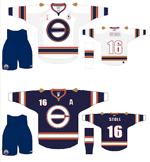
Here's what one designer had in mind for reconfiguring the Edmonton Oilers' logo and uniforms.
It's an "E" merged with an "O" that, quite frankly, might work better as a secondary logo. That isn't to say that the logo found on the shoulder of this jersey wouldn't work just as well. The one big thing that struck me with the Oilers' new Rbk EDGE jerseys is the plainness. I know a lot of people have been commenting on how some of the new sweaters look like practice jerseys, but for the Oilers, that couldn't be more true. The fact that the elbow stripes don't even go completely around the arm just adds to that.
But anyway, we're talking about this concept. And overall, I like it. The logo could use a splash of creativity, I've seen worse. And the oil drop might be a nice addition to the plain uniforms they have now.
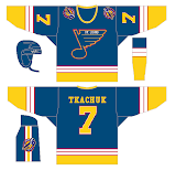
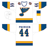
We're moving along to St. Louis now where one fan is mixing the old with the semi-old with the new. Usually when you throw to much stuff in a pot and cook it, the end result is less than delicious. That isn't necessarily the case here, but I don't think the red ever really worked for the Blues.
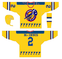
I think those would be solid designs if the red was removed entirely. Now, here's what you don't want to do — with a third jersey or otherwise.
That'll give a person nightmares. It doesn't go the horrifying length as the alternate Blues sweater Mike Keenan vetoed in the '90s, but it sure is trying. Look at those blue notes across the waist.
I like the idea of a trumpet for a secondary logo, but this really isn't the way to go. And how can a team called the Blues have a dark jersey that's anything but blue?
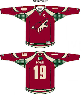
But I say we move on. A Phoenix Coyotes fan recommends reintroducing green into the color scheme. Here's how.
First off, I'm not sure you can put a team logo above the nameplate and have it look good. Secondly, I'm not sure it's even allowed. However, I think it would look just fine on the shoulder. I still like the PHX patch more, but the moon isn't terrible for the other side.
That's all I've got for now. I plan to have more later. Plus, don't forget to check out the Concepts Gallery where you'll find all the work I've posted plus some I haven't.



Reader Comments (3)
I actually like the idea of the trumpet logo for the Blues on a possible alternate jersey. I do not; however, like the idea of a bright yellow jersey with musical notes ringing the bottom like the old Nordiques jerseys used to do with the Fleur-de-lys.
I really love the the blues jerseys with the red that you posted. I dig the horizontal stripes at the bottom on any jersey, and I think those concept jerseys are sharp.
Nice thought with the Oilers logo, but not as a jersey crest. A shoulder patch, at best. Nothing wrong with the current logo. White numbers and letters on a white jersey doesn't work so well either.
BUT~! I like those stripes. Take those and put them on the current ones (and remove the piping) and you've got something. As long as they go all the way around the waist and arms!