In Response
 Wednesday · Sep 19 · 2007 | 12:14 PM PDT
  2 Comments
 Sometimes when I post concept art, I'll make suggestions here or there that speak merely to my own personal preferences. It's cool that every once in a while, someone listens to my suggestions and gives them a shot.
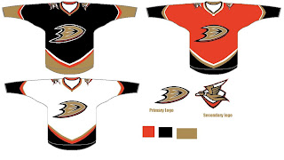
Yesterday, I posted an Anaheim Ducks design I thought was pretty cool, suggesting that instead of gold, the alternate jersey in the set might be better suited for orange. Well today in my email I find that someone gave me what I asked for.
I guess it just proves that some of you out there are actually reading what I write. And I appreciate that.
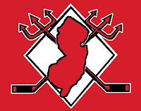
Then, just last week I posted a neat logo concept somebody came up with for the New Jersey Devils. I suggested that it needed something behind it to tie it together better. Then I was emailed this shortly after.
Looks a lot better if you ask me.
Anyway, I guess I just wanted to thank you guys for reading and show you that I do in fact read all my email. By the way, if you've ever written to me and are still awaiting for a response, chances are my feeble memory has forgotten. Just keep bugging me. You can get a hold of me at nhllogos@gmail.com.


Reader Comments (2)
I really like the ducks concepts. The webbed "D" looks good on its own and i like the orange. Personally i dont care for black as a main colour, but i would like to see the orange as at least a third.
Hands down the webbed "D" is a better logo.