Concepts For Logo Upgrades
 Wednesday · Sep 26 · 2007 | 1:20 PM PDT
  8 Comments
 All right, if you've been reading for a long time (or even a short time), you probably know about my distaste for the logo many consider to be among the best in sports. That of the Chicago Blackhawks. I just don't see the allure.
You might find it surprising that I don't stand alone. In fact, in the past I've even posted changes folks have made to the logo. Well, I have another one. I still don't love it, but with a little work, I'd call it a big step in the right direction.
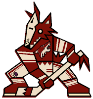
Then I thought this one was kind of funny. Not crazy enough to freak anybody out, but definitely different. Imagine the Phoenix Coyotes using both logos together with their current color scheme.
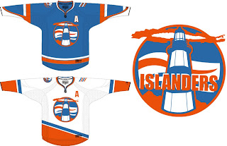
Okay so maybe it is a bit scary. What's not scary is this New York Islanders concept. I don't know. It just feels like such a special thing when you run into a concept this well-designed. Dump the text out of that logo and you've got yourself pure gold.
I like these jerseys so much. Even using the current logo on the shoulder is a great touch. Hell, I could even live with this lighthouse logo as a secondary. But I really do think the Isles should reintroduce something of this nature. I just feel like a lighthouse would make such a great logo for the Isles.
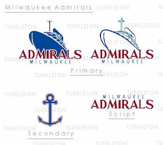
And finally, we go completely off topic here. This is a fan made logo redesign for the AHL's Milwaukee Admirals.
Thought it was pretty decent. It feels a little familiar to me, like I've seen it somewhere before. But that could just be my brain playing tricks.
What do you guys think? Feel free to drop a line in the comments.


Reader Comments (8)
That reminds me alot of the Norfolk Admirals.
I was going to point out the fact that it looks almost exactly like the Norfolk Admirals, too.
Chris, I love your blog, but you've officially lost me on this Blackhawks thing. That updated logo is horrible! All the artist did was remove a bunch of lines and any hint of expression from the face, watering the whole thing down!
Count me as one of the many that considers the Blackhawks logo one of the best, and perfect as is!
I completely agree with Robert Ullman. The blackhawks logo is good, and that one there is just brutal. As for the coyotes concept, that just takes the worst from both logos.
the blackhawks logo is one of sports best. Detailed yet simple. The updated one looks horrendous unfortunately
Ahh the Admirals, my old hometown team. Back in HS I used to draw up new logos and jerseys for them in MS Paint, back when they had the old Cap'n Crunch looking guy, personally I think this is a step up from the child skeleton 'admiral' they have now, but it could be a lot better.
What we need is an updated Vancouver Canucks "skate" logo.
Being from Milwaukee, I can say I don't favor that Admirals logo at all. While our skeleton doesn't look tough, our new colors are better then the red/blue we had going before and the shoulder bone anchors are dope.