Mailbag: Silly Bolts Concepts
 Wednesday · Sep 26 · 2007 | 1:45 PM PDT
  5 Comments
 It occurs to me I haven't written a Lightning posted in a while — six days to be precise. It's all right though because some folks have been creating some crazy Tampa Bay concept art. These were emailed to me this past week and they're worthy of the Freak Out series, but I just could bear to wait any longer to post them.
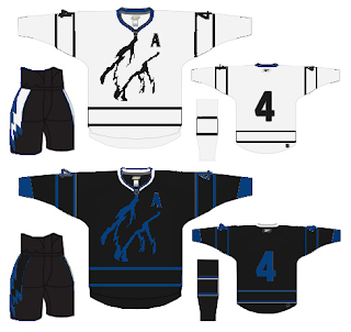
This first one is a rather simple concept. The team is called the Lightning. So let's put some lightning on the jersey.
I wasn't amused. More like horrified. But it was a good effort. Though I've never seen black or blue lightning bolts in my life. Perhaps 23 years in Florida isn't enough.
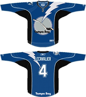
Then, along the lines of sharks and panthers biting through hockey sticks comes this idea.
What worse is that this was stolen from my own design — the only one I've ever made for this site. It's frightening, really.
By the way, I hope you all understand I'm not trying to be mean. It's just a team that's close to my heart. Anyway, that's all I got. If you've come up with anything or seen anything that hasn't been posted already, please send it along. I'd love to see it.


Reader Comments (5)
the bolt across the shoulder isn't a bad idea. the rest...not so much.
lol those jerseys are fitting for such a craptacular team
WOW... i never thought i would see such terrible jersey designs....
lol those jerseys are fitting for such a craptacular team
... that has a Stanley Cup! :)
I still love their old third jersey alternate.