Oilers, Here's How You Fix It
 Thursday · Sep 27 · 2007 | 3:27 PM PDT
  6 Comments
 The Fix It series trudges on tonight as we consider improvements to the new Rbk EDGE NHL uniforms. I told you yesterday that you'd be in for a treat on this one.
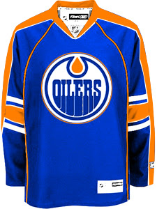
As far as I'm concerned, the Edmonton Oilers have gotten stuck with one of the worst new sweaters in the league. That's a personal opinion, but I stand by it. Many have complained that the Rbk EDGE jerseys look a lot like practice jerseys. I disagree with that statement as a generalization. But here, I find it appropriate.
I have several designs to show you and I'll save the best for last. We'll start out by making some very slight alterations that would improve the jerseys on a major scale.
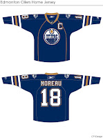
By simply extending the stripes on the sleeves to wrap completely around the elbows and adding a shoulder patch — one borrowed from last year's third jersey — you already end up with a sweater that doesn't look quite so blank. It's disappointing to see that the Oil couldn't manage something as easy as this on their own.
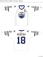
Then we have another design very similar to this but with a brand new shoulder patch.
I think that's a very interesting logo and with a little work, it could be great. I also truly believe that fixing the elbow stripes and adding something to the shoulders is all this jersey needs to really make it shine.
But speaking of shining, this is what you've been waiting for. Personally, I feel like it's one of the best Edmonton concept designs I've seen this summer.
The pattern was borrowed, obviously, from the Florida Panthers' new duds, but these colors are what Oilers hockey is all about. Imagine Gretzky and Messier wearing this. You almost can't help it. I am very impressed with this design, but as a Bolts fan I'm not sure I really have a say. I'll leave it to the rest of you now to decide. Especially Oilers fans.
Tell us how you feel about these fixes in the comments.
Up next: Washington Capitals.


Reader Comments (6)
I surprised myself (a Canucks fan) by realizing I would have probably voted for the Oiler logo all the way to the end of the competition; I think it's that good. Considering they had such a great logo to start with, their current jersey's are abysmal.
But that last concept jersey is wonderful. I've always thought the Oil should go back to the shoulder yolk of the Gretzky era -- it's what makes their jersey most distinctive and immediately identifiable.
I really don't see what the big kerfuffle is about the Oiler's new jersey. Sure it looks bad, but so does basically every other in the league (barring the ones that stayed largely the same). The Oilers jersey isn't any worse than Minny, or any better than Vancouver. They just have a crappy team.
I like our new jersey's personally as is the only thing I would change would be to put piping down the arm so as to make the elbow stripes not end at nothing, and maybe adding a shoulder logo I think the secondary logo of that second concept looked nice and had a lot of potential with some tweaking, as it is I don't think we could go back to the orange and blue, the copper and blue I think looks better and helps to keep us from living in the past this is a new generation a new chance for greatness
I was severly disappointed w/ the new Oilers jerseys, especially when you see what the Islanders did with theirs. Our colors on that design would have been awesome. The previous poster hit the nail on the head, even glory day fans want something different in everyday jerseys, but that last concept would make a kicka** third jersey.
I'd like to see someone deviate from the blue and orange and do a new color scheme for a concept.
Well, we sure do need fixing.
Drop the vertical piping on either of the first two and they're fine, especially the first. I like the shoulder patch idea on the second one, too.
Not big on the third one. The half-stripes look a bit better there, but I'd rather never see them again.